
United Design Practice 的设计作品《一正品牌体验馆》刊登在专业照明设计杂志 mondo arc .
mondo*arc
Since its inception in 1999, mondo*arc has become the leading international magazine in architectural lighting design. Targeted specifically at the lighting specification market, mondo*arc offers insightful editorial on architectural, retail and commercial lighting.
We know the specifier community has high standards. That’s why mondo*arc features the best photography, the best writers, high quality paper and a large format that shows off its projects in the best possible light. Free of any association or corporate publisher interference, mondo*arc is highly respected for its independence and well read within the lighting design profession.
自1999年成立以来,mondo * arc 已成为国际领先的建筑照明设计杂志。mondo * arc专门针对照明规范市场,提供了有关建筑、零售和商业照明的有见地的编辑。
我们知道说明者社区有高标准。这就是为什么mondo * arc 有最具特色的摄影,最好的作家,高质量的纸和大开本,展示最优秀的灯光照明项目。没有任何协会或公司出版商的干扰,mondo * arc 在照明设计专业高度尊重其独立性和良好的阅读性。
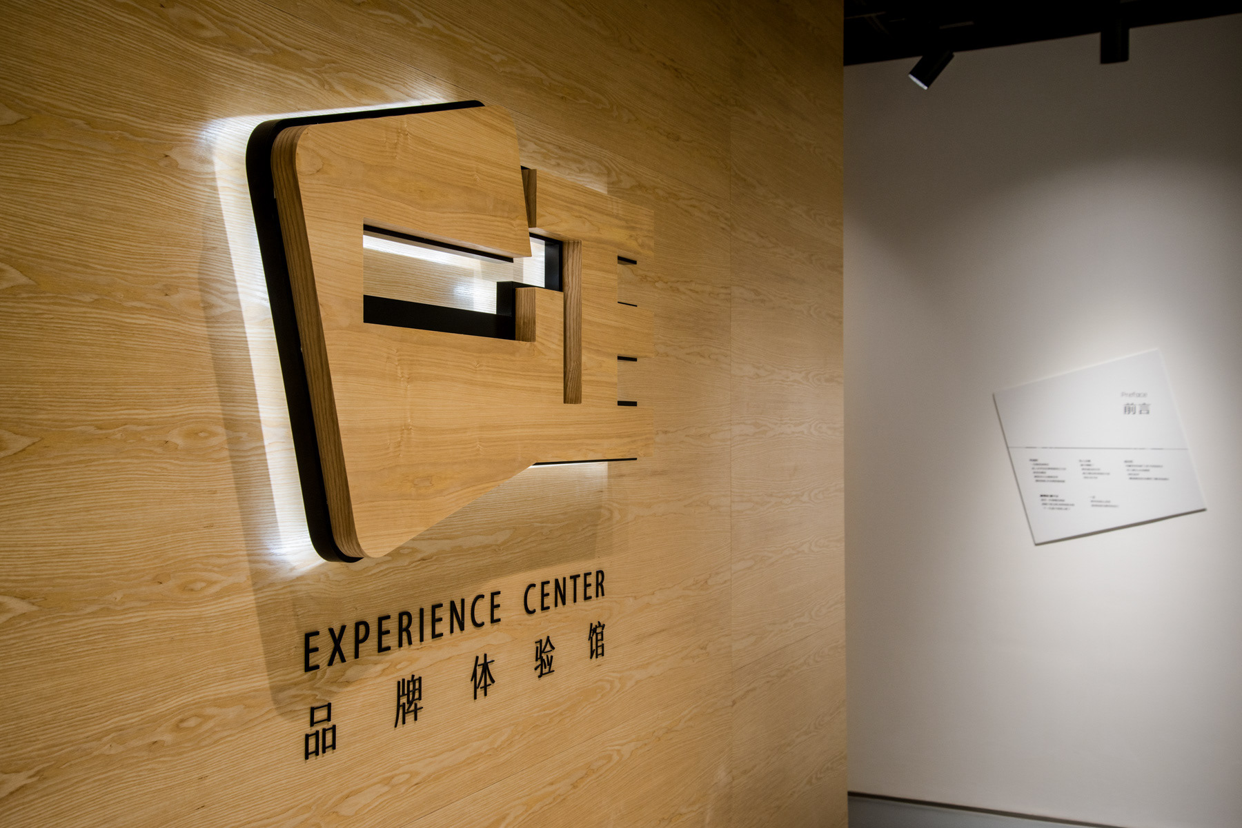
Yizheng Brand Experience Centre
Zhejiang Province, China
Yizheng Stationery is a market leader in children's eraser in China. This experience centre, though grounded in this category, is not targeted at children. This is part of a broader B2B communications brand building framework.
一正文具是中国儿童橡皮品类的市场领导者,但这个体验馆不是针对孩子们。这是一个整体 B2B 品牌策划框架的一部份。

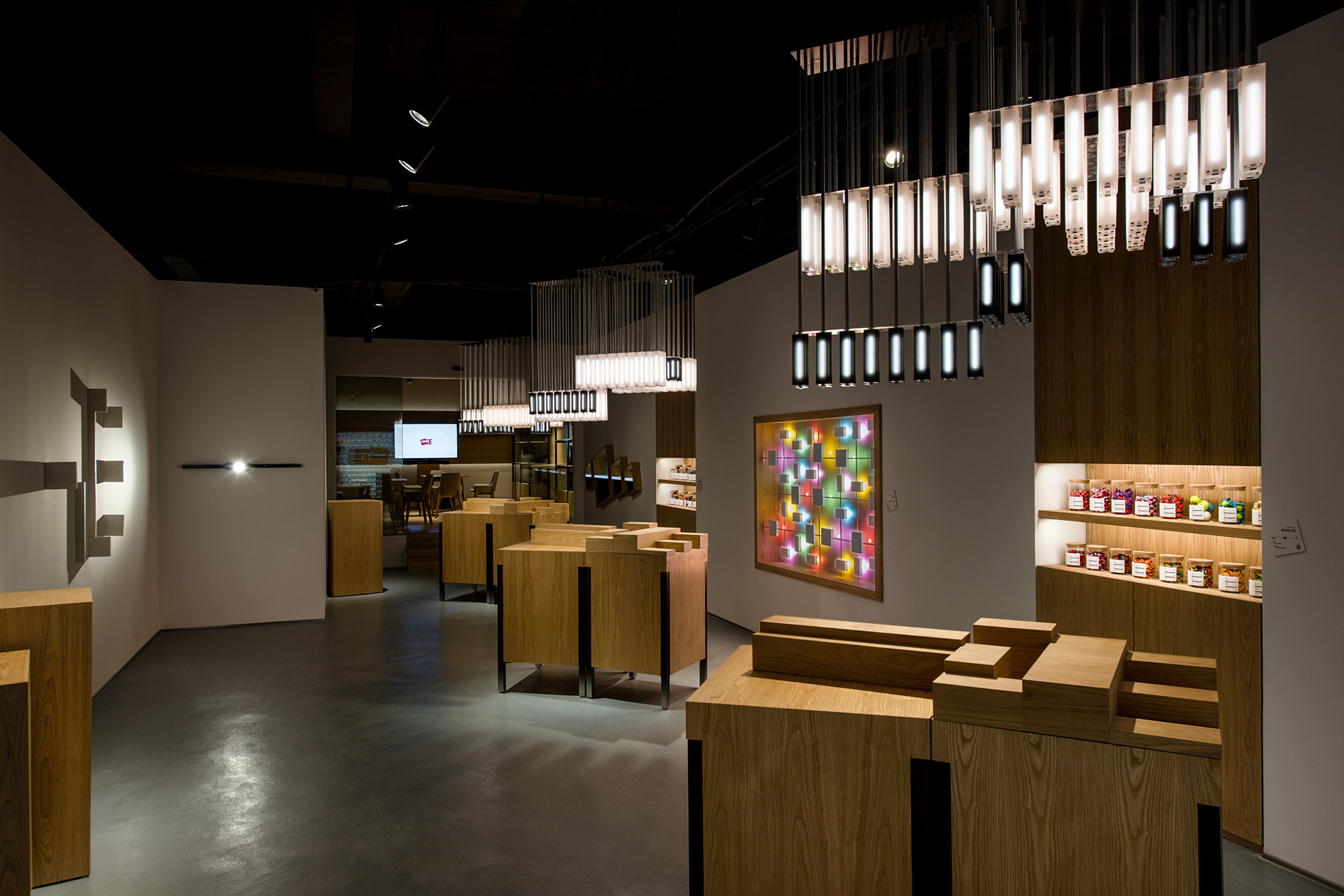
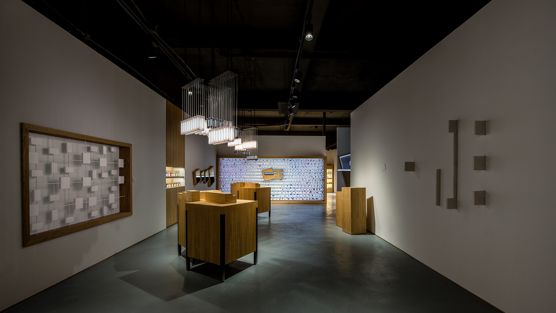
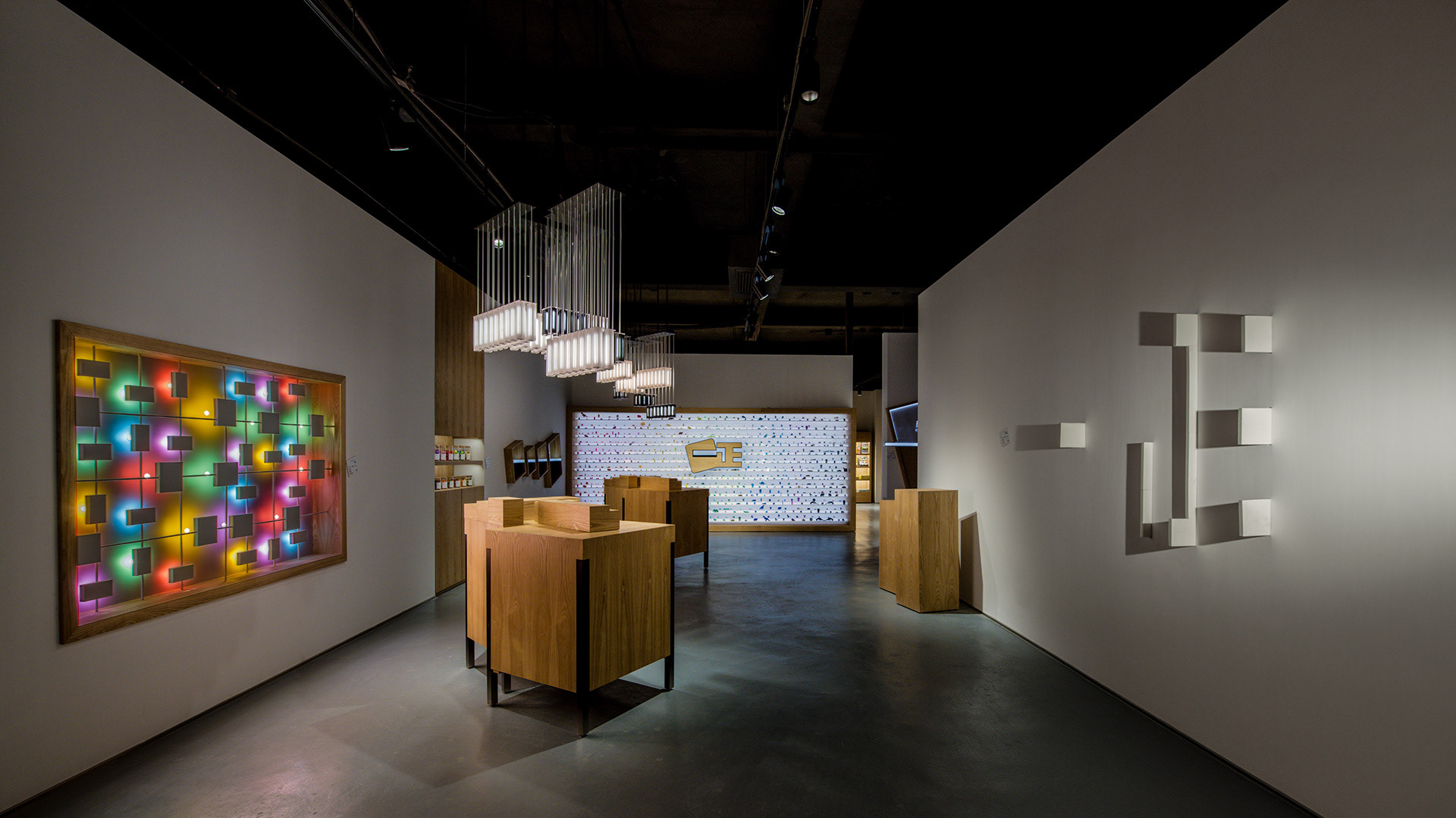
Spatial Layout / 区域分布
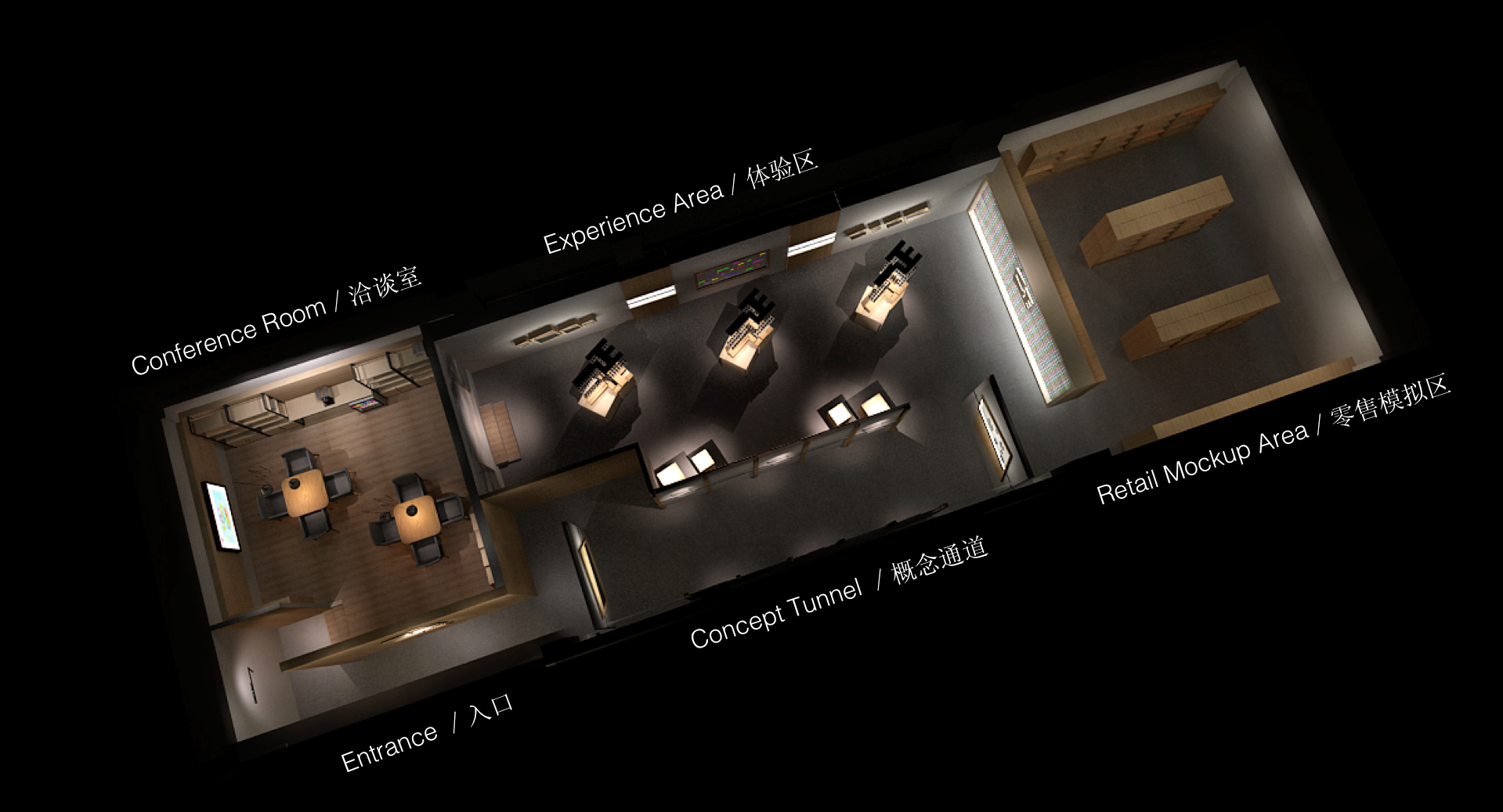
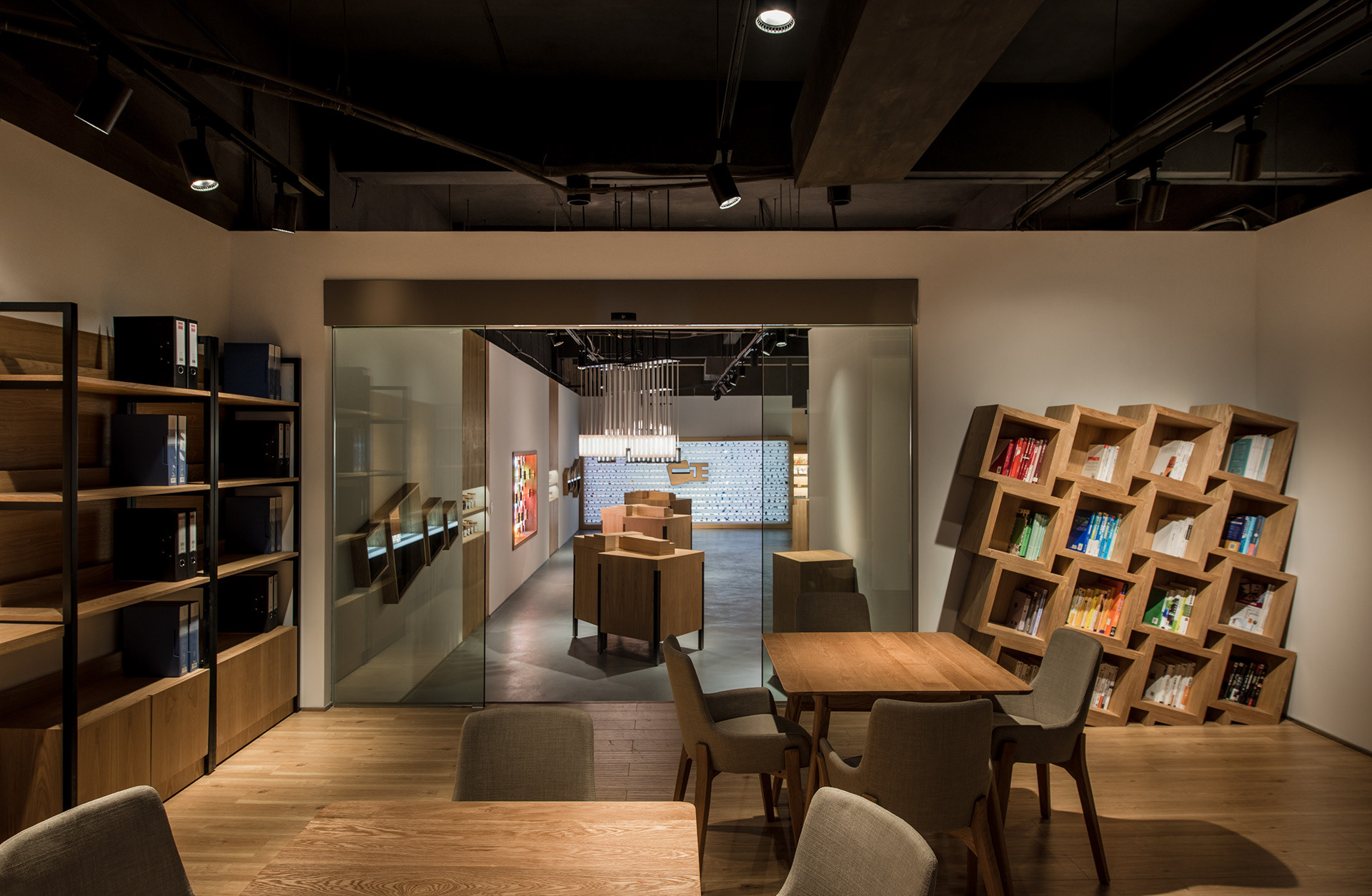
This experience centre is situated in the factory, it is meant to be part of an entire sales journey. As such, the spatial layout and circulation is meant to enhance this experiential journey. Upon arrival, they past through the lobby, enter the experience centre and turn left into conference area. Here they rest, freshen up take a drink, and watch the brand video. Thereafter, they leave to visit the factory, to see for themselves the level of automation and production sophistication. Re-entering the space, they turn right, passing into the concept tunnel, and into the retail mockup area. It is important for business partners to understand the diversity of their product range. The journey continues into the experience zone and back to the conference room where the client will address further questions and conclude the business discussion.
因为这是在工厂的体验馆,得考虑到商务访客的参观流程、动线。客人抵达工厂后,进门先左转,先到洽谈区,小歇片刻,喝个水,看品牌视频。之后出门参观工厂车间,直观了解工厂产能、自动化优势。参观完不同制造、包装车间后,再次进入,这次右转,经过概念通道,再到零售模拟区看看在销商品。这里展现的是产品的丰富性和品类的多元性。之后参观体验区,再回到洽谈区,做最后的解答和沟通。
Entrance / 入口
Our Concept / 我们的概念
In terms of brand communications, we ground the overall concept on the user level. In this age category, even if the child is the end user, the parent is the gatekeeper. The former typically only cares about whether how attractive the product is, the latter however, are the ones we are targeting in terms of messaging.
We all have good and bad memories from our childhood. But as we grow older, the bad ones tend to fade, leaving the good ones. This is the empowering message that we wish to convey to the parents and for them to tell their children. Everything has two sides to it. If we manage to overcome the short term difficulty, the reward is often life long. Once we overcome the unfamilarity of making friends, the resulting friendship could last a lifetime. From this concept, we developed five posters.
在品牌沟通层面,我们还是把重心放在最后受众和用户那里。亲子品类,虽然用户是孩子,沟通对象却是父母。因为前者只在乎东西好看,可爱,后者会在意更多,也有能力解析品牌层面的各种属性。这也为了后续市场端 2C 层面的沟通开个头,垫个基石。
每个人在儿时记忆里都有好的和不好的回忆。但很奇妙,我们都会慢慢把不好的擦掉,留下好的。我们希望父母能把这种正面激励的信息告诉孩子。事情都有两面,克服了眼前的困难,往往获得都是一辈子的。克服了陌生,就可能获得陪伴自己后半生的友情。所以就有了 “擦得掉/擦不去” 这个概念。因为一正橡皮擦已经不只是一种功能的满足,更多是一种情感的共鸣。我们为此创造了不同的 “擦不掉/擦得去” 的海报,视频是基于一个主题的展开版。
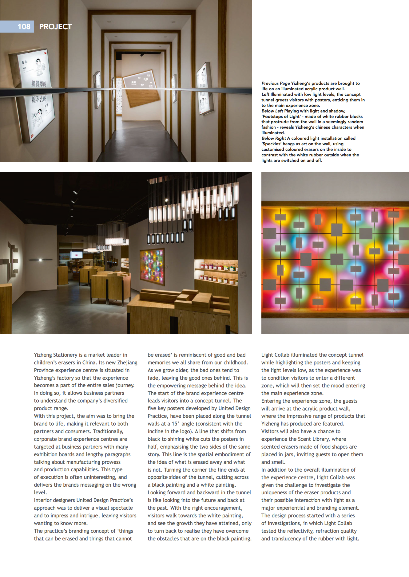
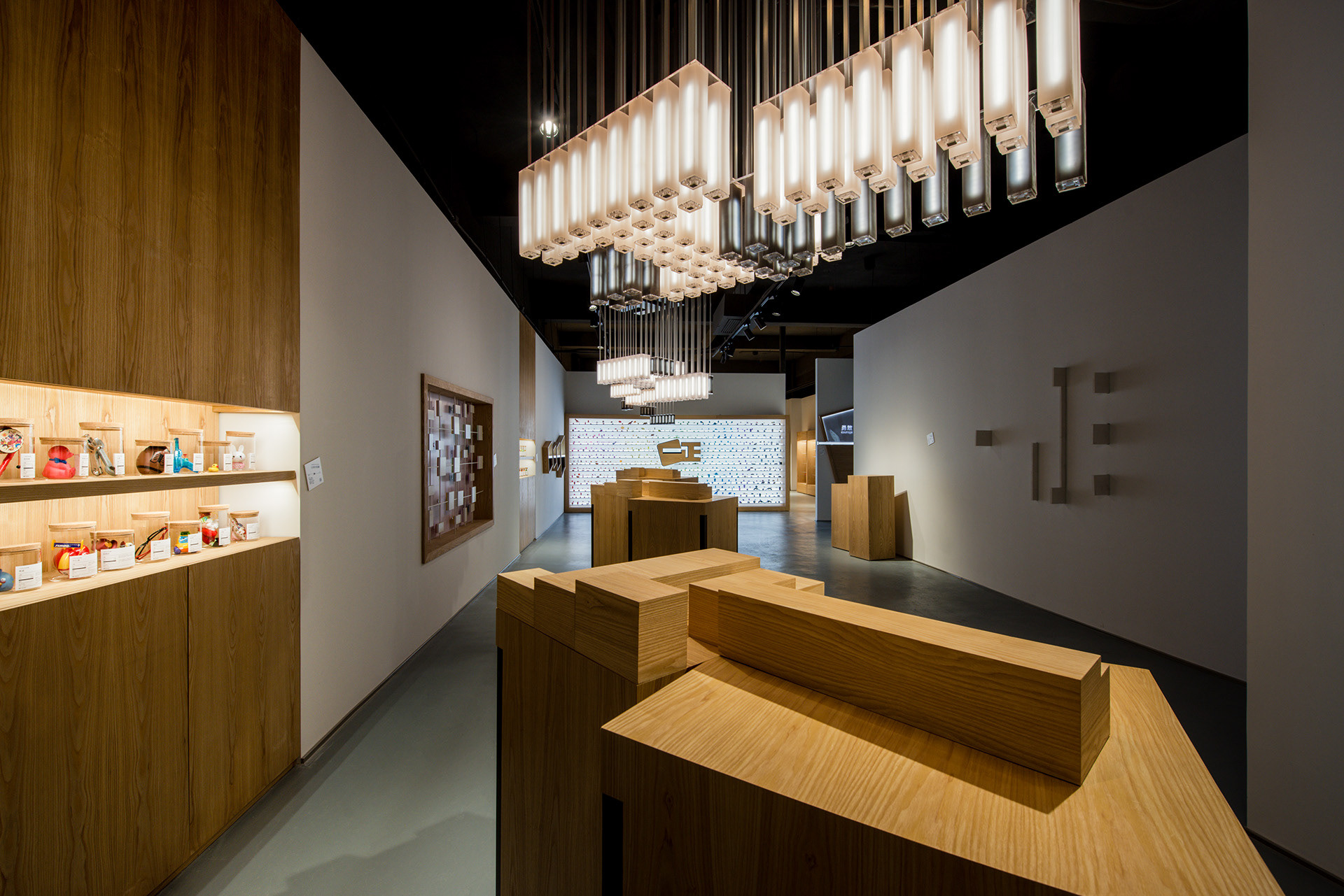
Concept Tunnel / 概念通道
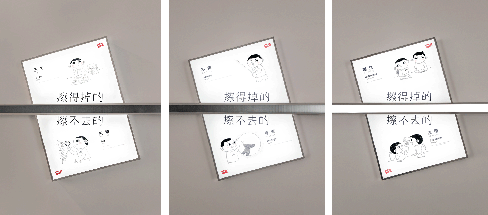
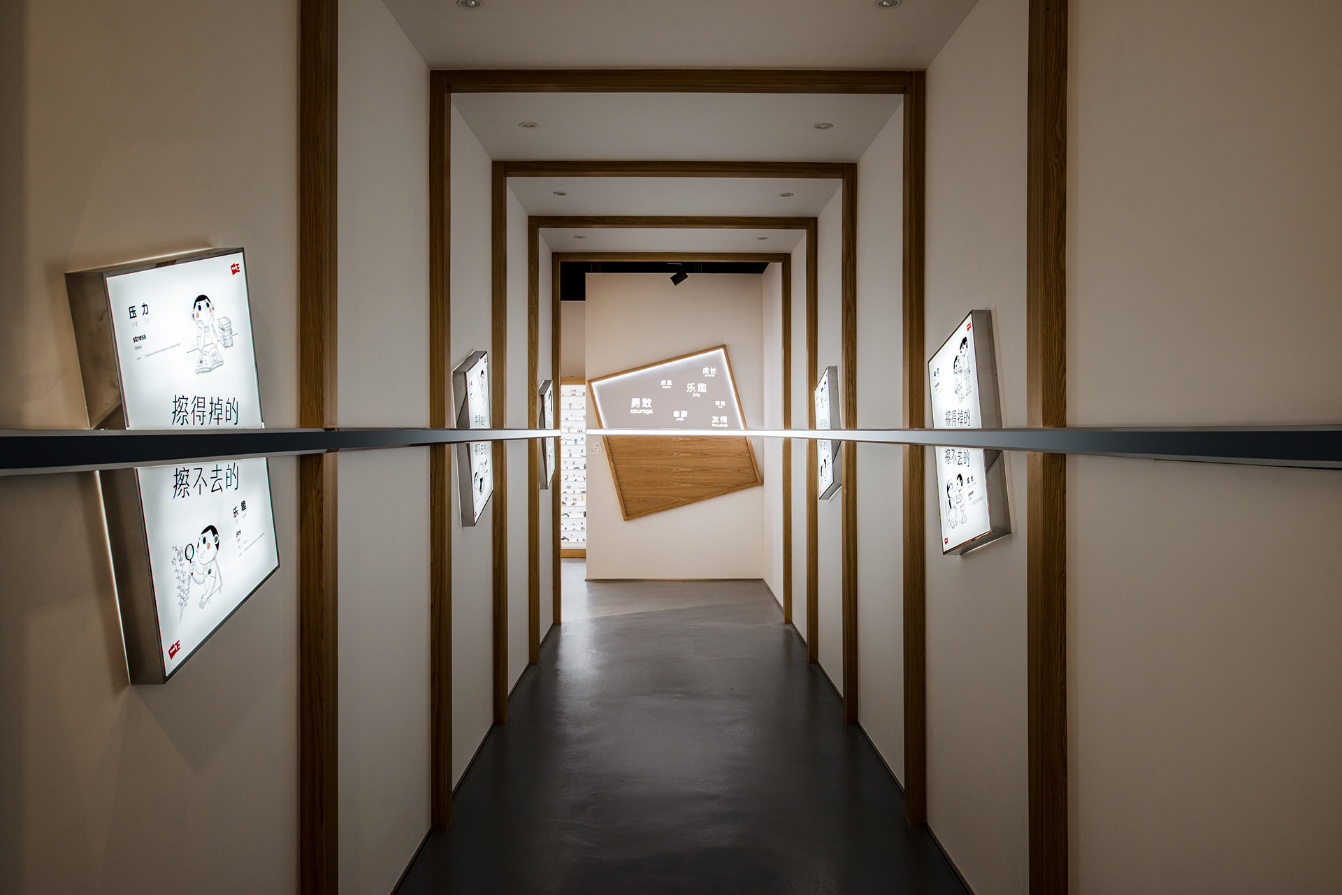
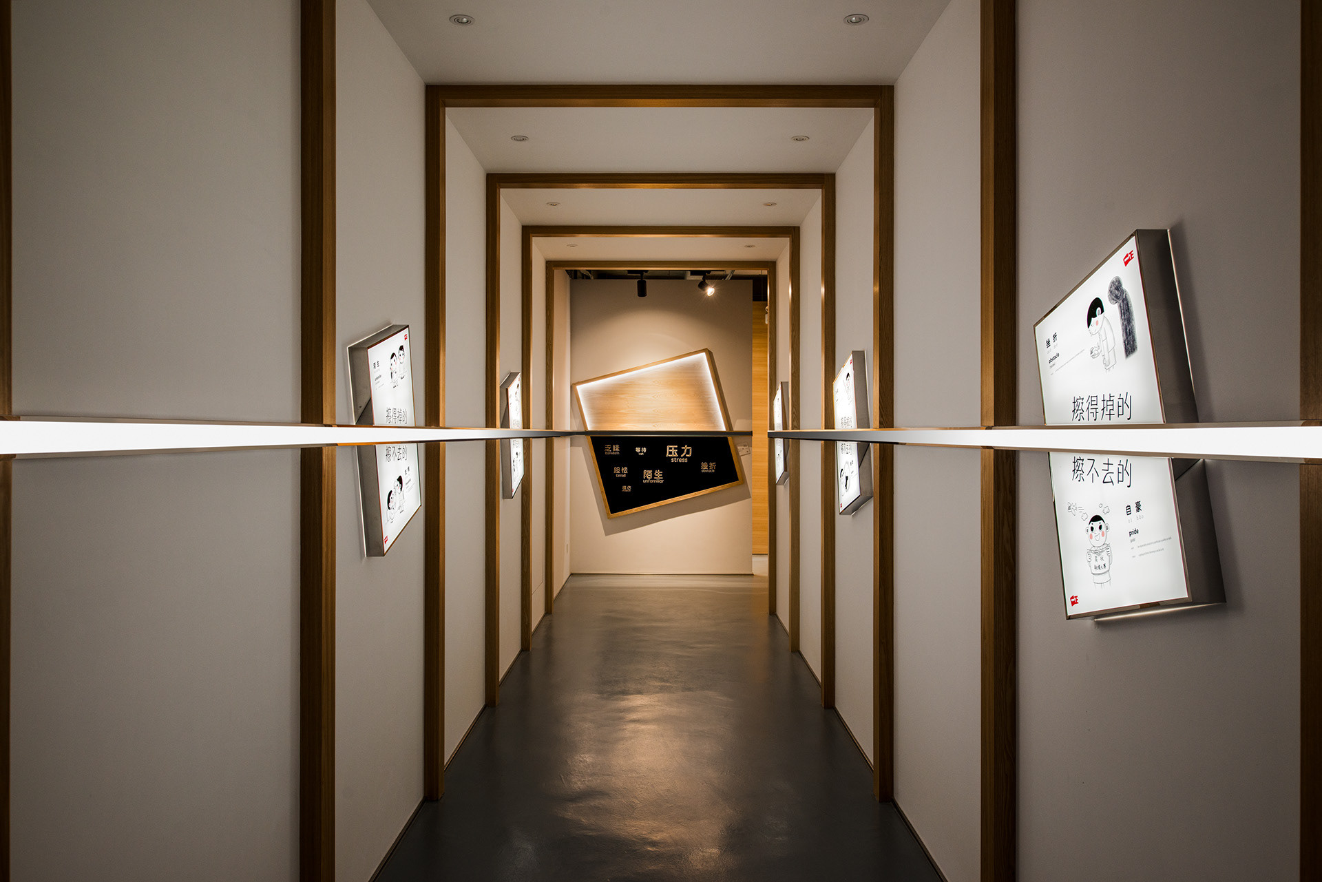
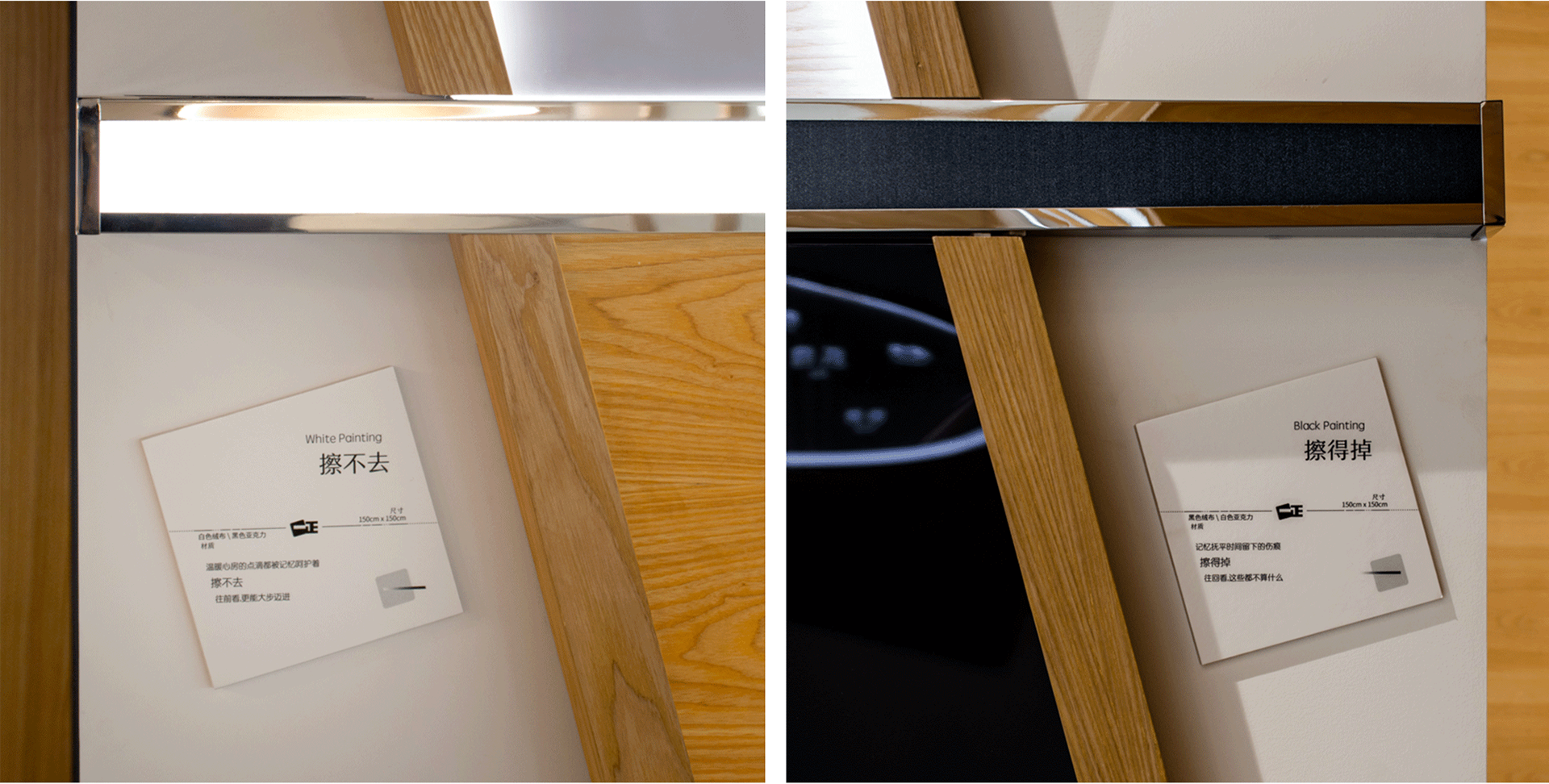
Spatially, the tunnel is not only a transitional space. The 5 key posters are placed along the tunnel walls at a 15 degree angle (consistent with the incline in the logo). A line that shifts from black to shining white cuts the posters in half, emphasizing the two sides of the same story. This line is the spatial embodiment of the idea of what is erased away and what is not. Turning the corner the line ends at opposite sides of the tunnel, cutting across a black painting and a white painting. Looking forward and backward in the tunnel is like looking into the future and back at the past. With the right encouragement, we walk towards the white painting, and see the growth we have attained, only to turn back to realise we have overcome these obstacles that are on the black painting.
从空间角度,这个通道不只是起到一个空间转换的作用。这通道的墙上斜挂着这五幅主题海报。15 度斜度来自 logo 原用的倾斜度。一条黑渐变到白色发光的线,贯穿了这些海报,分割了这些事情的两面。这条线就是主题 “擦得掉/擦不去” 的线。这条线再沿着通道墙折回通道两端。这两端分别有两幅画,白的 “擦不去” 的,和黑的 “擦得掉” 的。这像一个时间隧道,有了正确的引导,往前看,就看到了自己的各种擦不去的成长。回头看,原来克服了这么多困难,都被擦掉了。
Experience Area / 体验区
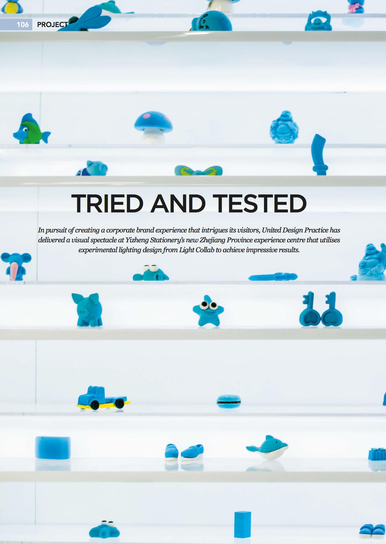
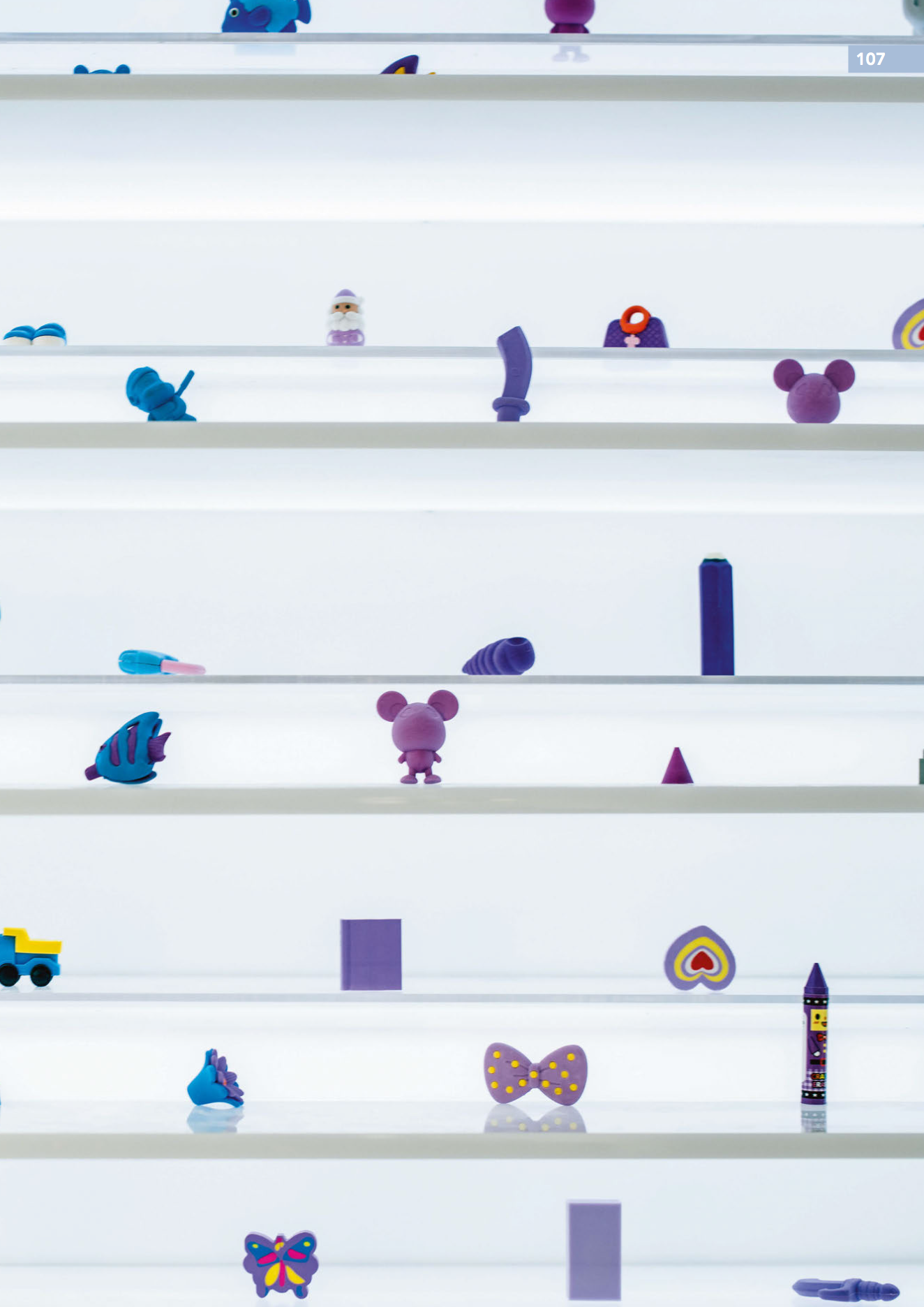
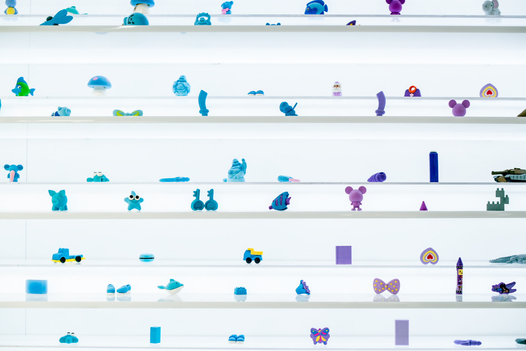
Many manufacturers likes to talk about how great they are. This is not only unconvincing, it is a sign of low self-esteem and lack of confidence, much like a person you meet who likes to brag. In initial discussions with the client, we reached the alignment that we will not talk, but actually demonstrate with real actions. The retail mockup area shows impressive product range. The acrylic wall displays an overwhelming numbers of erasers of all shapes and colours. How then do we demonstrate brand innovation, creativity, and constant pursuit of excellence? This is where we came up with delightful solutions.
很多传统制造企业,太在乎让人知道它们多厉害。但越这样越显得不自信。和客户的前期讨论,我们很默契一起打到这样的共识。我们不说自己多厉害,我们做出来。零售模拟区体现产品的多样性。亚克力墙赤裸裸的把这些产品呈现出来。如何沟通品牌的创新性和不断对产品的追求和研发呢?我们给到的是让人惊喜的解决办法。
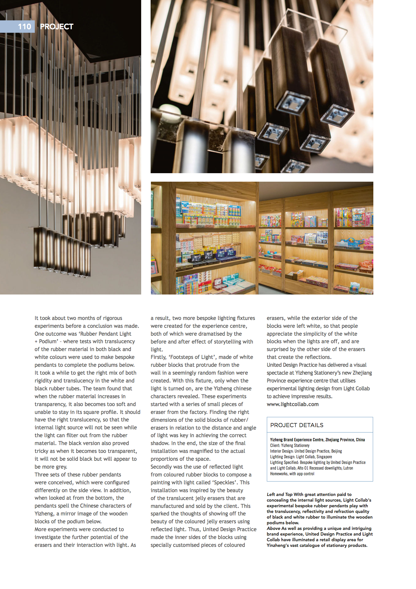
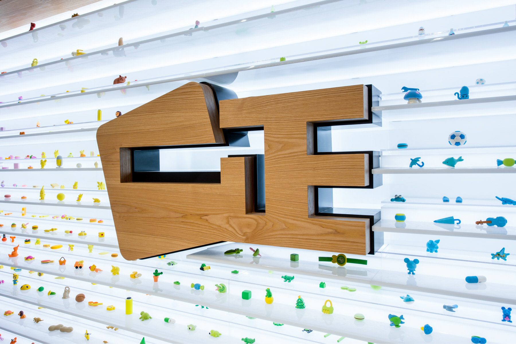
Rubber Light Installation / 橡皮灯光装置
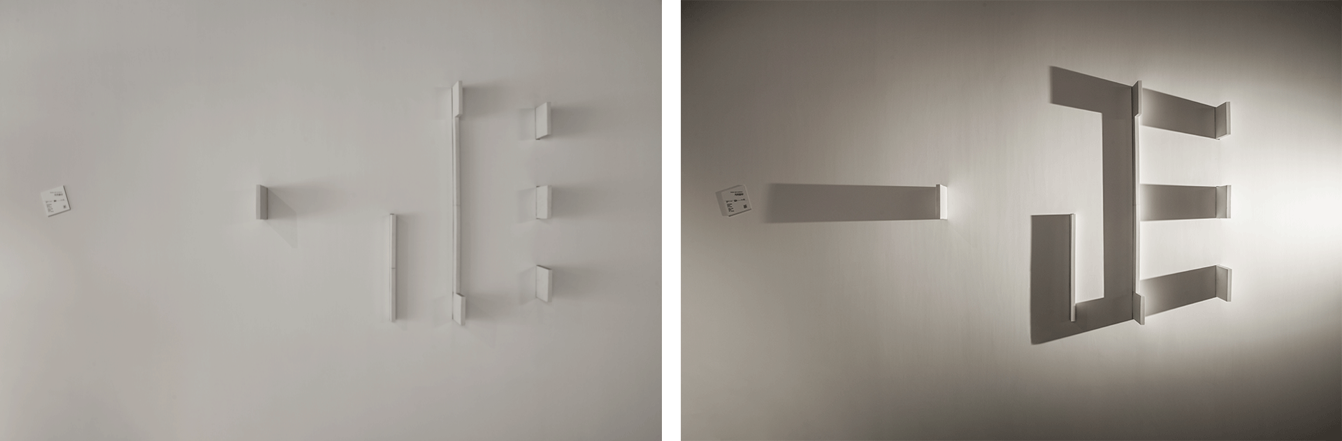
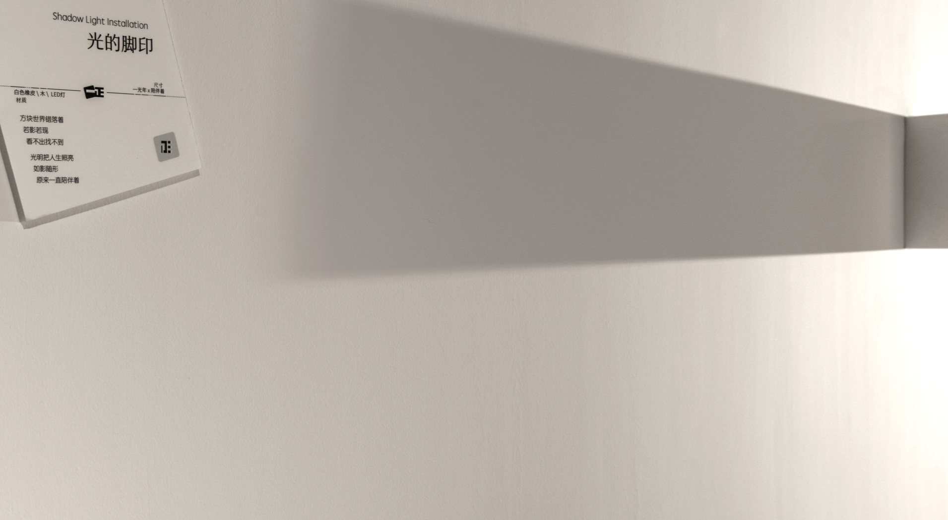
Shadow Light Installation / 光的脚印
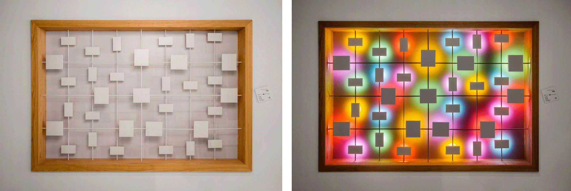
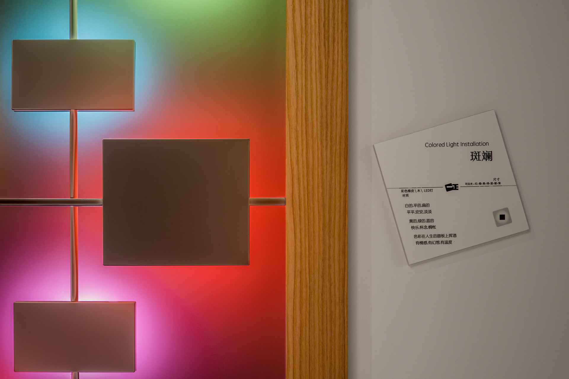
Coloured Light Installation / 斑斓
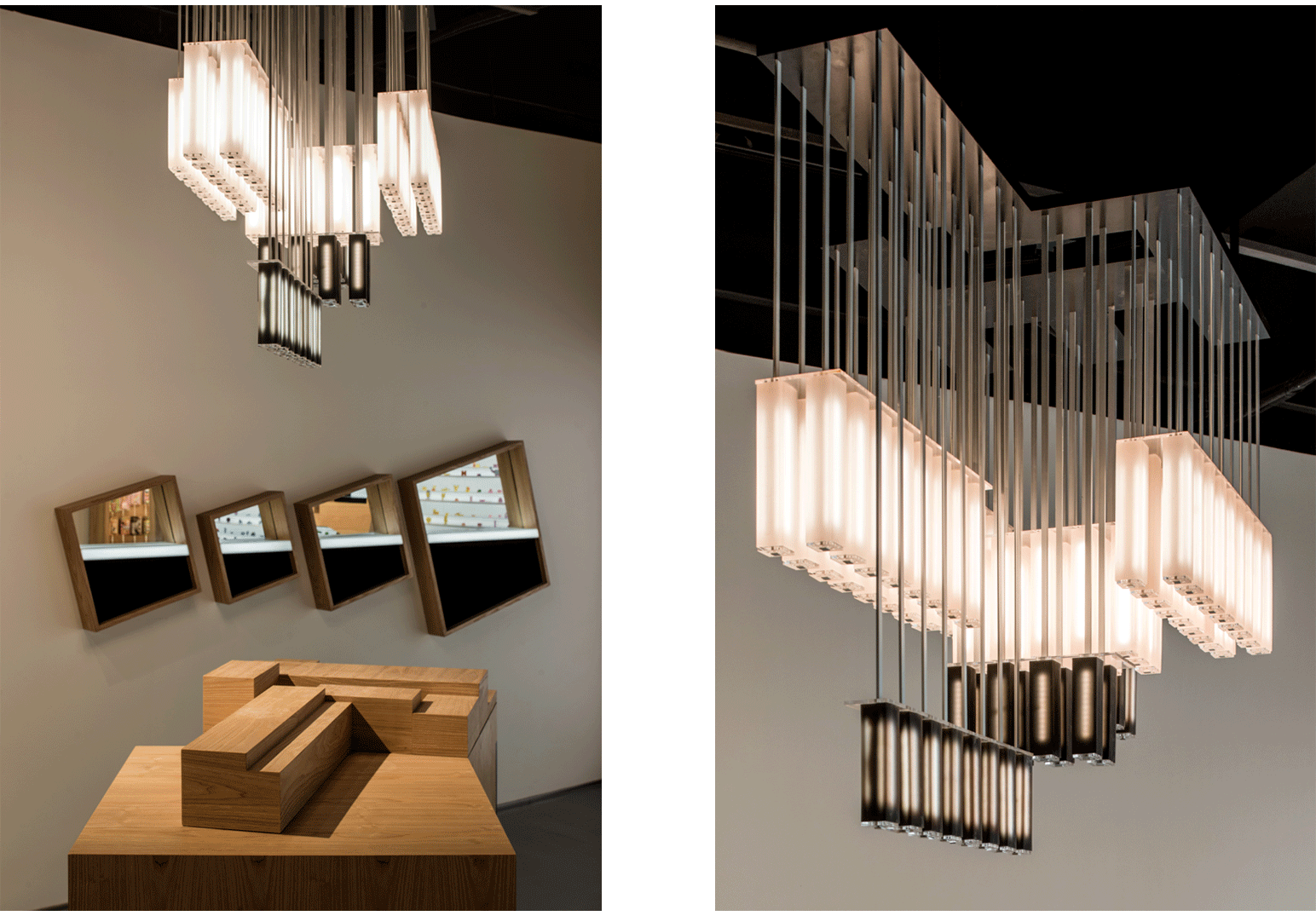
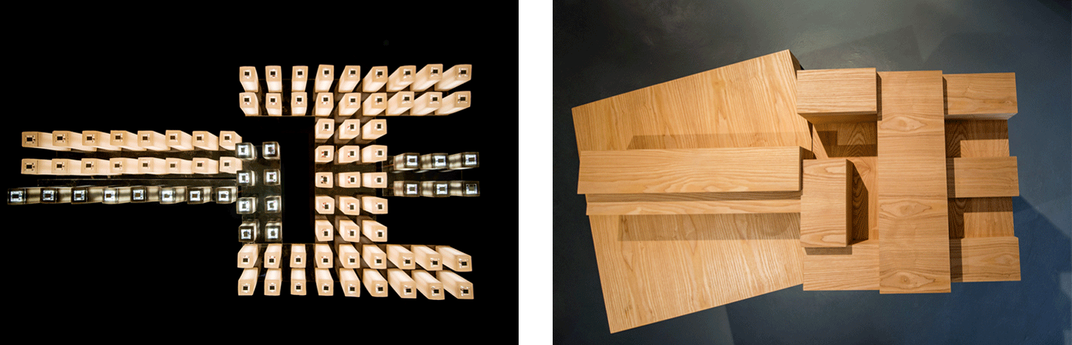
Rubber Pendant Lights + Podium / 橡皮吊灯和站台
Childhood Time Capsule / 儿时时空胶囊
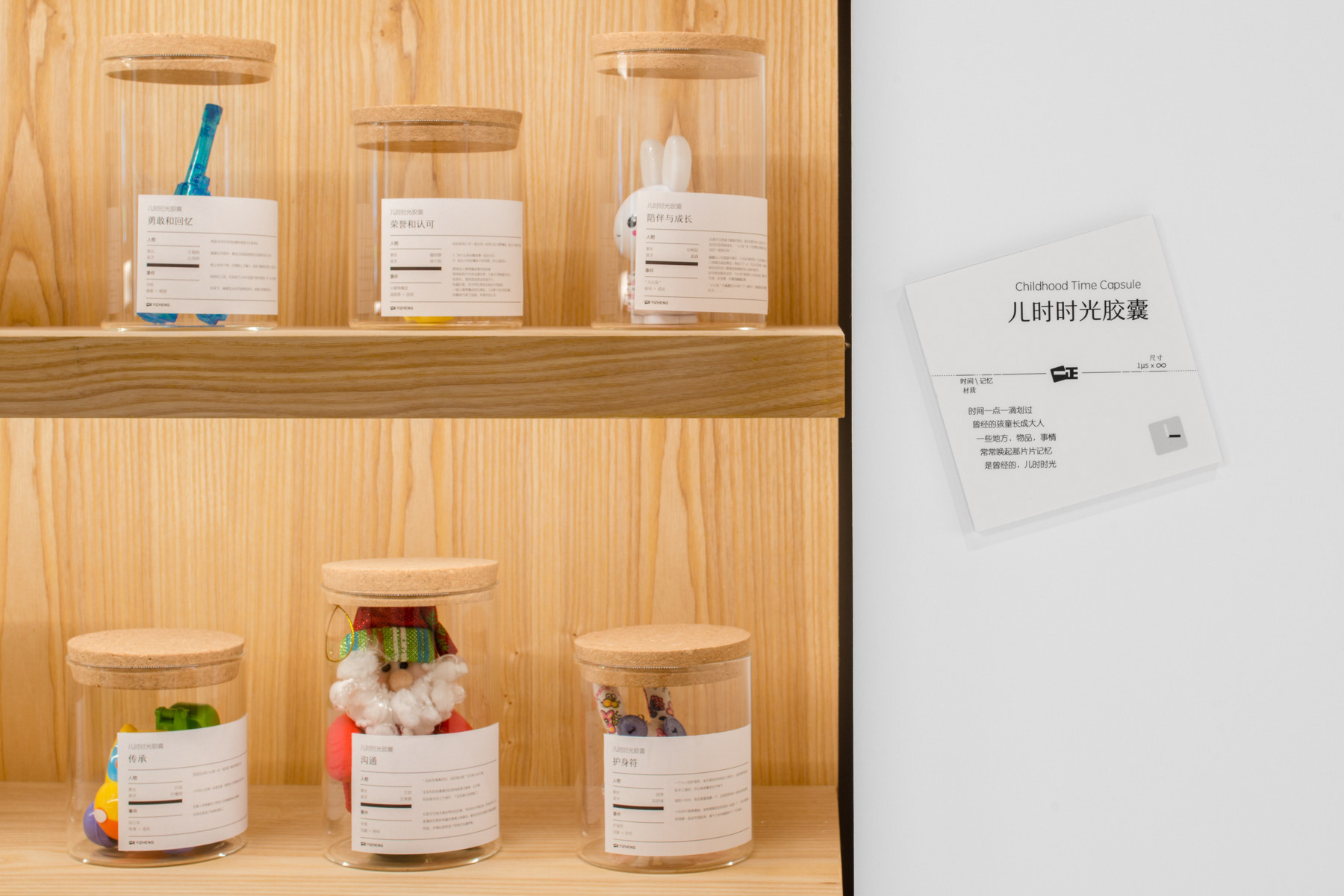
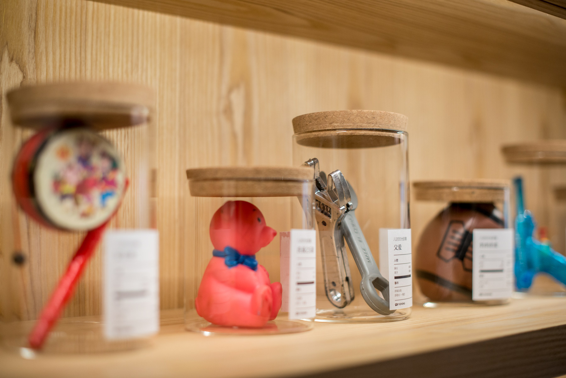
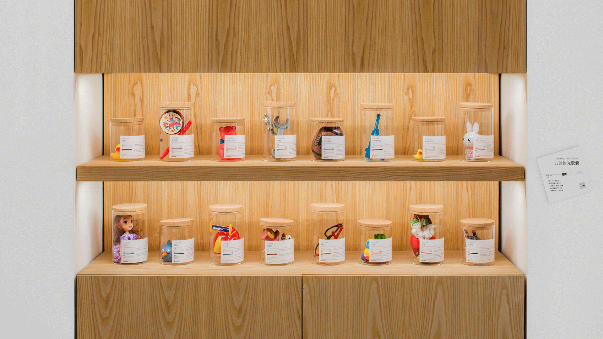
In our consumer interviews, we found that Yizheng erasers were not just functional, really they are like companions to the children. We set up here a rotating exhibit, for parents to share the items that made an emotional connection with their children. And on the labels, we printed the names of parents and kids, as well as the story behind the exhibit. Each exhibit is a time capsule, a snapshot in time, left here on loan.
在我们的消费者访问里,我们发现一正橡皮擦不只是功能性的,更重要它扮演了玩伴的角色。这些展品在孩童记忆里都有着一段故事。我们把家长和孩子的名字放在标贴上,包括背后的故事。每一件展品都是一个时空胶囊,一个写照。
Scent Library / 香味图书馆

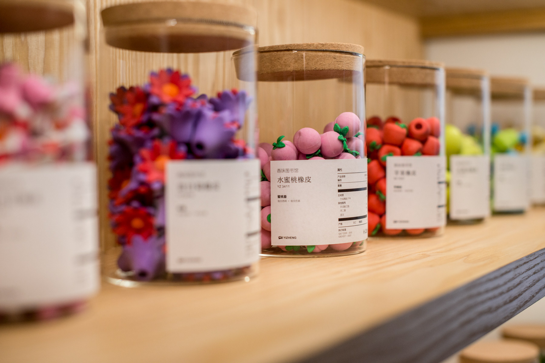
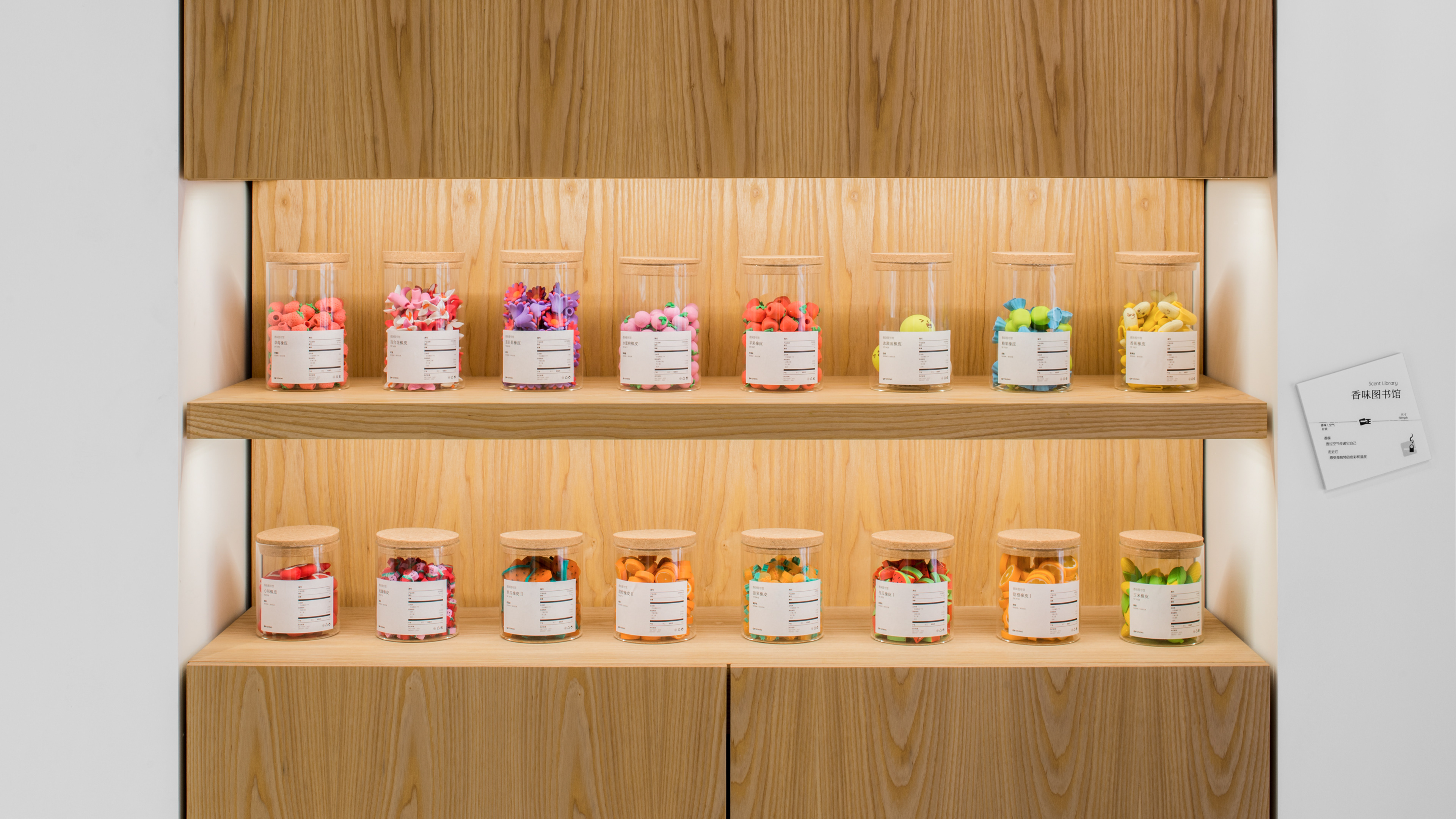
Here, we want to showcase the fact that Yizheng products uses food quality colouring and scent additives. Safety is especially important to parents. We placed the erasers in jars, and for the guests to open them and smell. This adds a level of interactivity without the message being too in your face.
一正橡皮擦使用的是食用级别的色素和香精。这对于父母是很重要的信息。我们把这些香味橡皮放进了罐子,让参观者能打开,自己闻各种香味,增加互动性。
Product Showcase Acrylic Wall / 产品橱窗亚克力墙
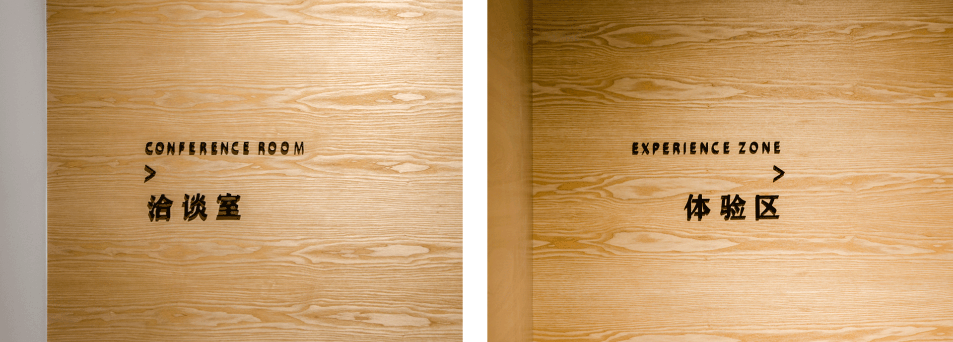
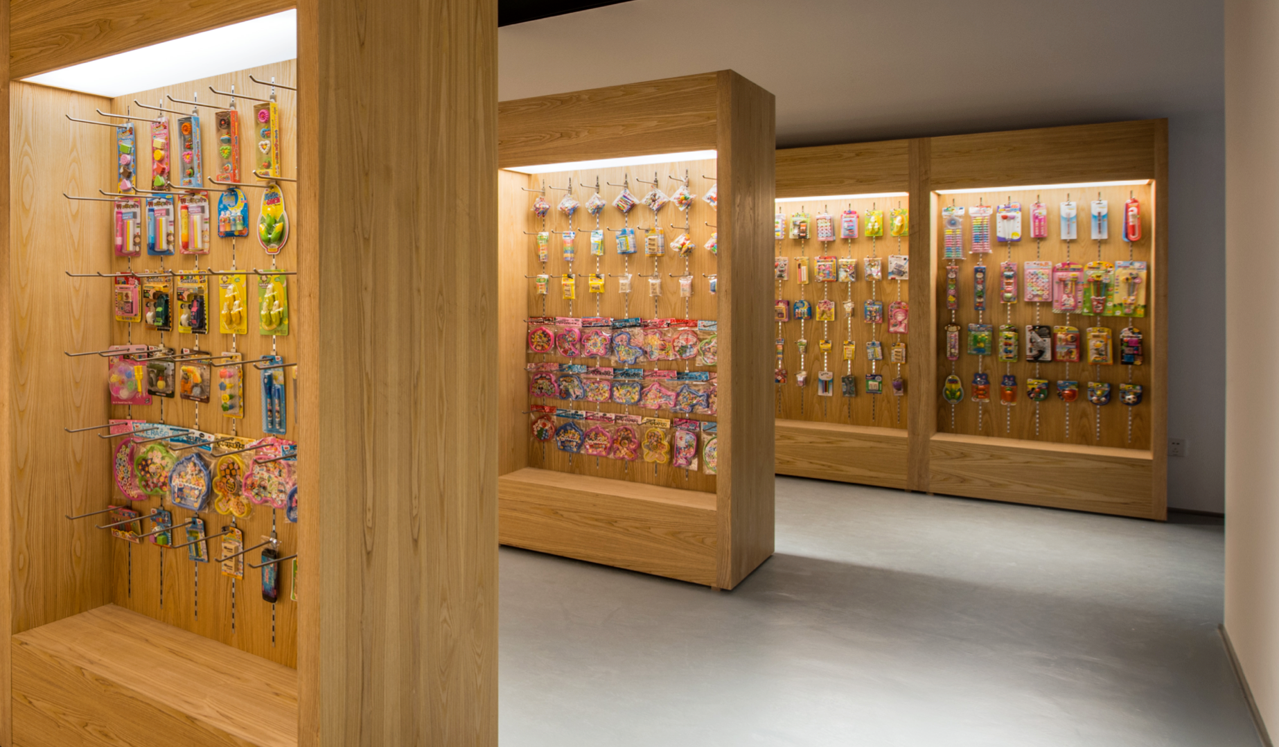
Retail Mockup Area / 零售模拟区
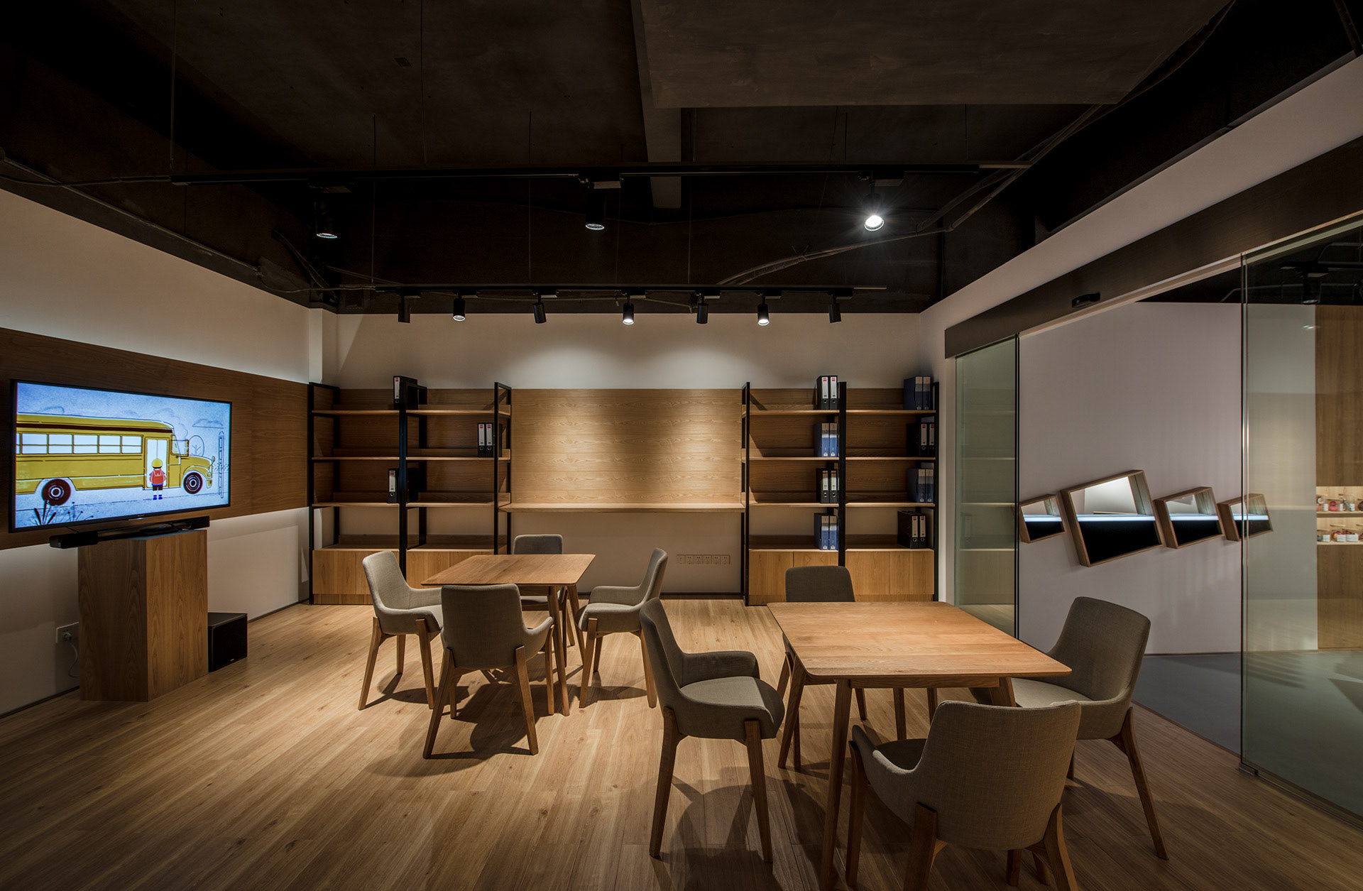
Conference Room / 洽谈区
Our Team / 合作团队
Client: Yizheng Stationery
Overall Concept, Interior, Graphic Design: United Design Practice (Beijing)
Construction & Engineering: NFH (Shanghai)
Lighting Design: Light Collab (Singapore)
Photography: Shawn Koh (Beijing)