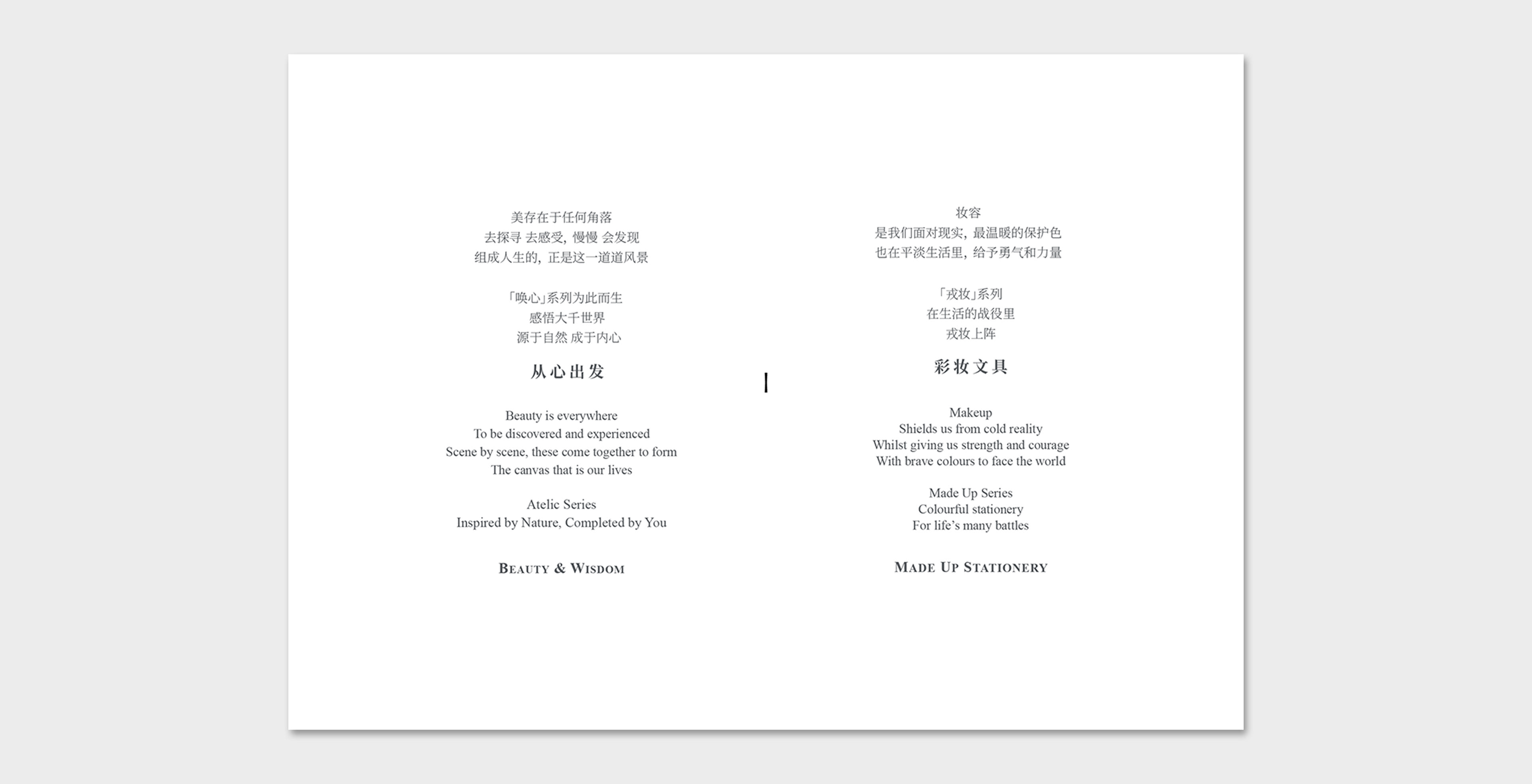
We took a different take on product booklets by putting the focus not on the products, but on the end users. In particular, how colors paint different emotional states. Hence the graphics and copy describe a particular scene in this vast canvas that is our lives.
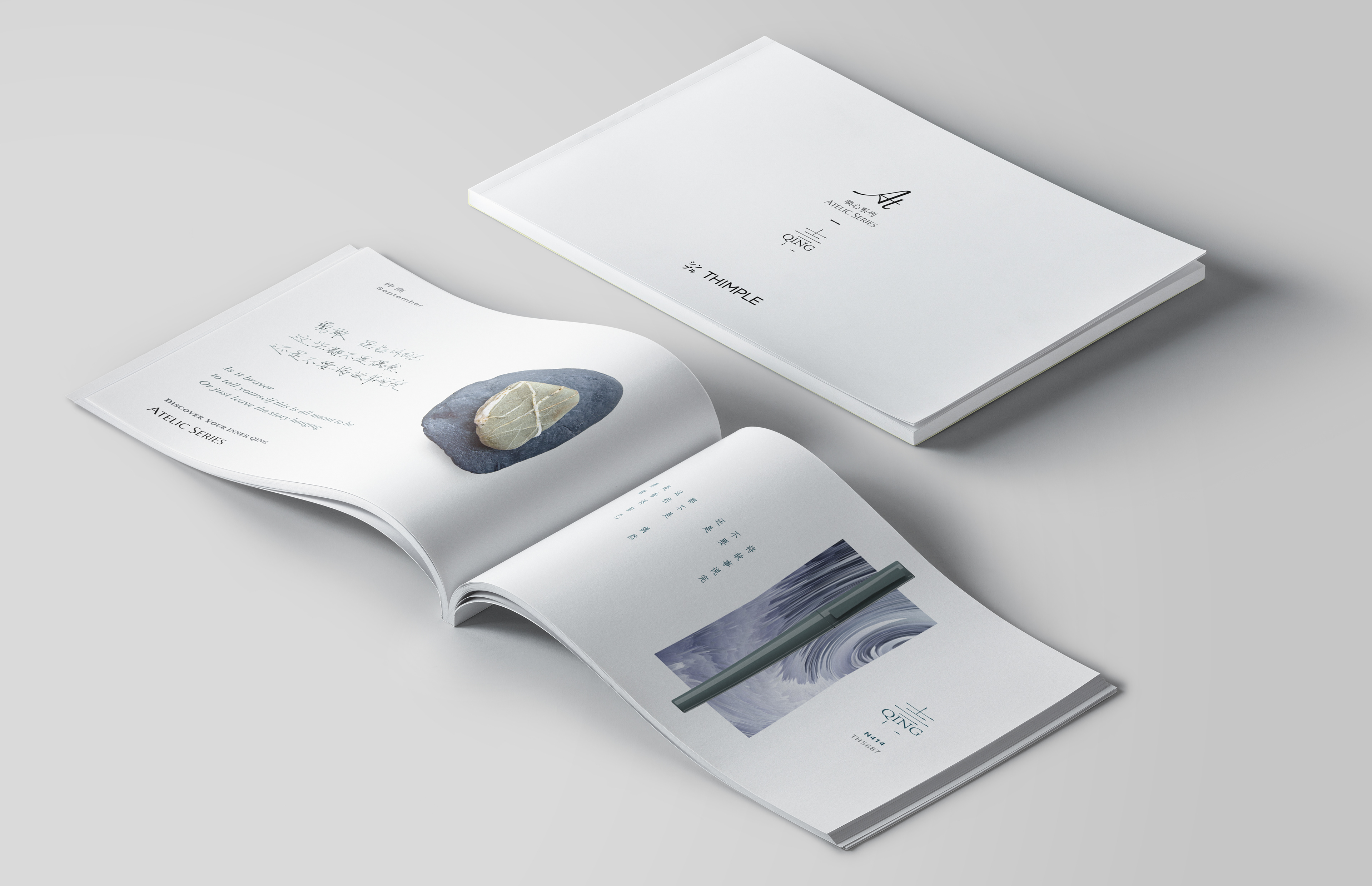
Here we have two booklets from 2 product ranges, Qing and Made up.
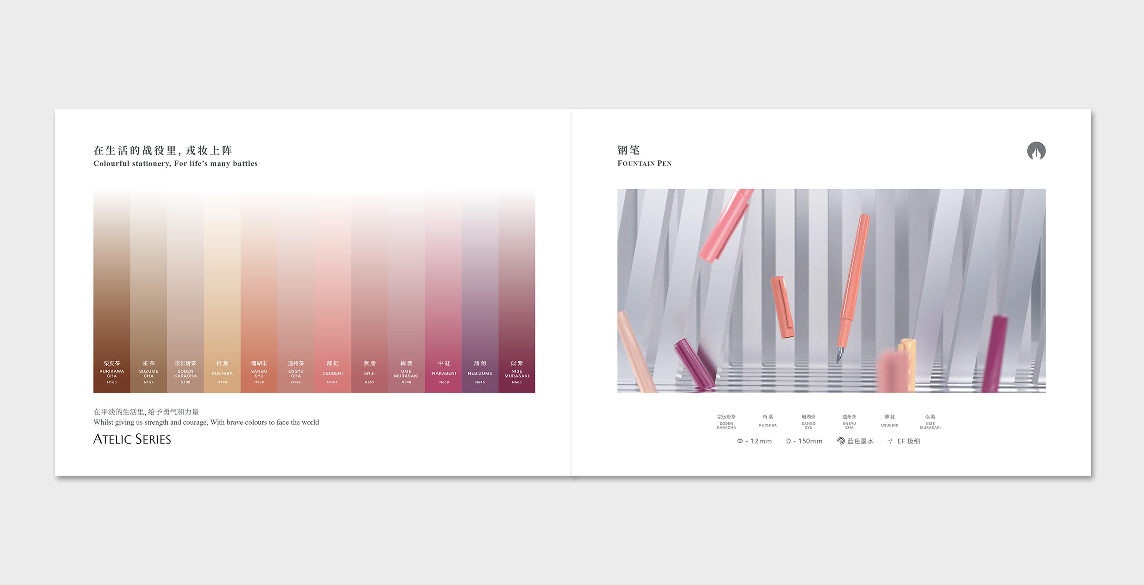
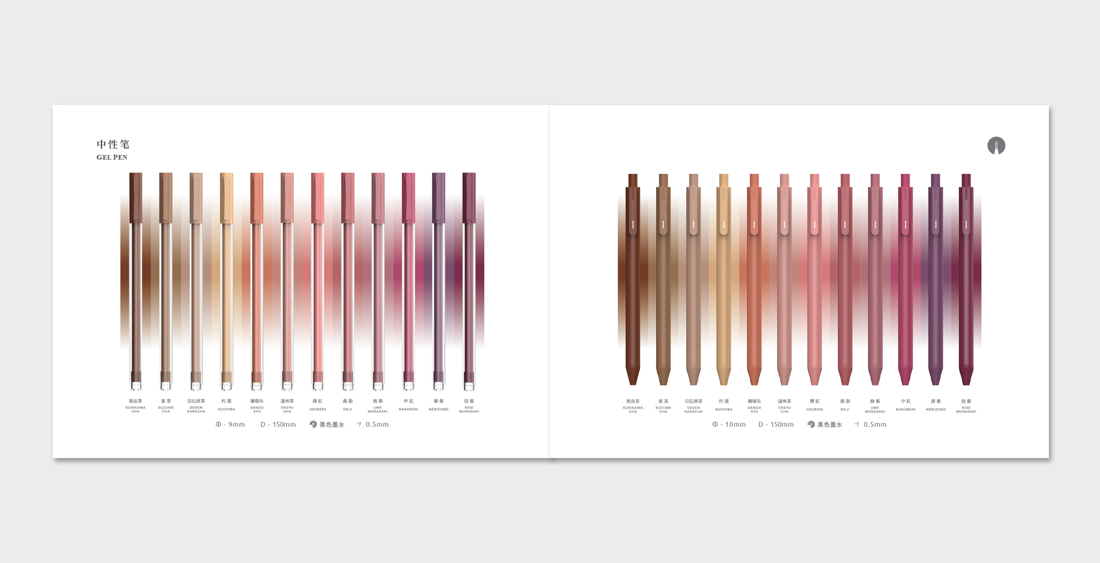
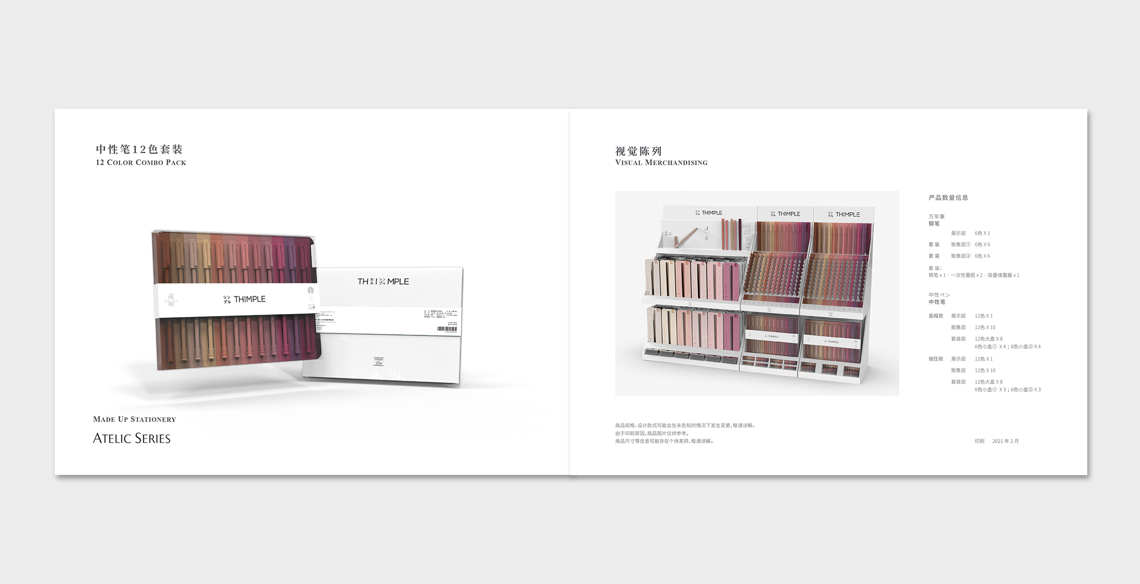
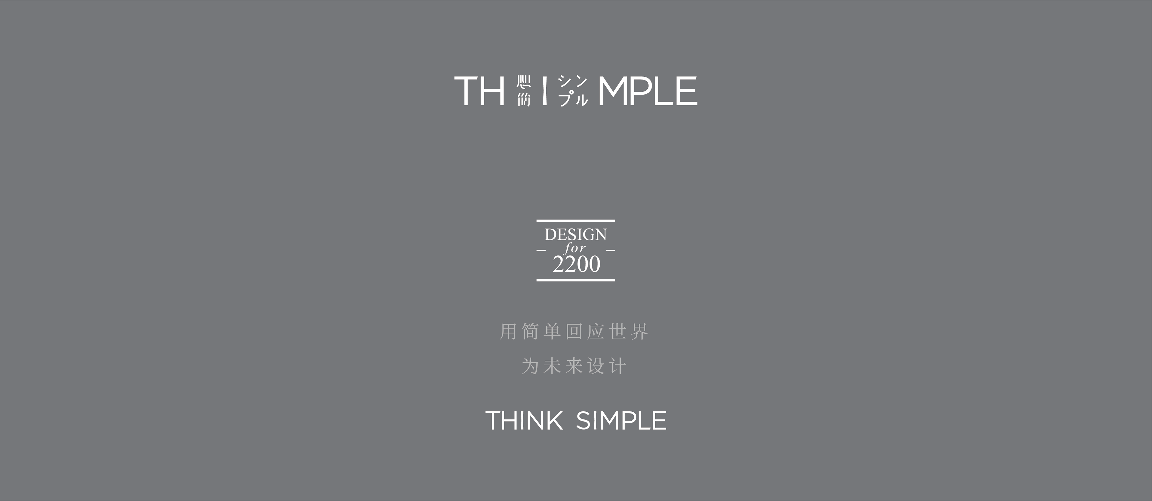
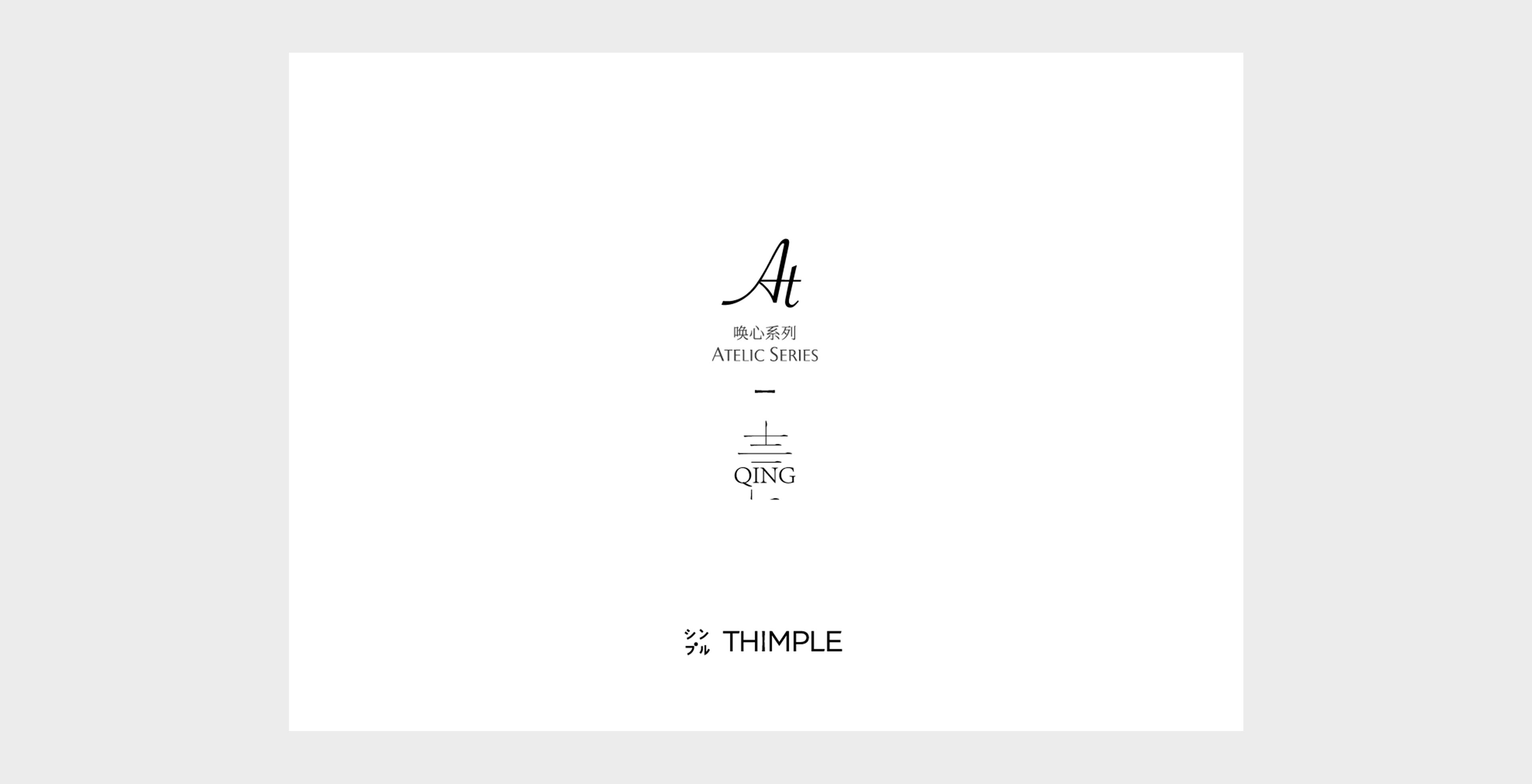
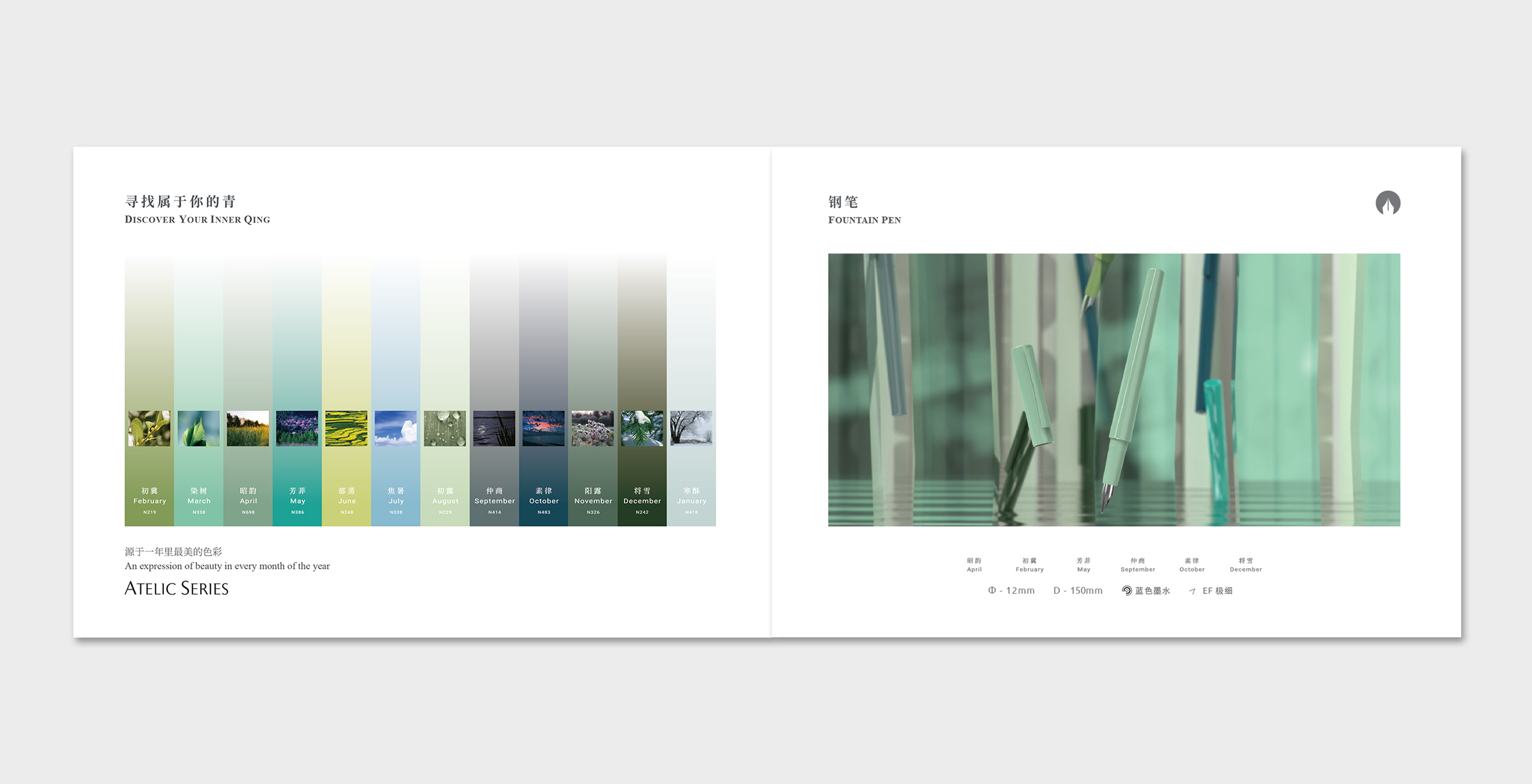
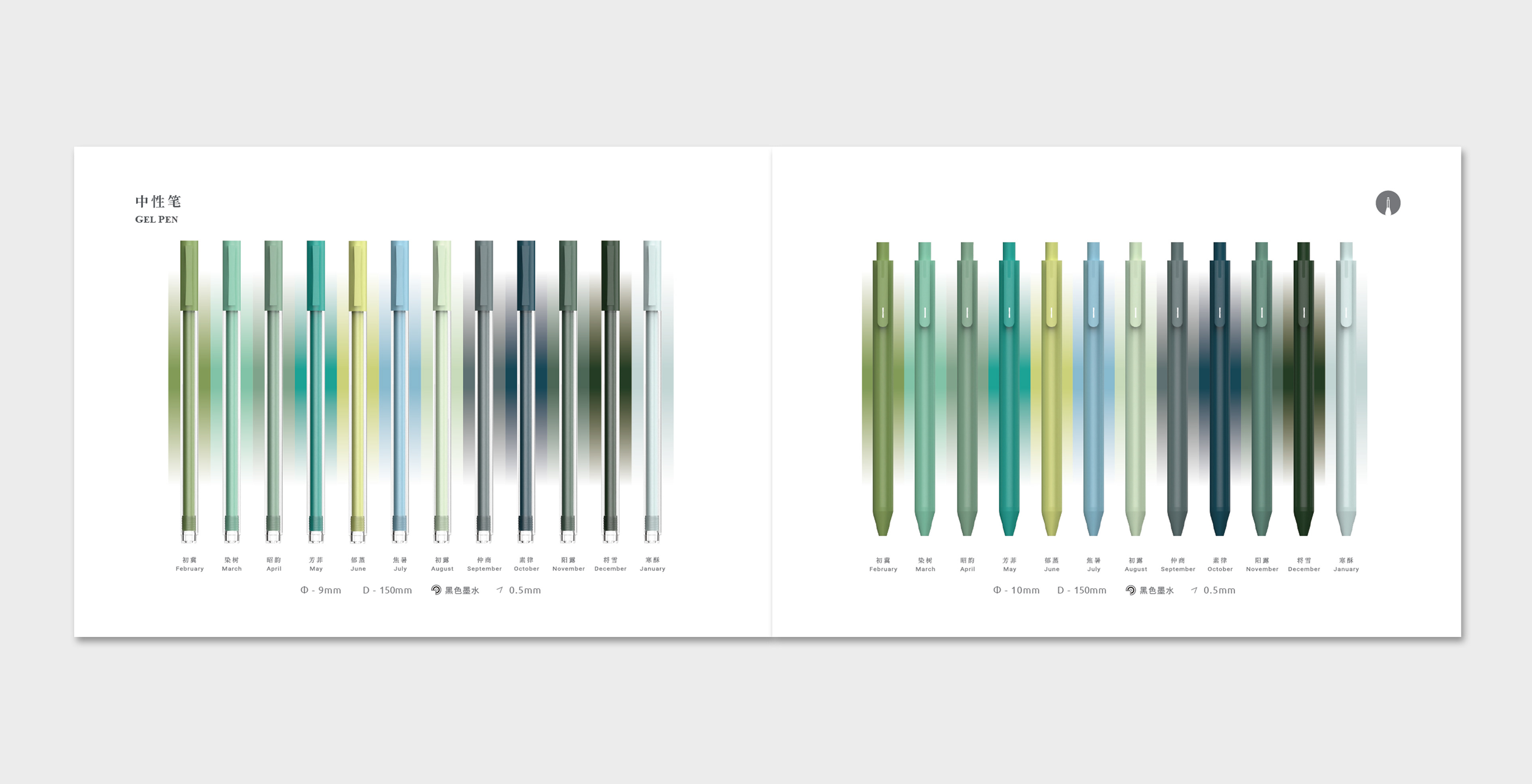
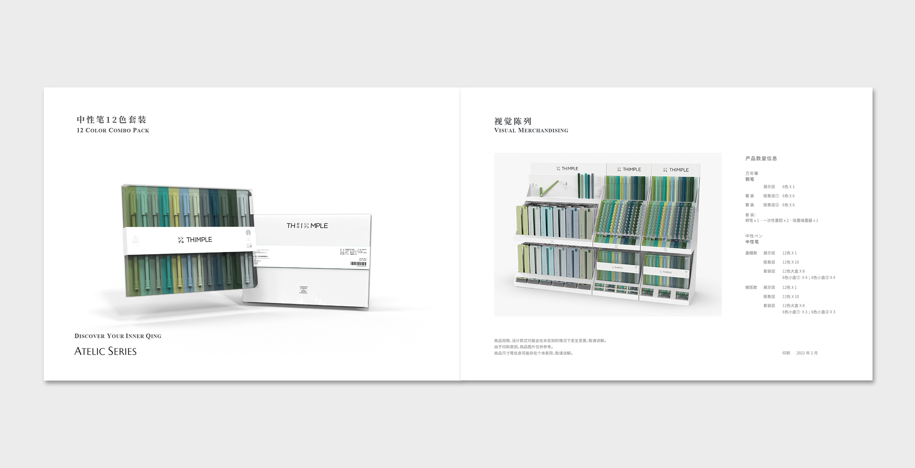
Thimple is derived from Think Simple, an attitude we felt to be an apt antidote to our times. Atelic is the name of this series, describing unfinished imperfection, much like the pursuit of beauty in our lives. Brands used to emphasize their heritage with Since 18xx. Here instead, we use Design for 2200, a focus on the future and the good of humanity.
我们通过文字的间距和排列方式来渲染语句韵味,还原语境,搭建与读者之间的情感共鸣。

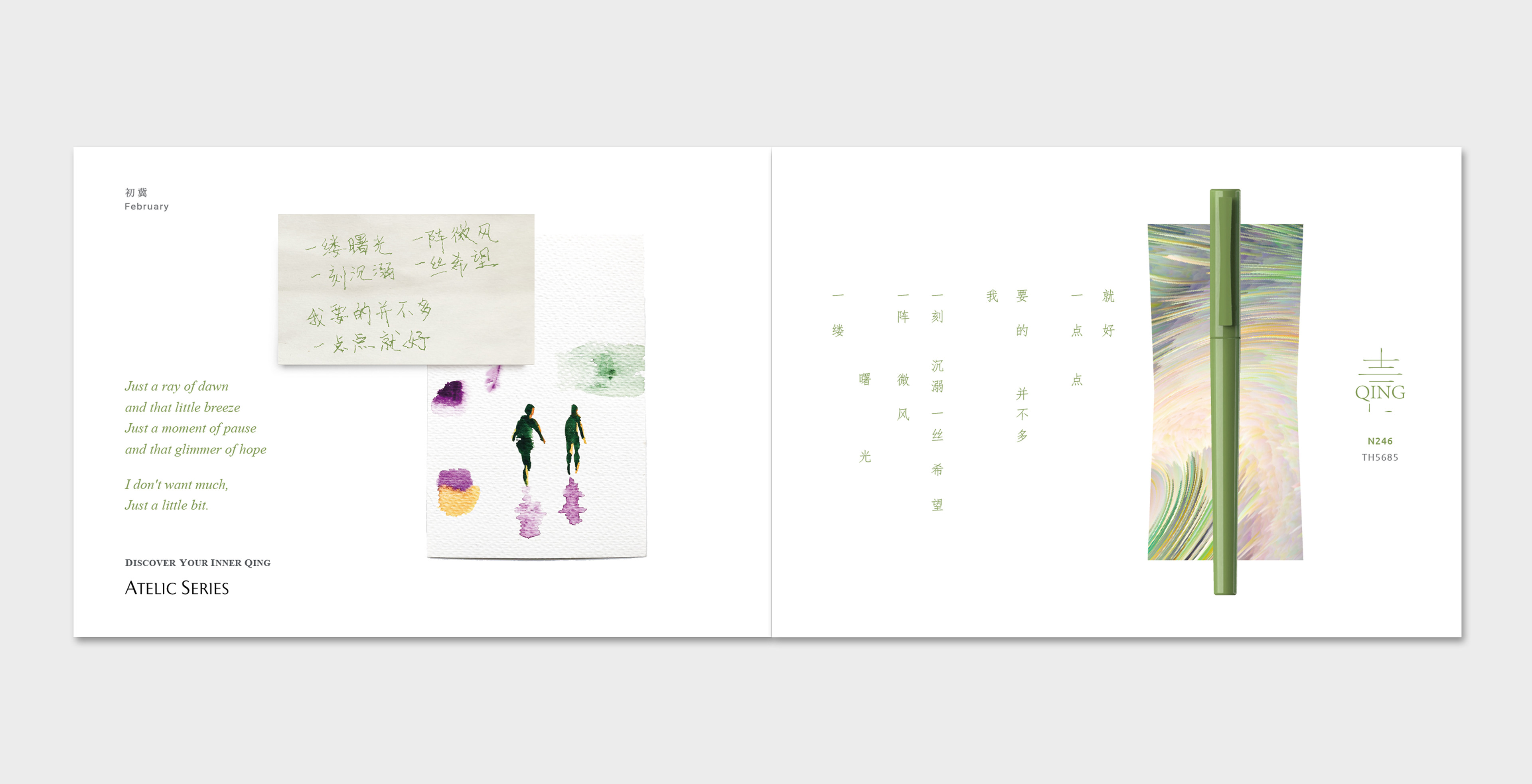
一缕曙光,一阵微风
一刻沉溺,一丝希望
我要的并不多
一点点就好
一刻沉溺,一丝希望
我要的并不多
一点点就好
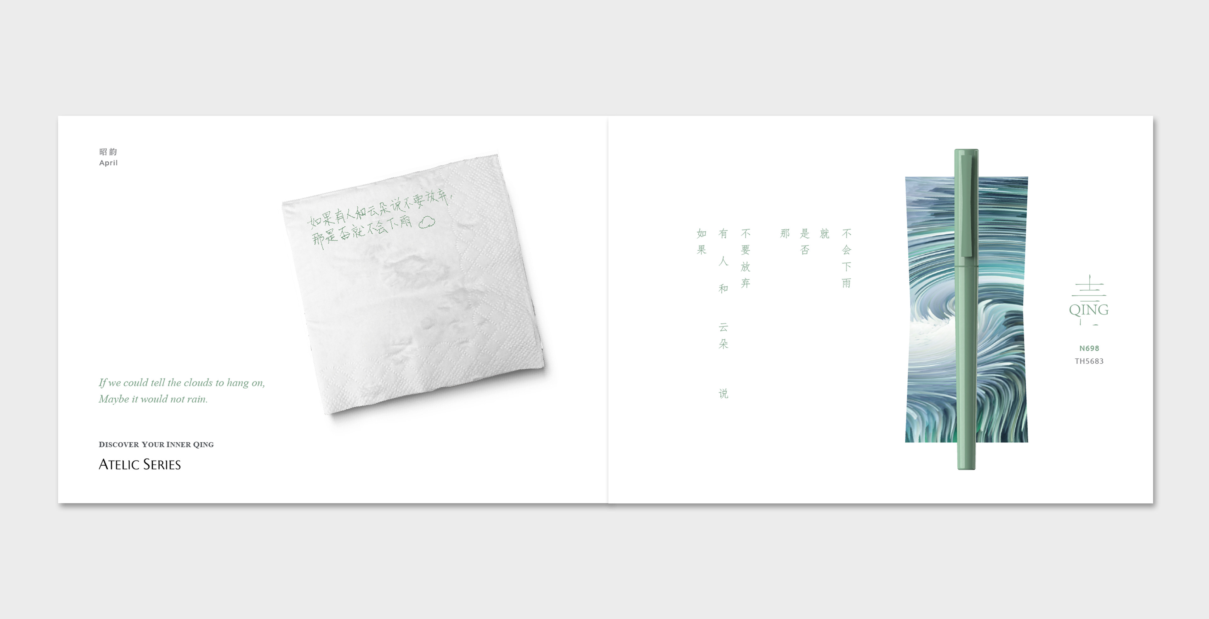
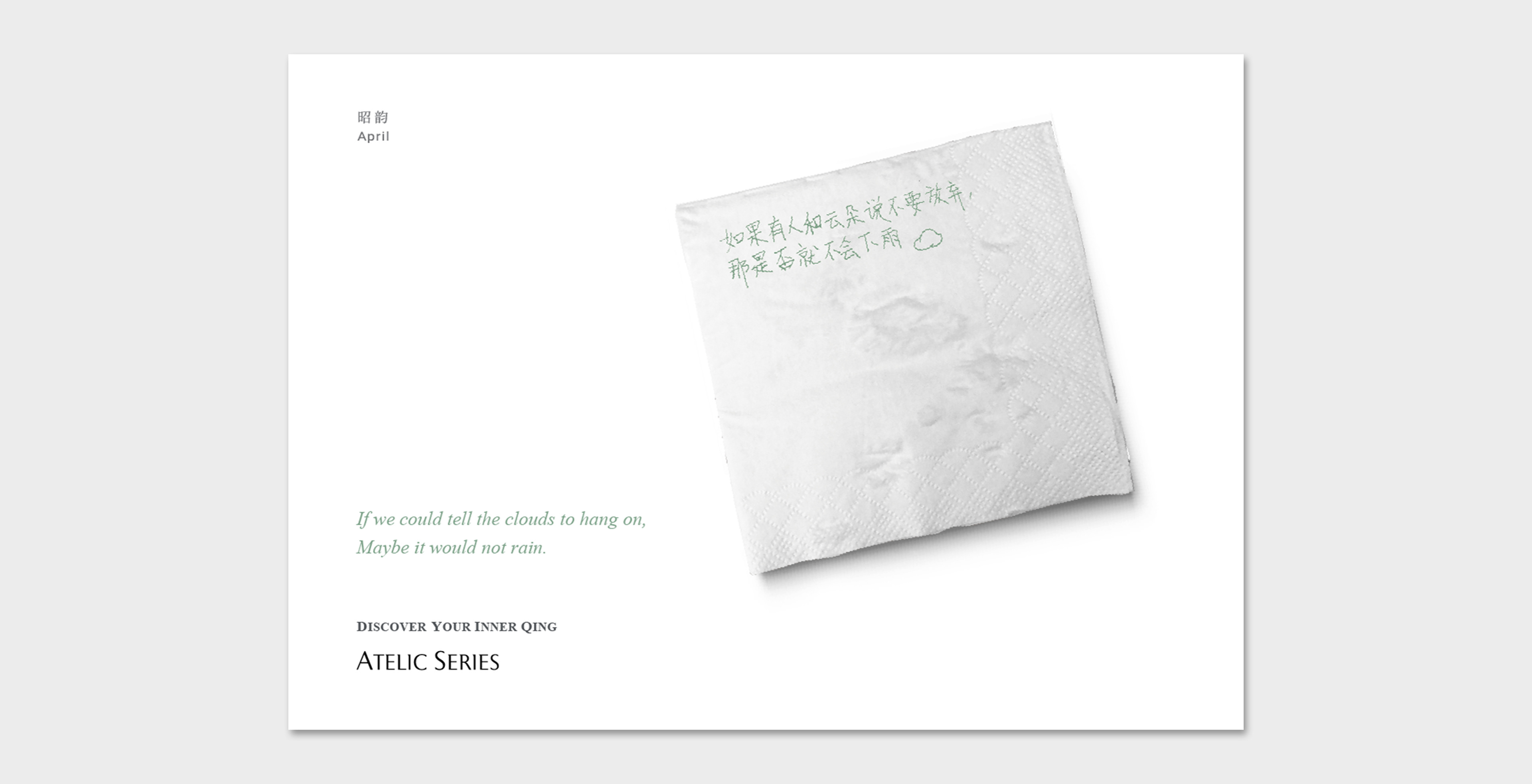
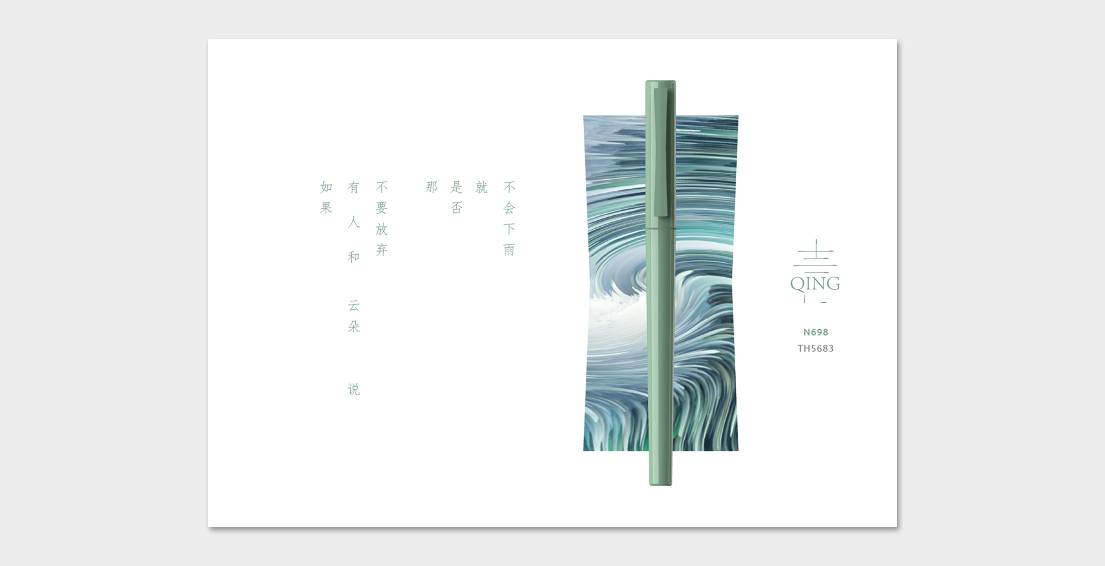
如果有人和云朵说不要放弃
那是否就不会下雨
那是否就不会下雨
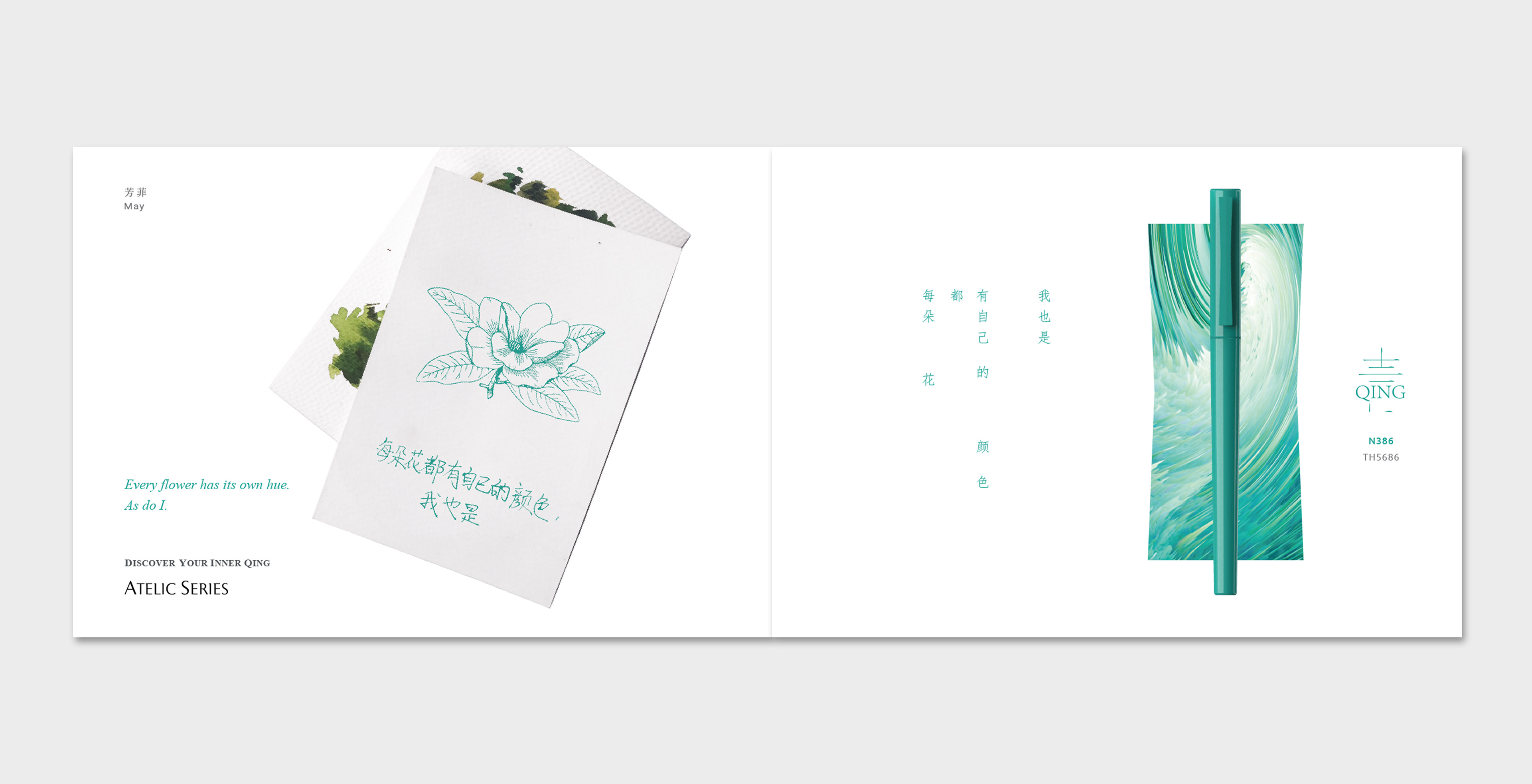
每朵花都有自己的颜色
我也是
我也是
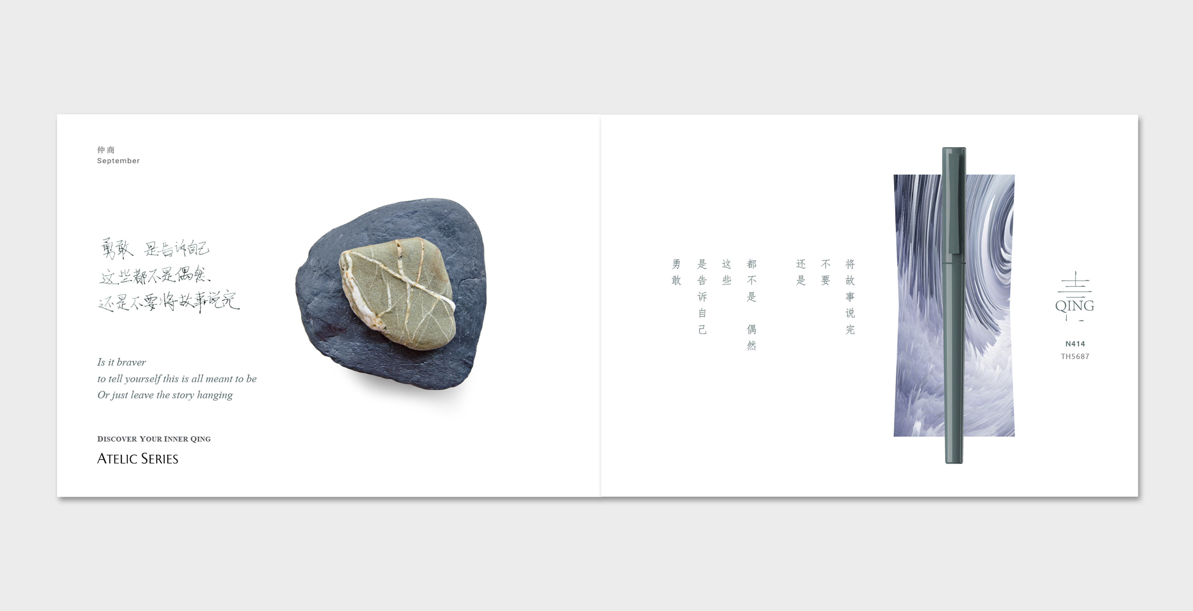
勇敢,是告诉自己
这些都不是偶然
还是不要将故事讲完
这些都不是偶然
还是不要将故事讲完
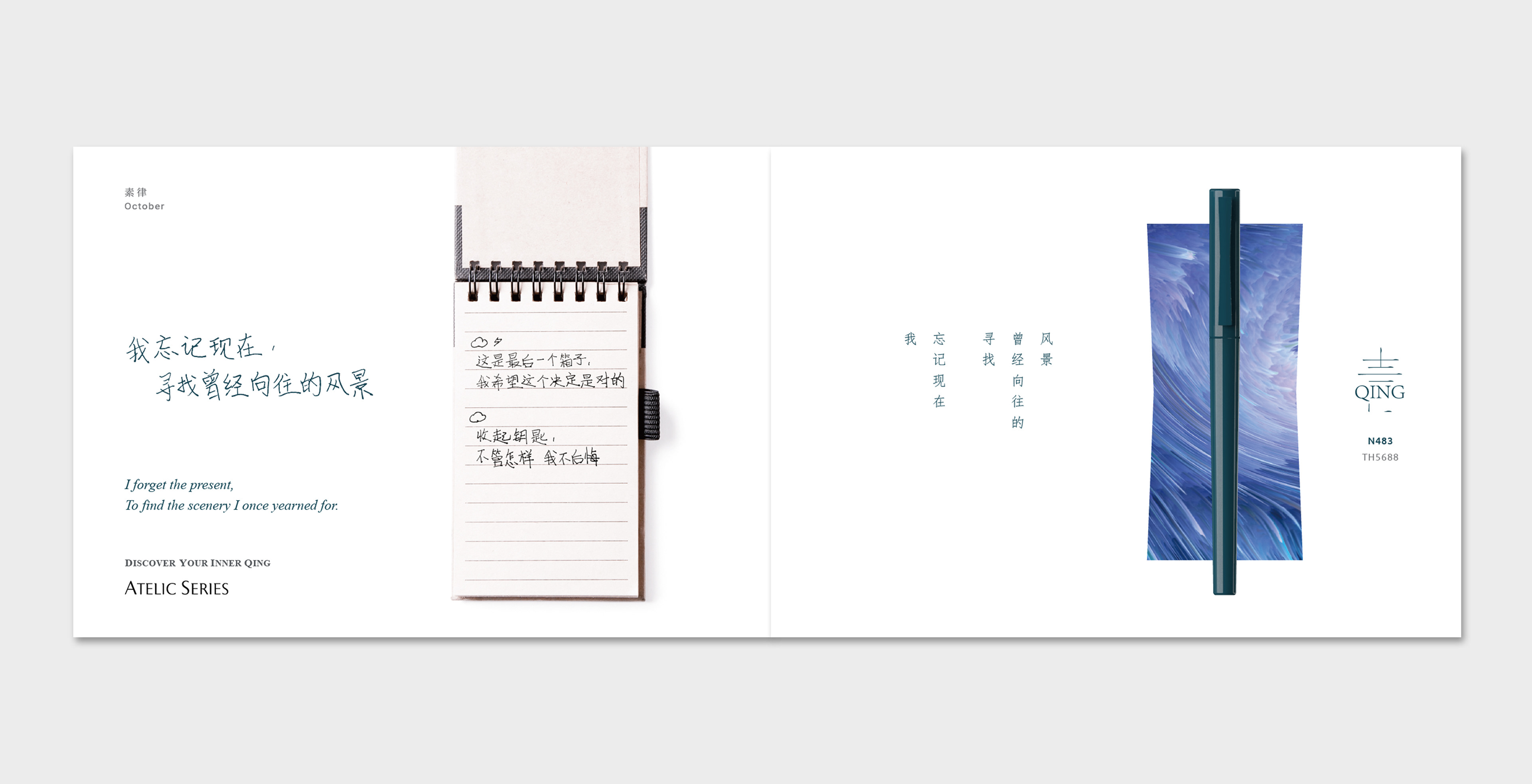
我忘记现在
寻找曾经向往的风景
寻找曾经向往的风景
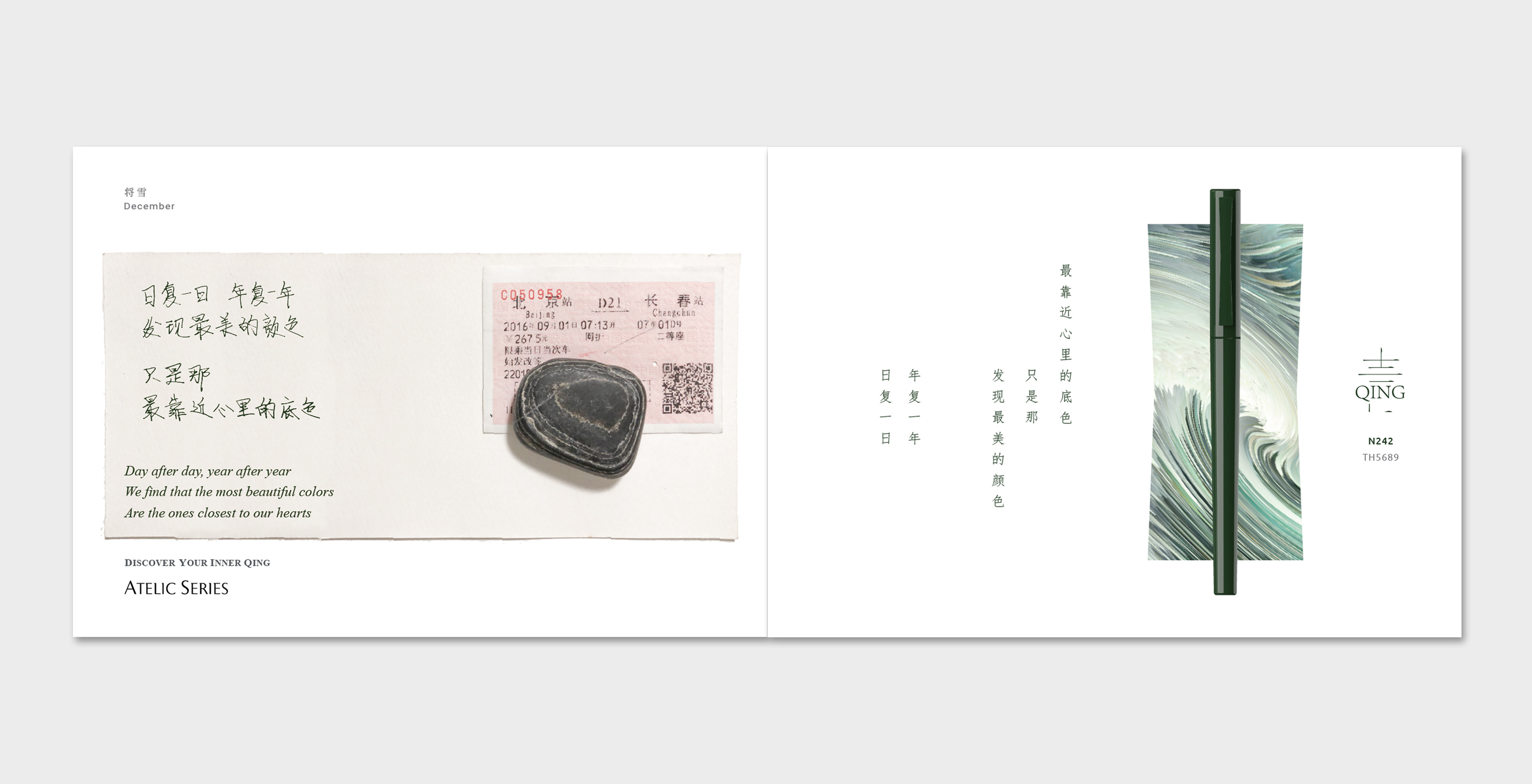
日复一日,年复一年
发现最美的颜色
只是那
最靠近心里的底色
发现最美的颜色
只是那
最靠近心里的底色


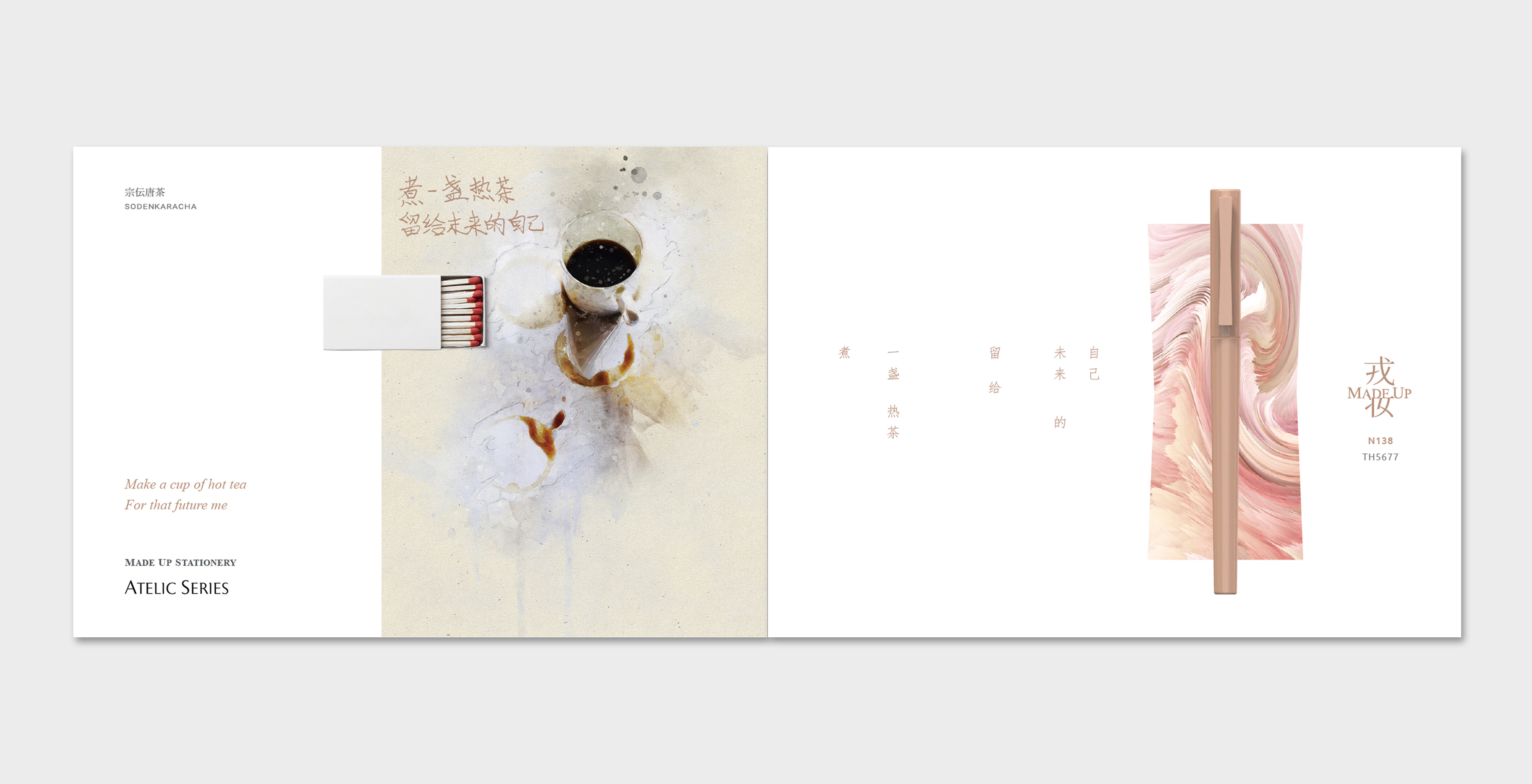
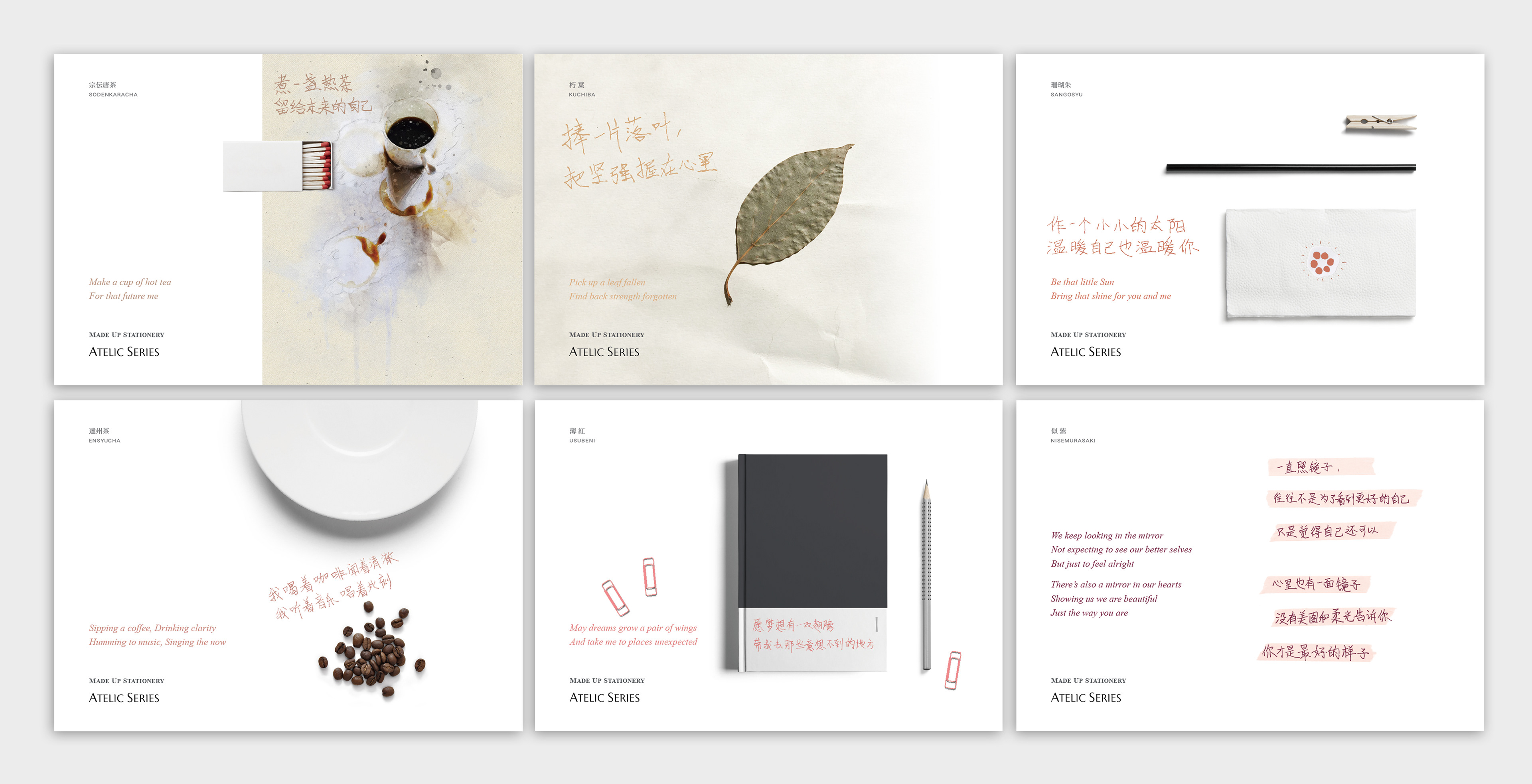
煮一盏热茶
留给未来的自己
留给未来的自己
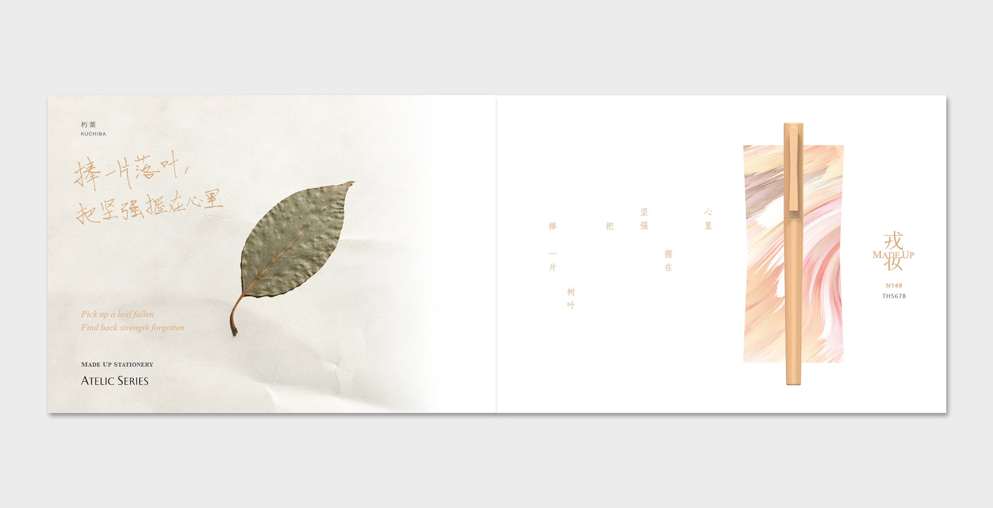
捧一片落叶
把坚强握在心里
把坚强握在心里
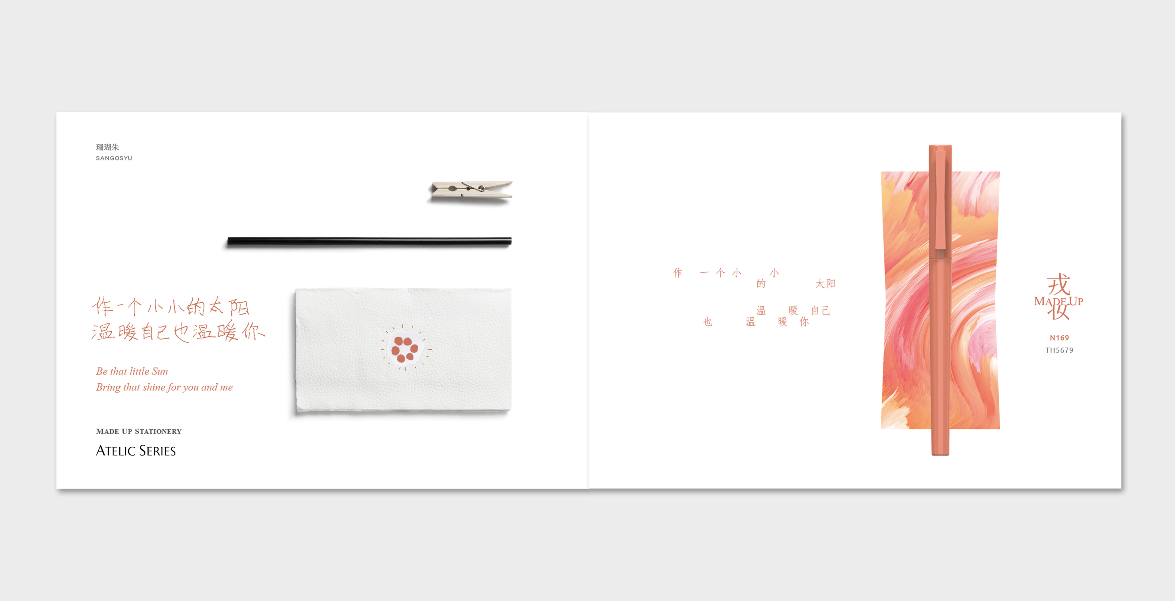
作一颗小小的太阳
温暖自己也温暖你
温暖自己也温暖你
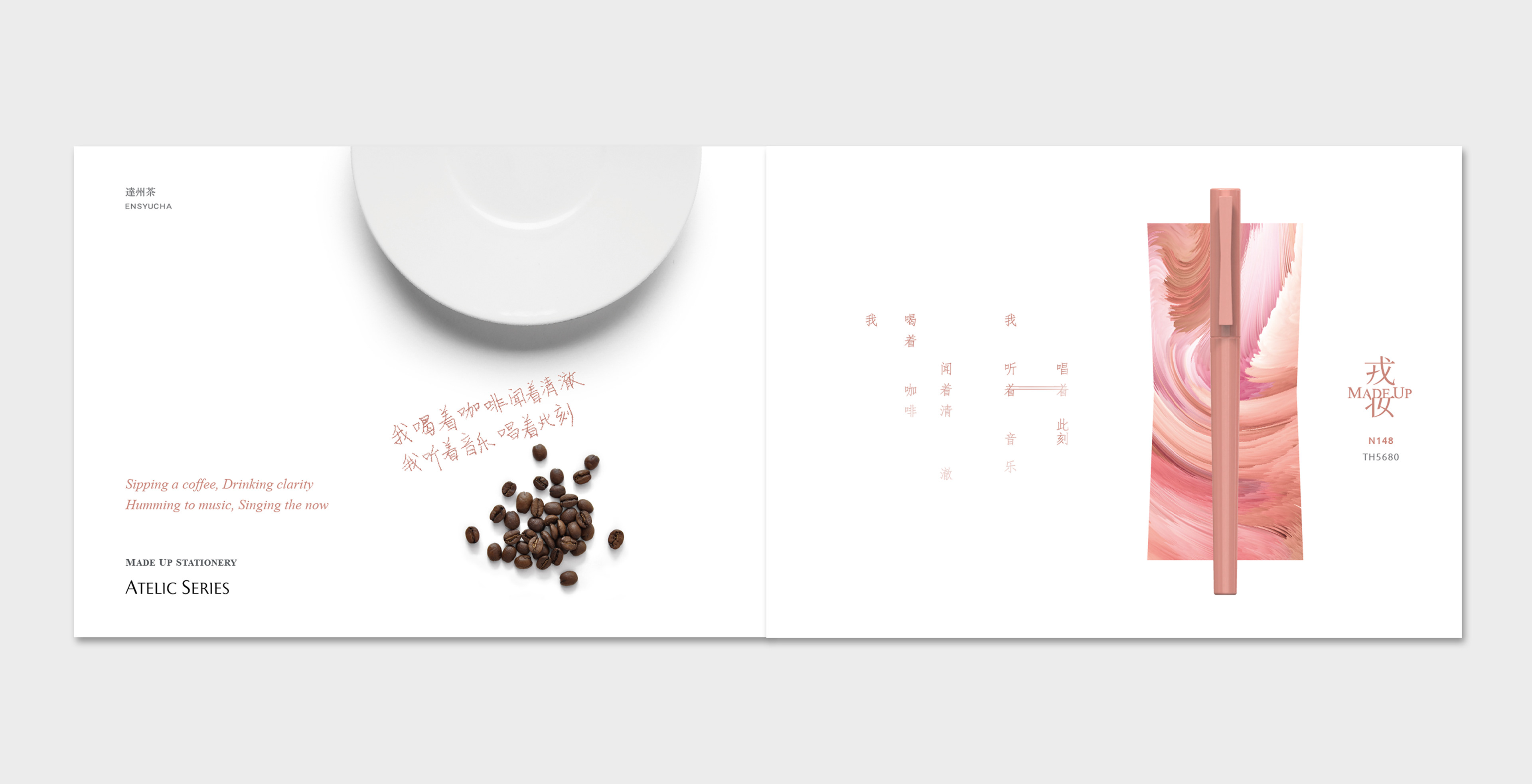
我喝着咖啡闻着清澈
我听着音乐唱着此刻
我听着音乐唱着此刻
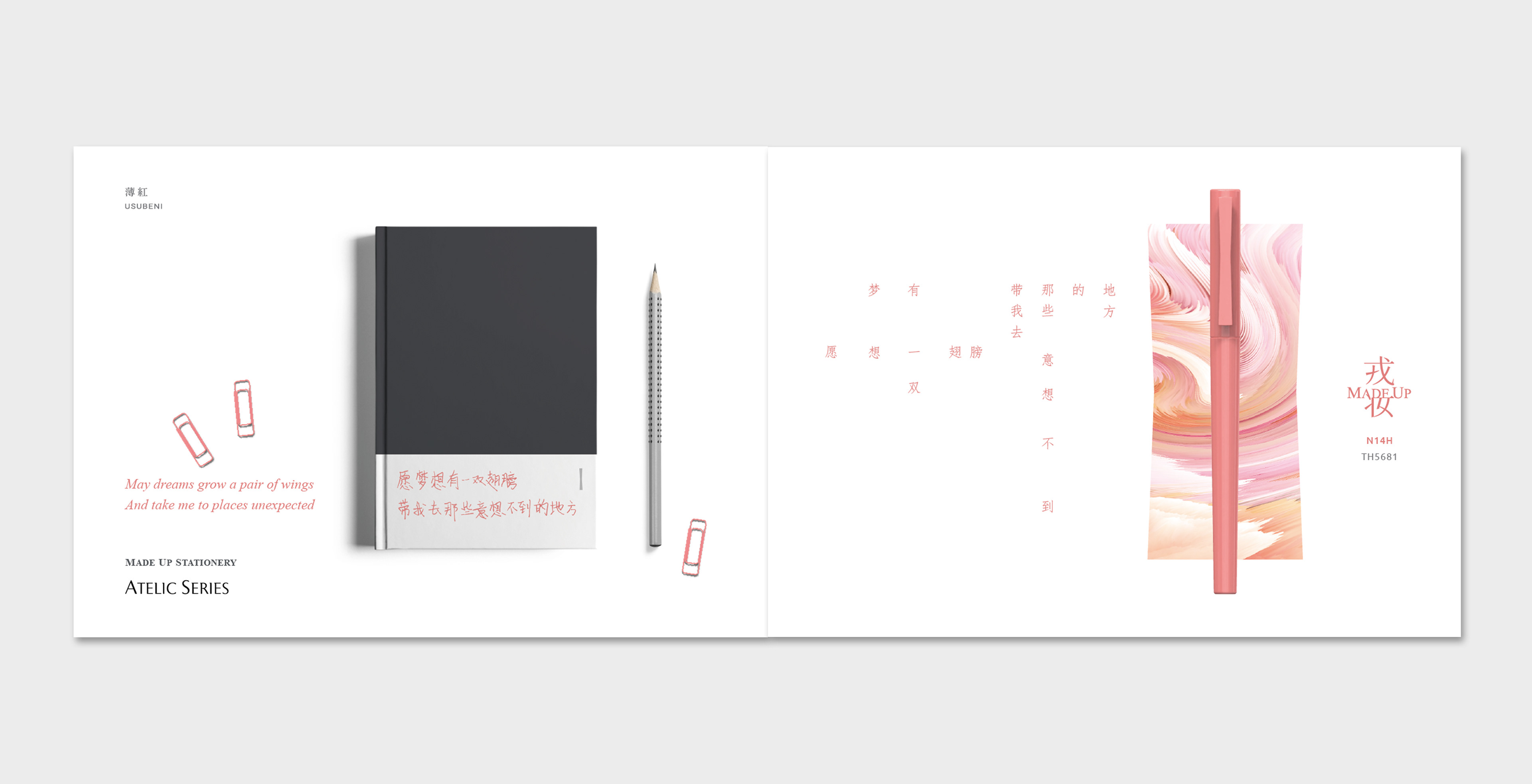
愿梦想有一双翅膀
带我去那些意想不到的地方
带我去那些意想不到的地方
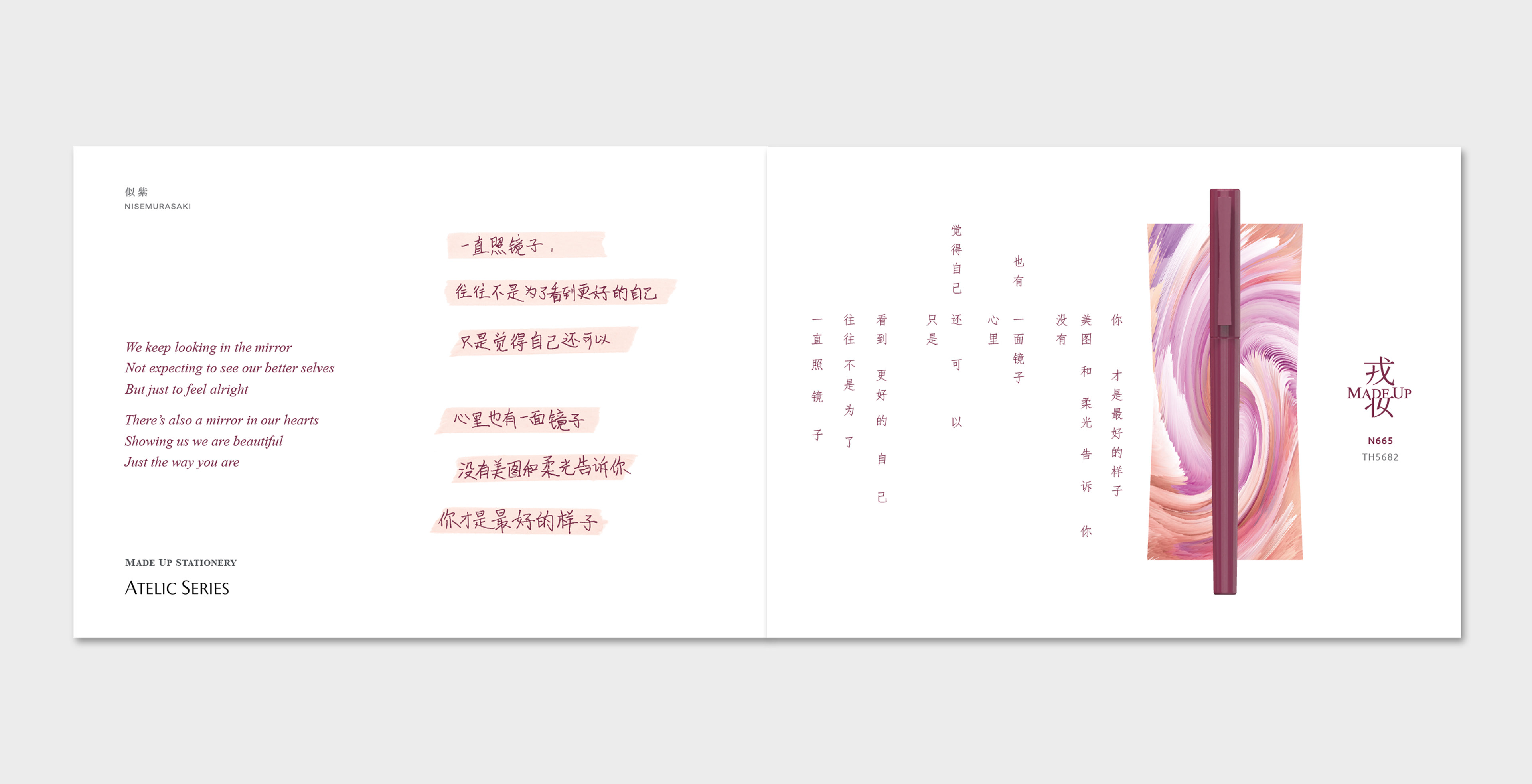
一直照镜子,往往不是为了看到更好的自己
只是觉得自己还可以
心里也有一面镜子,没有美图和柔光告诉你
你才是最好的样子
只是觉得自己还可以
心里也有一面镜子,没有美图和柔光告诉你
你才是最好的样子