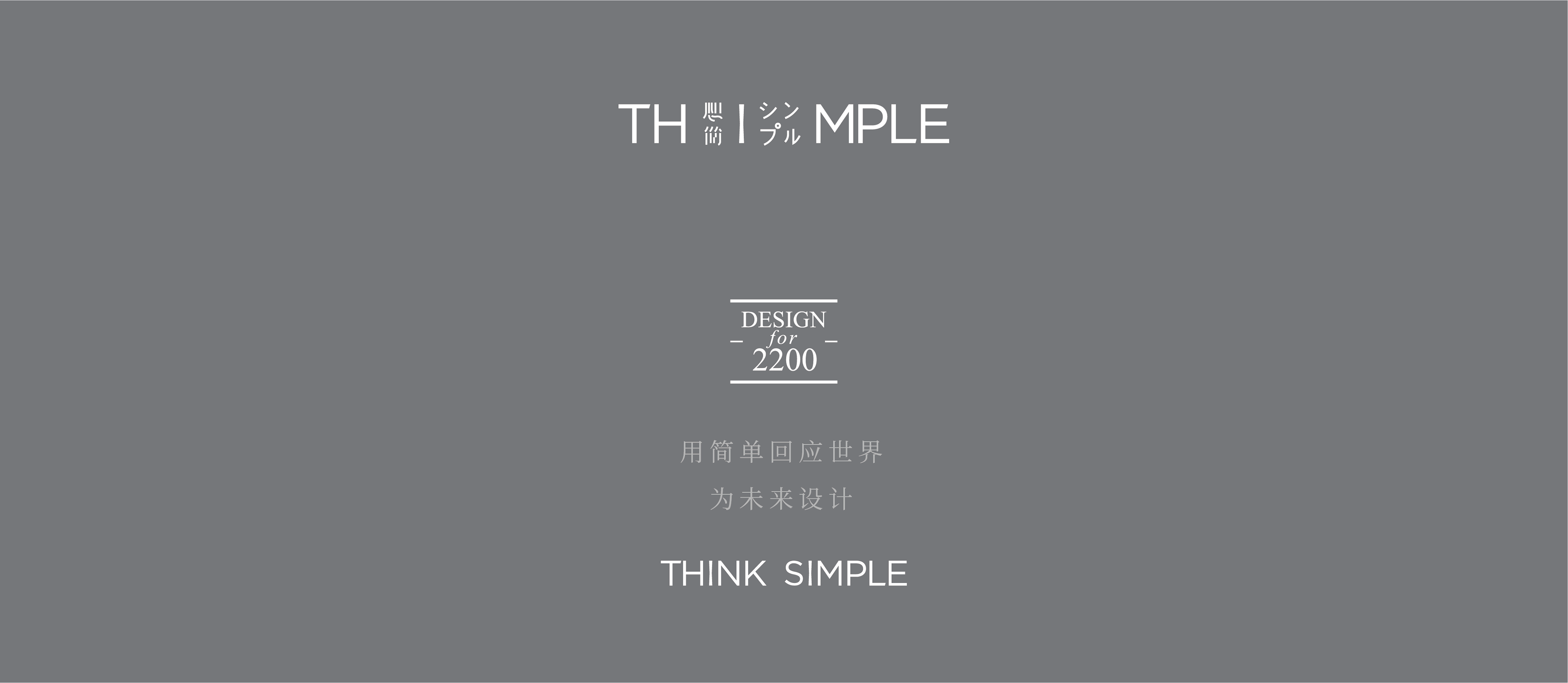
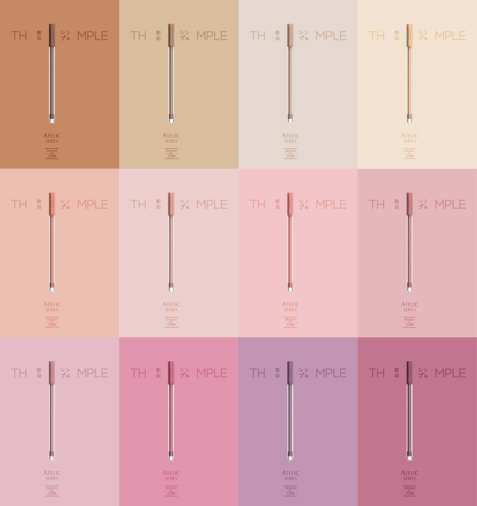
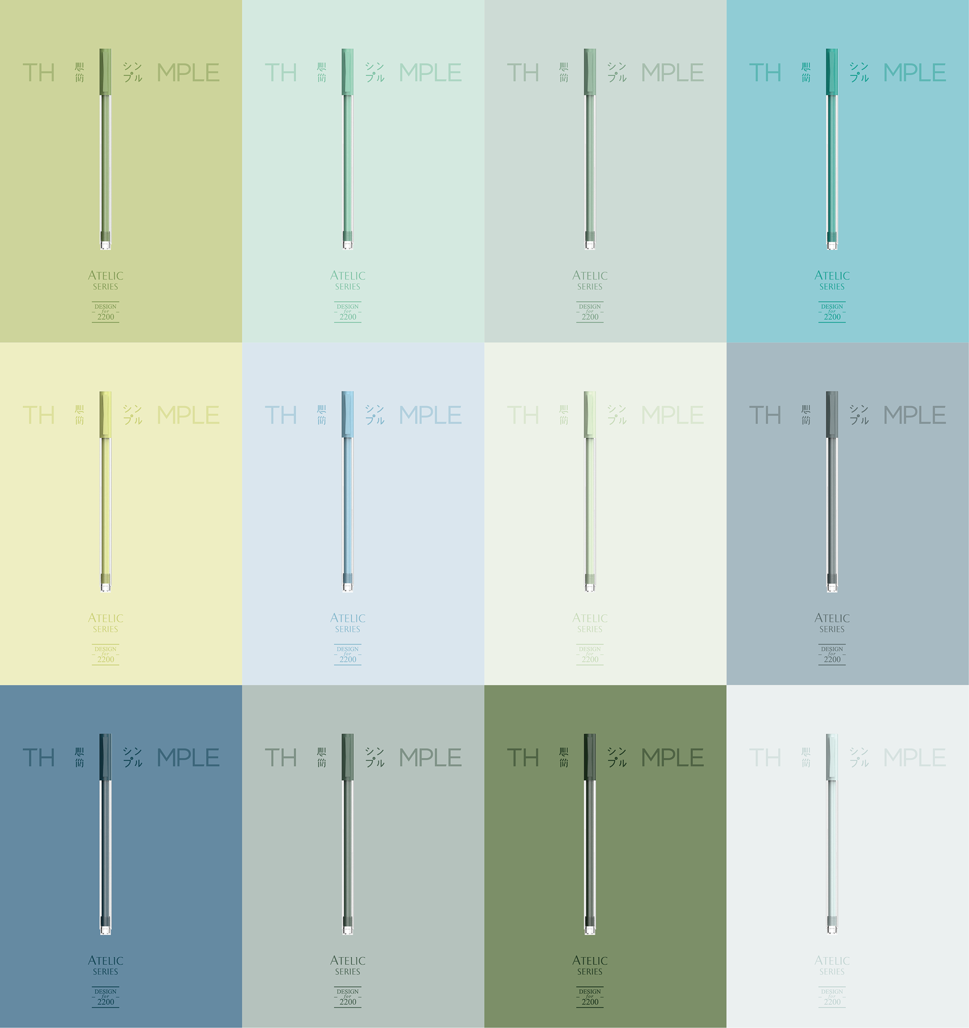
THIMPLE is a new stationery brand catering to students and young professionals.
Concept
Thimple is derived from Think Simple, an attitude we felt to be an apt antidote to our times.
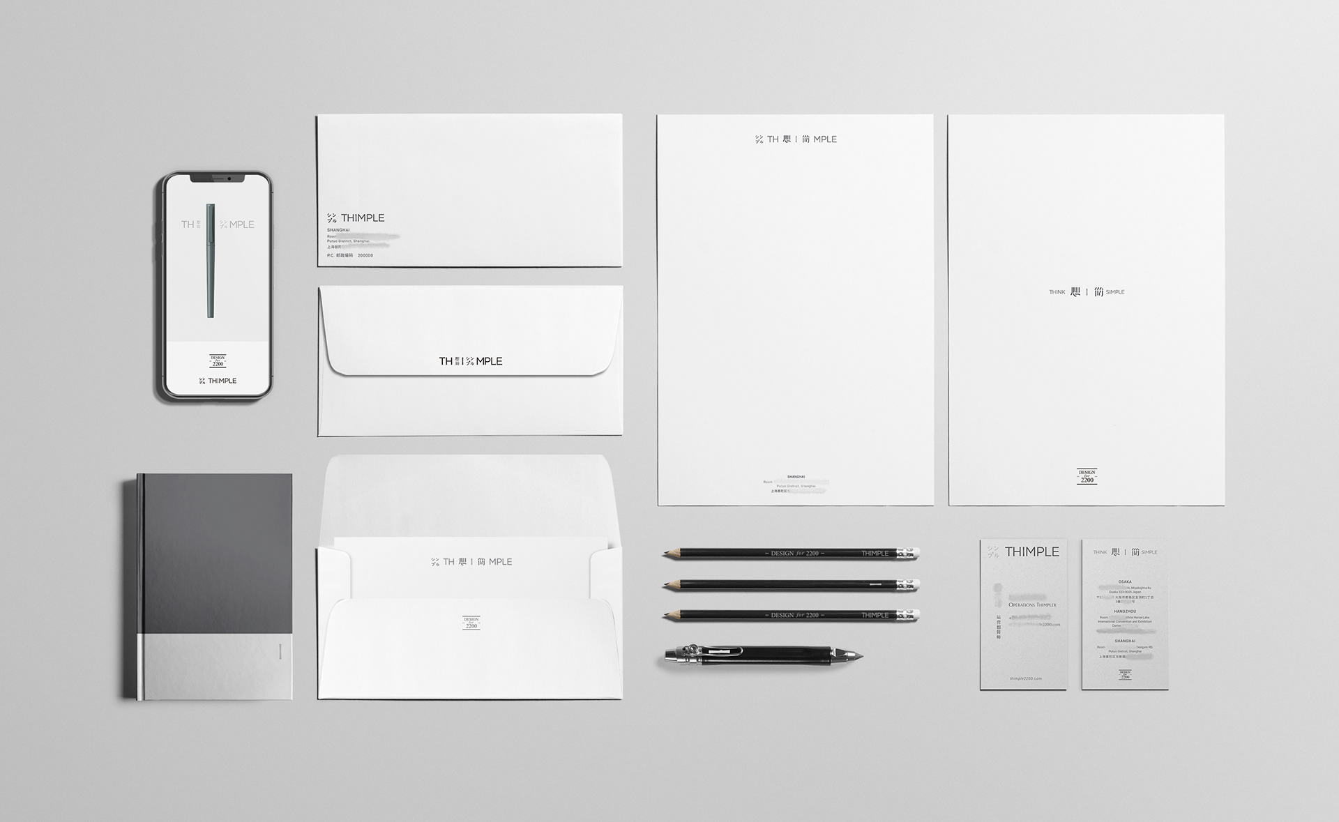
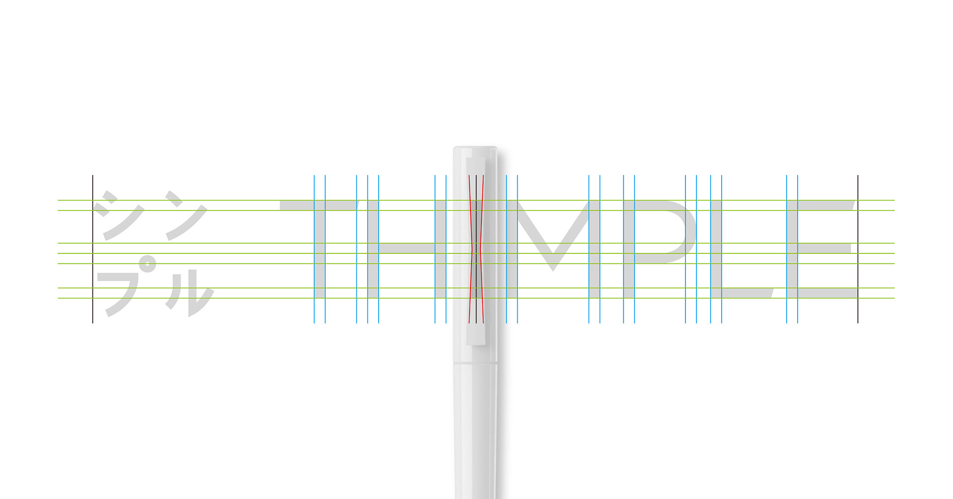
The I in Thimple is developed into a brand marque in the pen clasp.
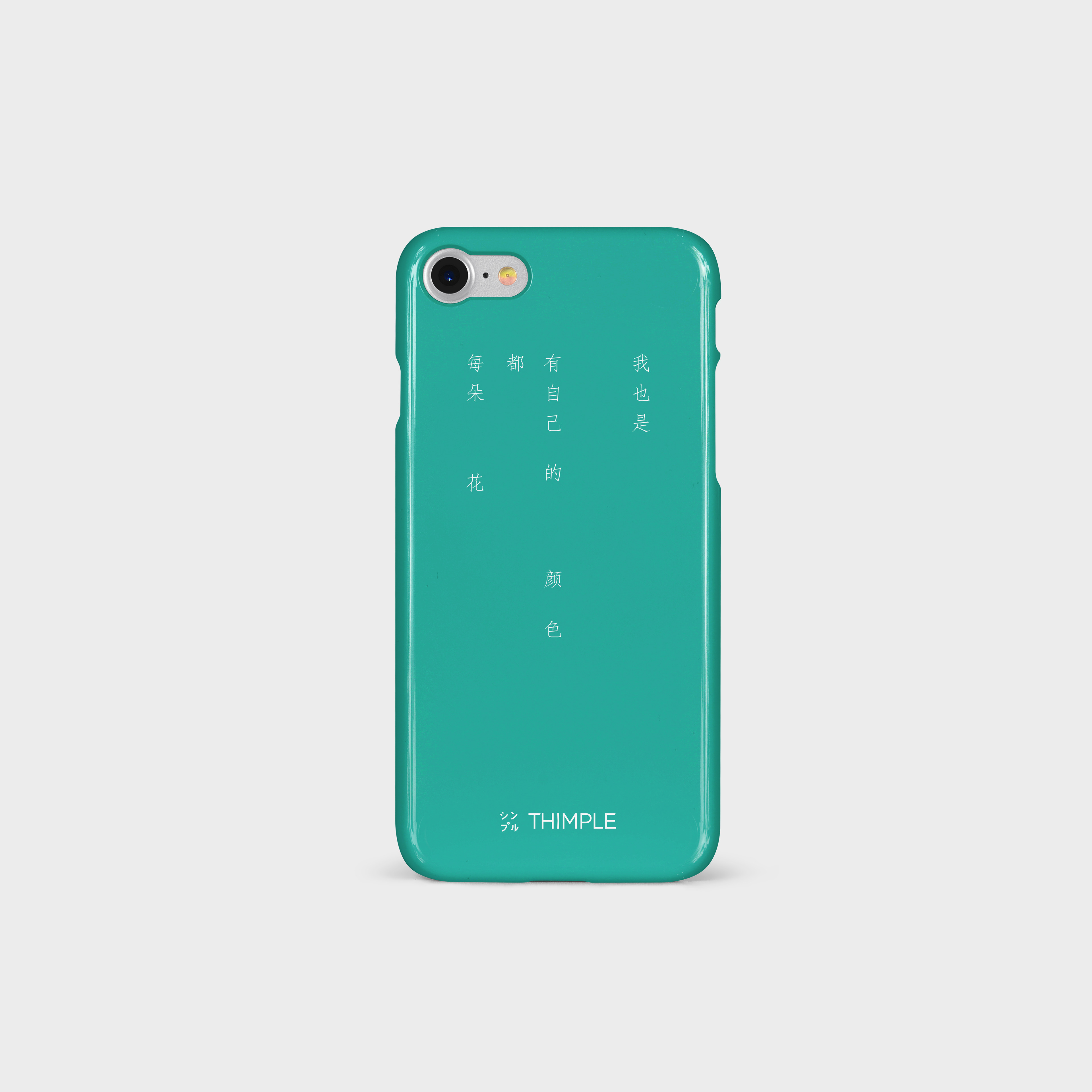
Different use of spaces and combination of English, Chinese (domestic) and Japanese (export market) characters were used in various layout and retail setting.

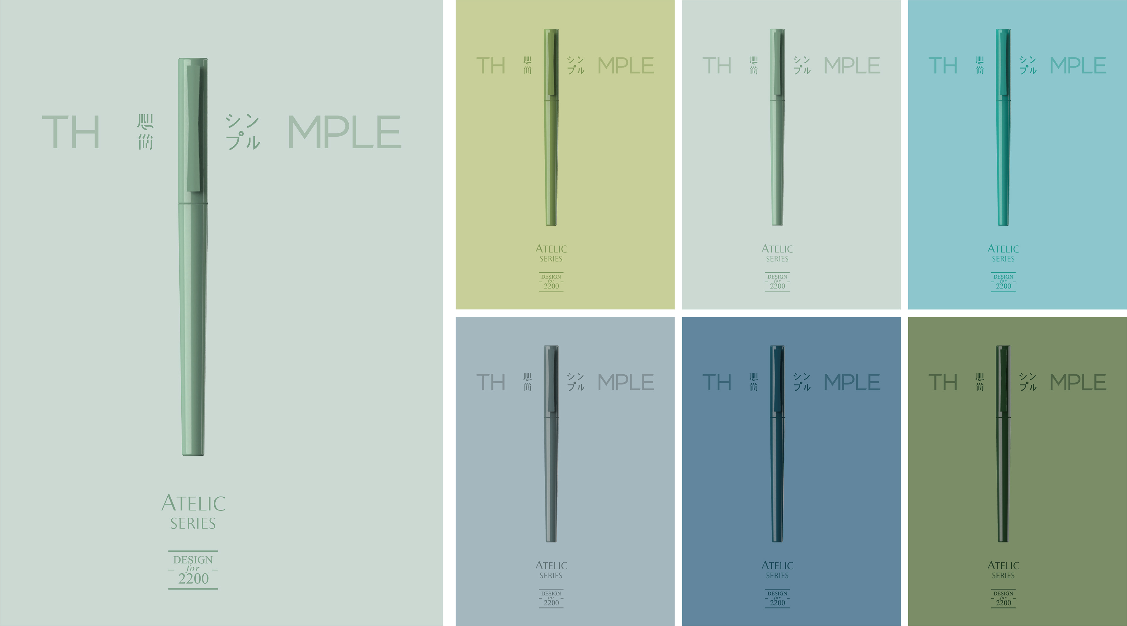

Brands used to emphasize their heritage with Since 18xx. Here instead, we use Design for 2200, a focus on the future and the good of humanity.
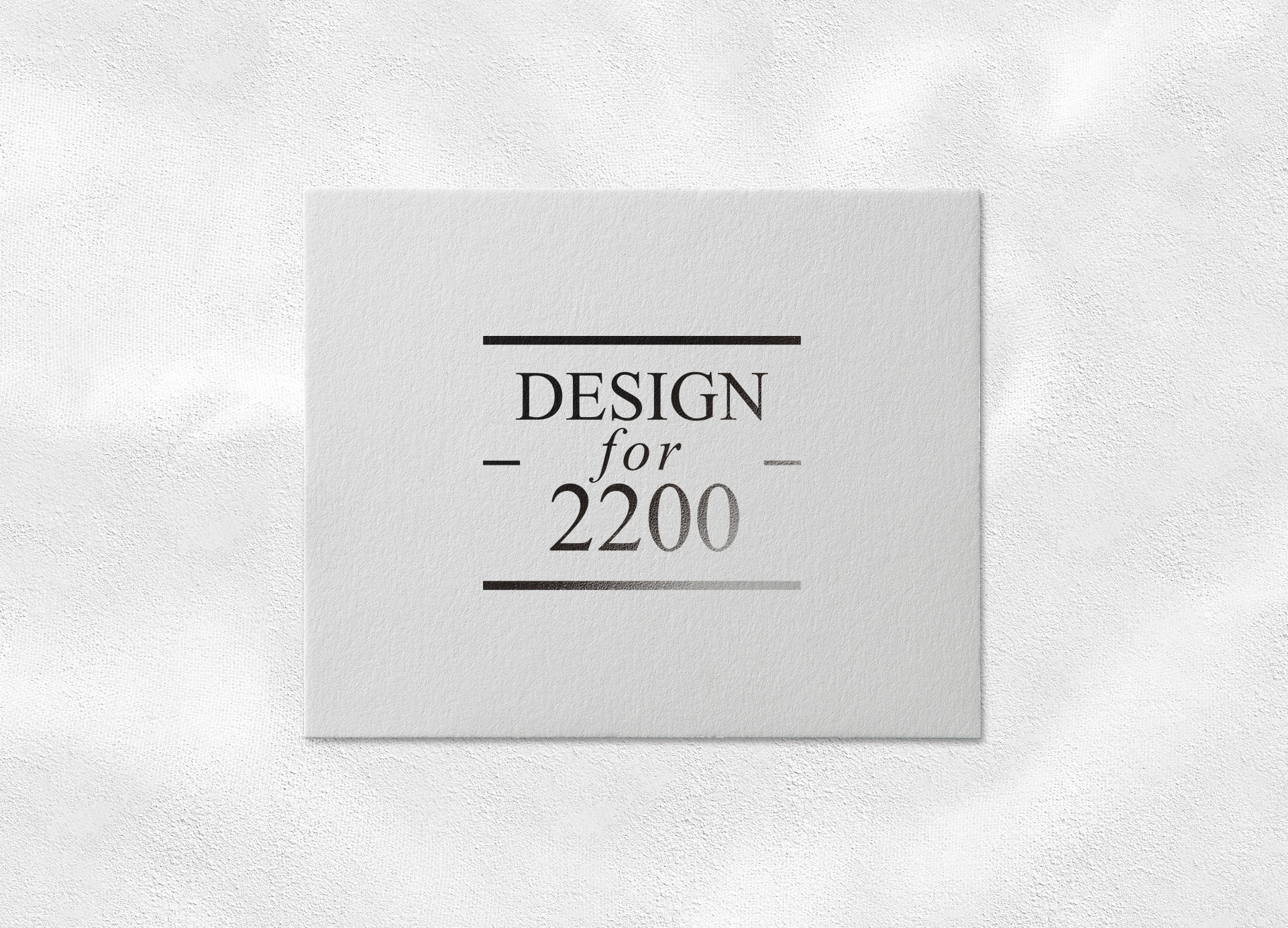
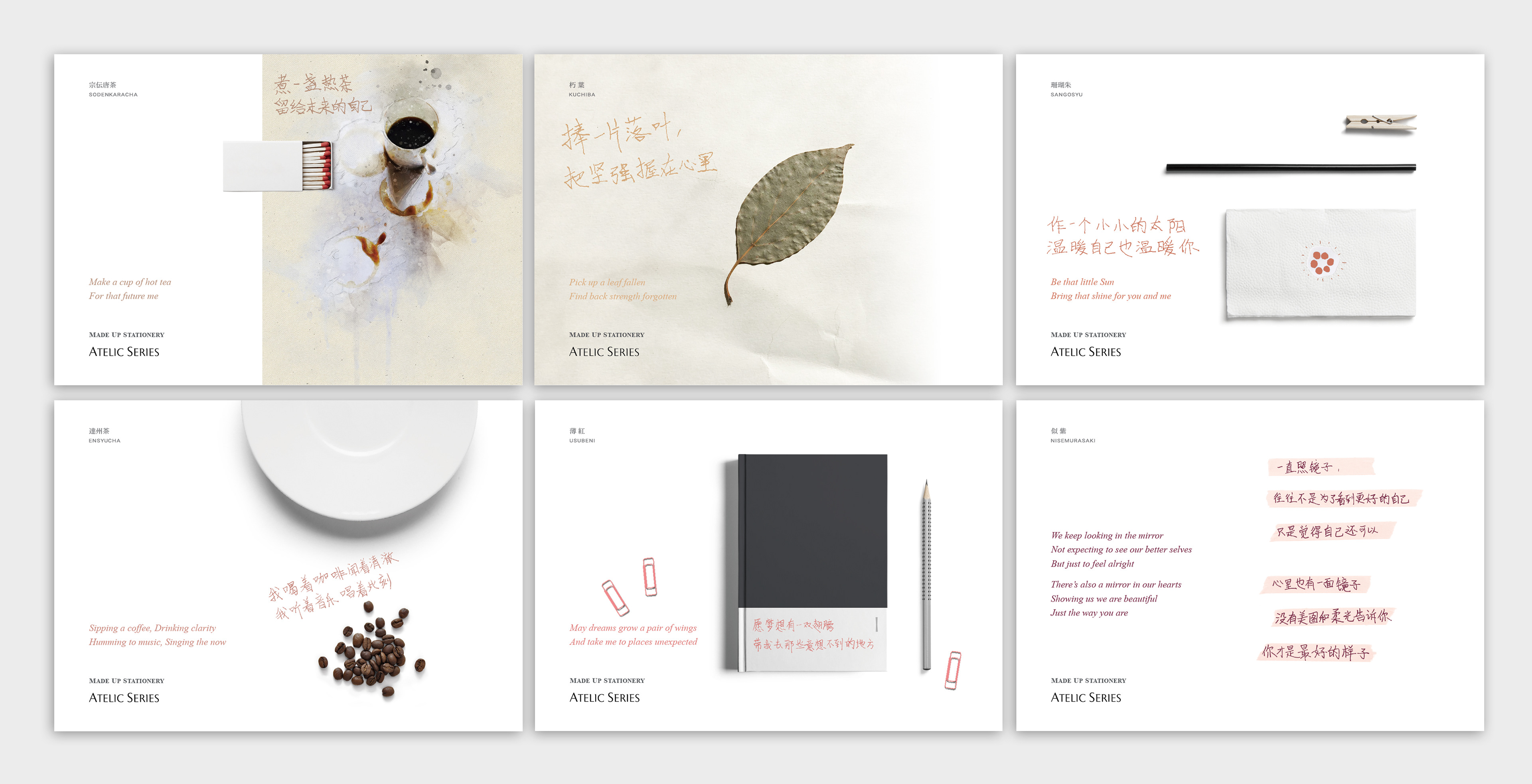
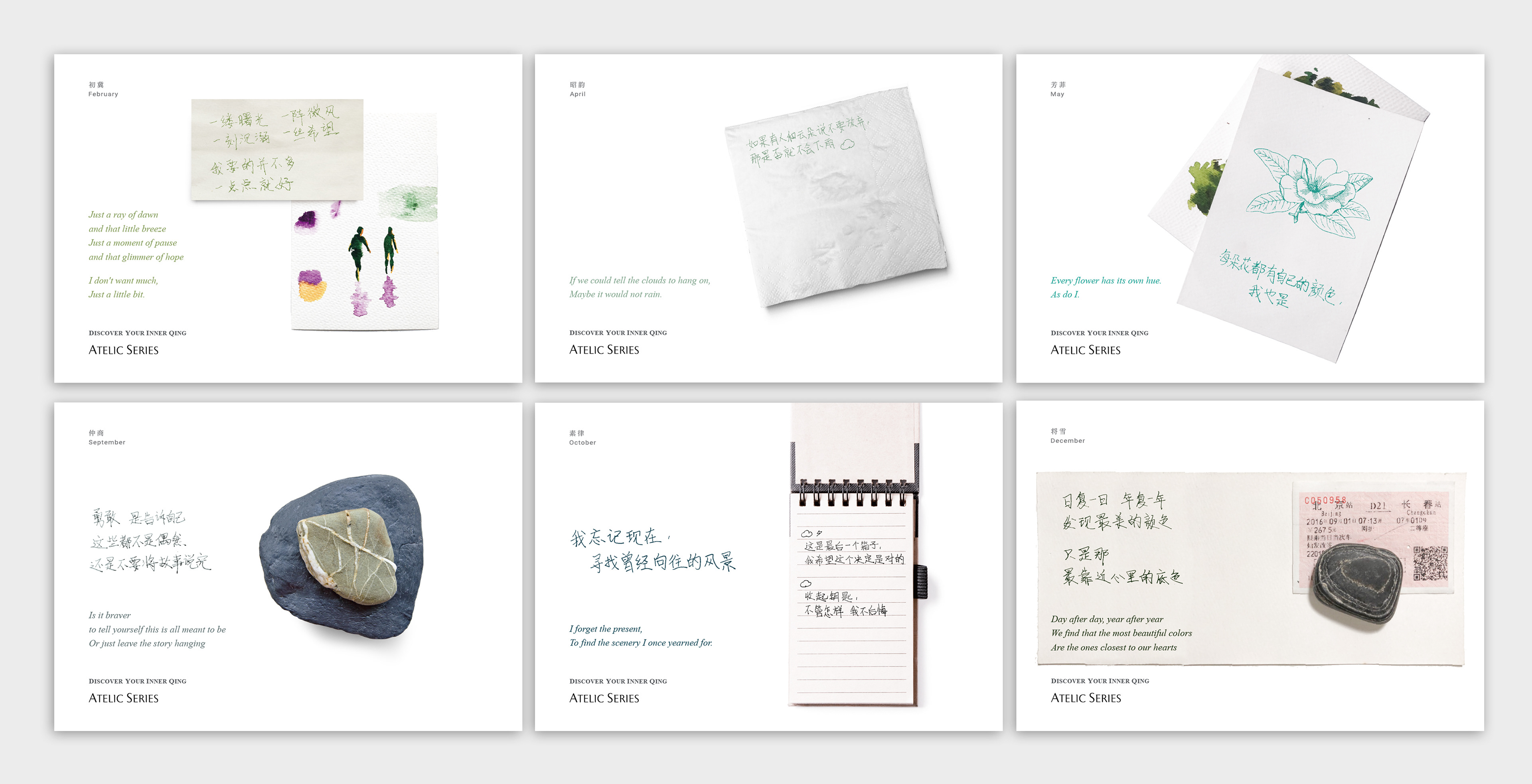
Atelic is the name of this series, describing unfinished imperfection, much like the pursuit of beauty in our lives.
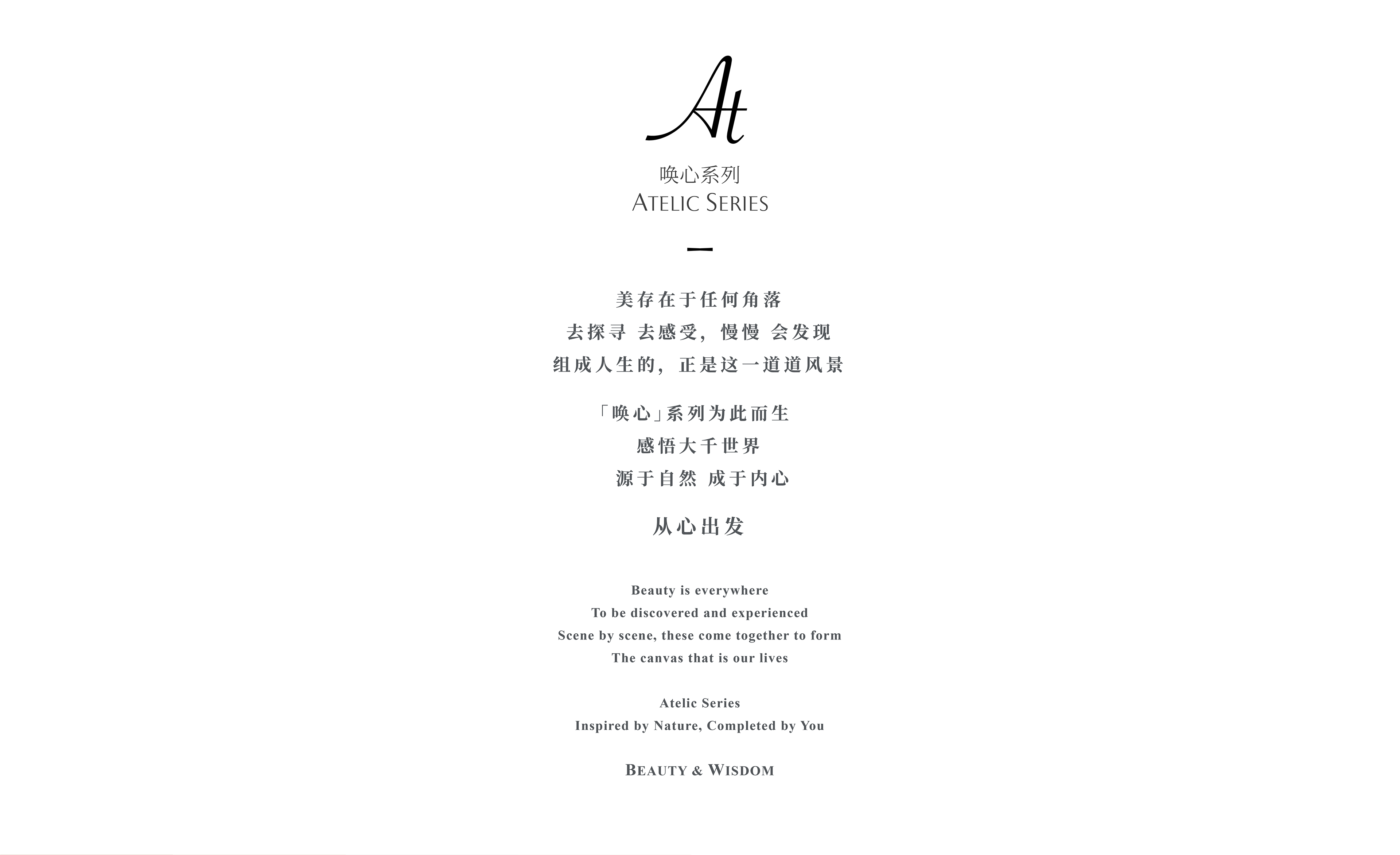
Emotional Resonance
We took a different take on product booklets by putting the focus not on the products, but on the end users. In particular, how colors paint different emotional states. Hence the graphics and copy describe a particular scene in this vast canvas that is our lives.