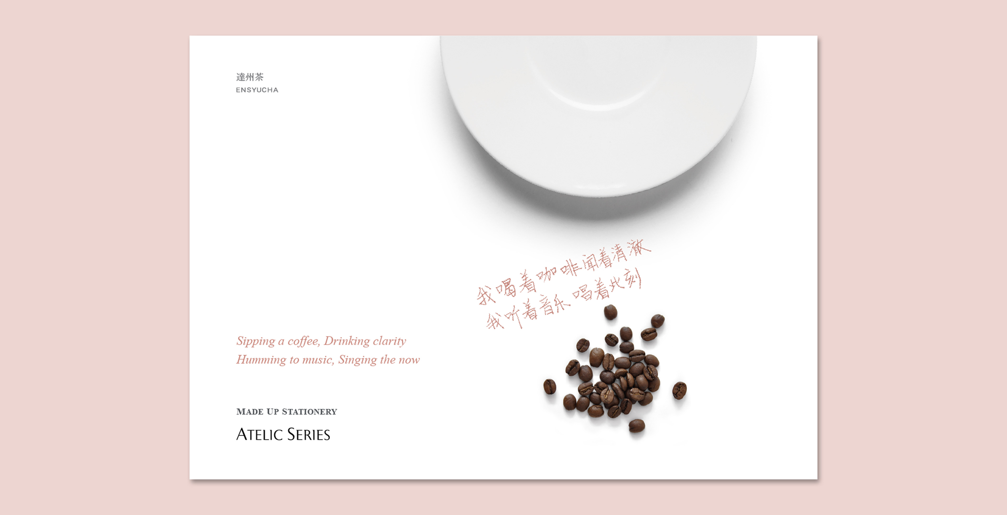
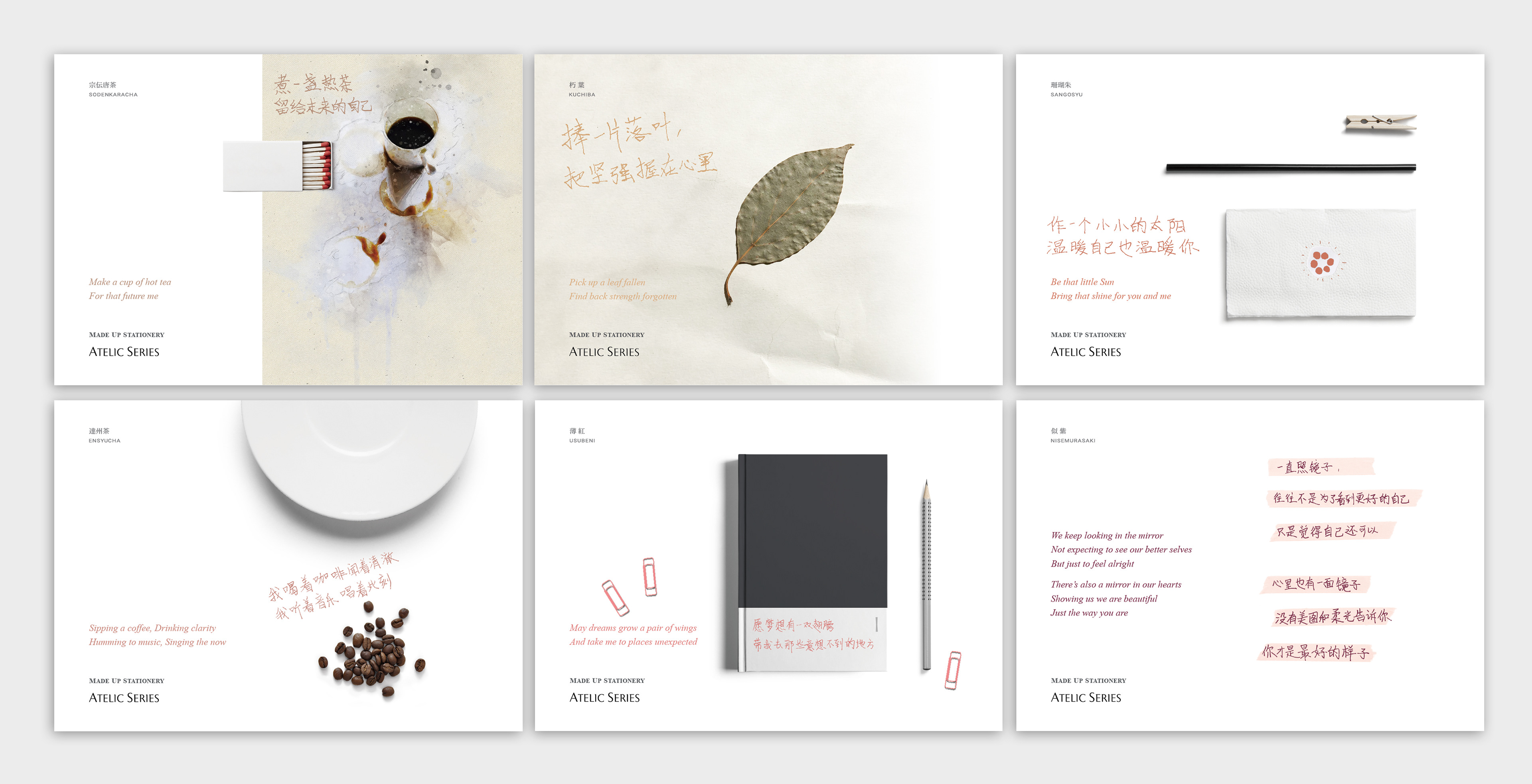
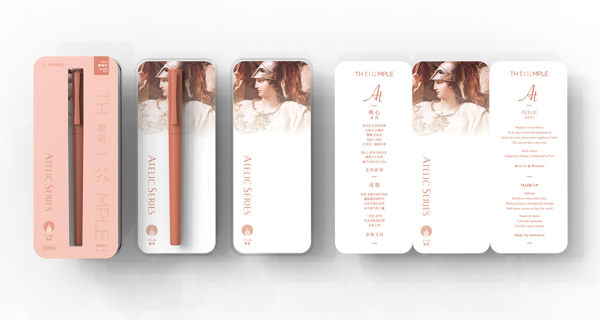
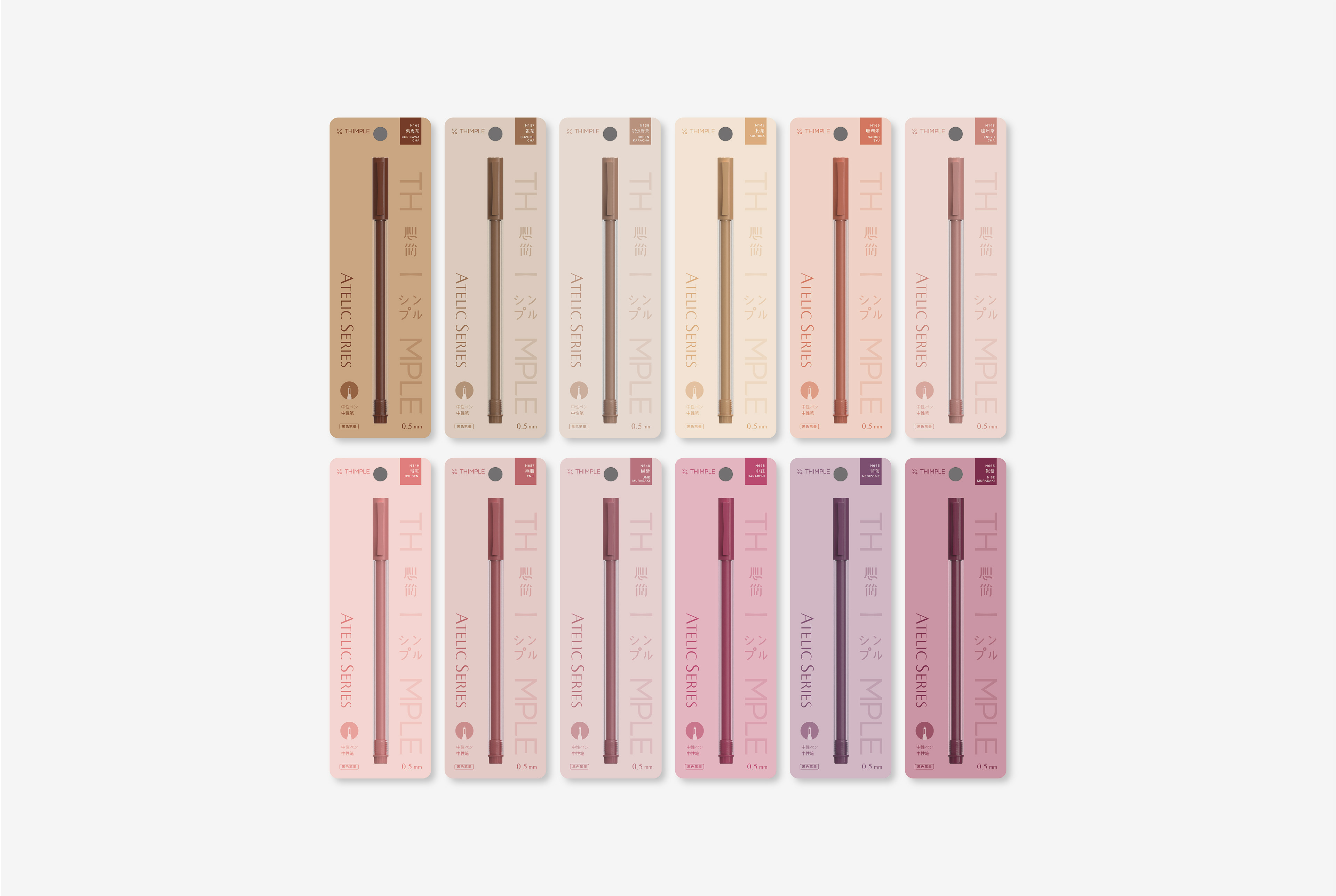
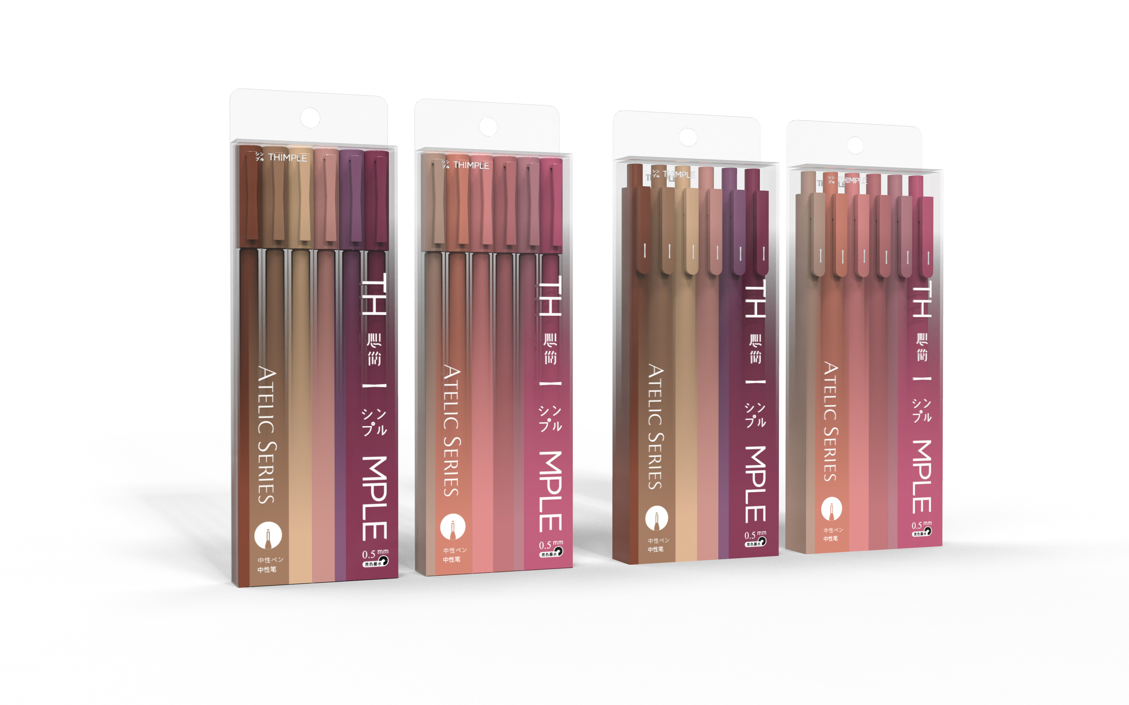
Beauty is a lifelong pursuit, both internal and external. Enhancement through cosmetics and make up ultimately empowers one with confidence to face life’s daily struggles. As stationery shares largely a consumer base with the cosmetics industry, we borrowed this visual language to produce a range of products, that we hope, will similarly empower and bring warmth to daily life. The naming of the colors took reference from traditional Japanese culture, which in turn originated from the naming traditions of Song and Tang dynasties in China.


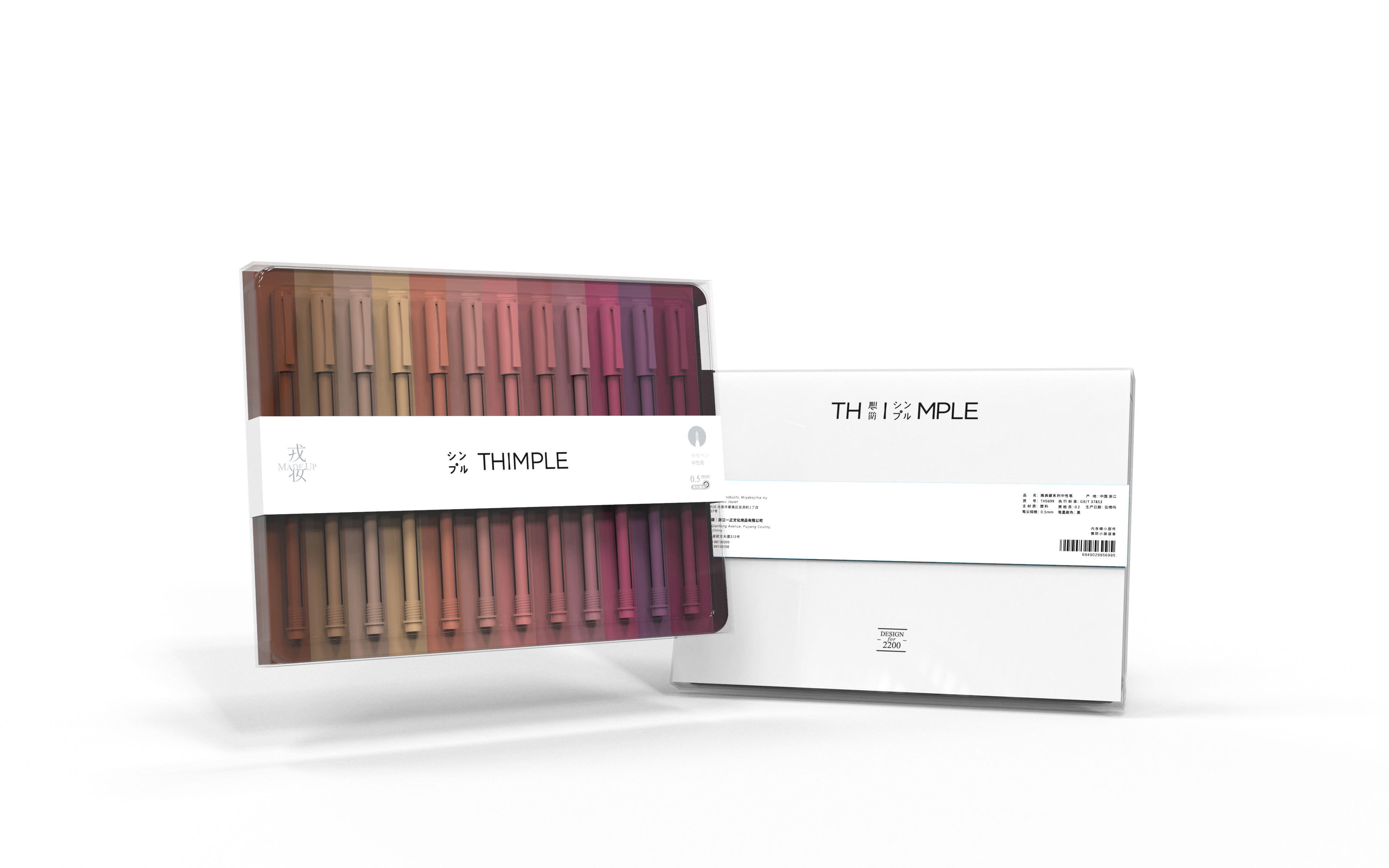


Visual Merchandising is an important touchpoint in brand communications at the offline retail level, especially in the stationery category where opportunities for telling brand story is scarce.
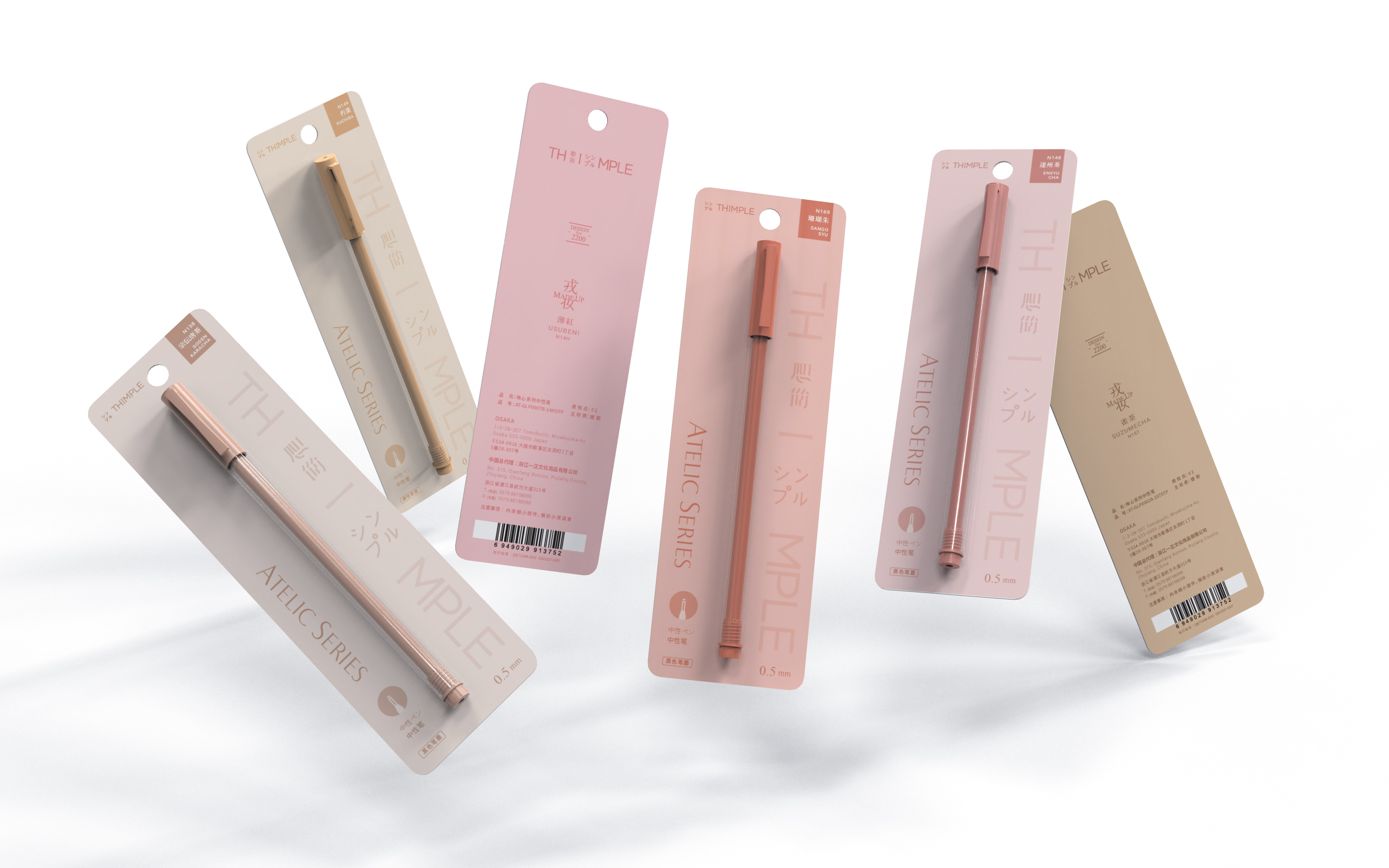
The stationery market shares an overlapping target audience with the cosmetics industry with females as primary consumers. We borrowed merchandising design language from this adjacent category for this purpose. The top tier seeks to convey brand and product concepts, displaying test pens in the best light. The second and third tiers allows for different SKU options.