绿色和平在中国是一个非常受尊重的公益组织。他们的所作所为不仅勇敢,又巧妙结合了政府推行的改革计划,在环境保护、推广可持续能源资源、抑制环境污染的命题上,来做出实质性改变社会的工作。
这个案例是和绿色和平中国的环境与能源部门一起合作的。问题在于之前的市场推广非常分裂,缺乏视觉统一性。每一次的推广需求都是和不同设计方合作的结果。点串不成线,更别提面。但这问题不简单因为需要沟通的主题很不一样,甚至调性不同,受众也不同。如何解决统一性又能满足差异性,加上可持续性的运用是我们品牌传播上最大的挑战。
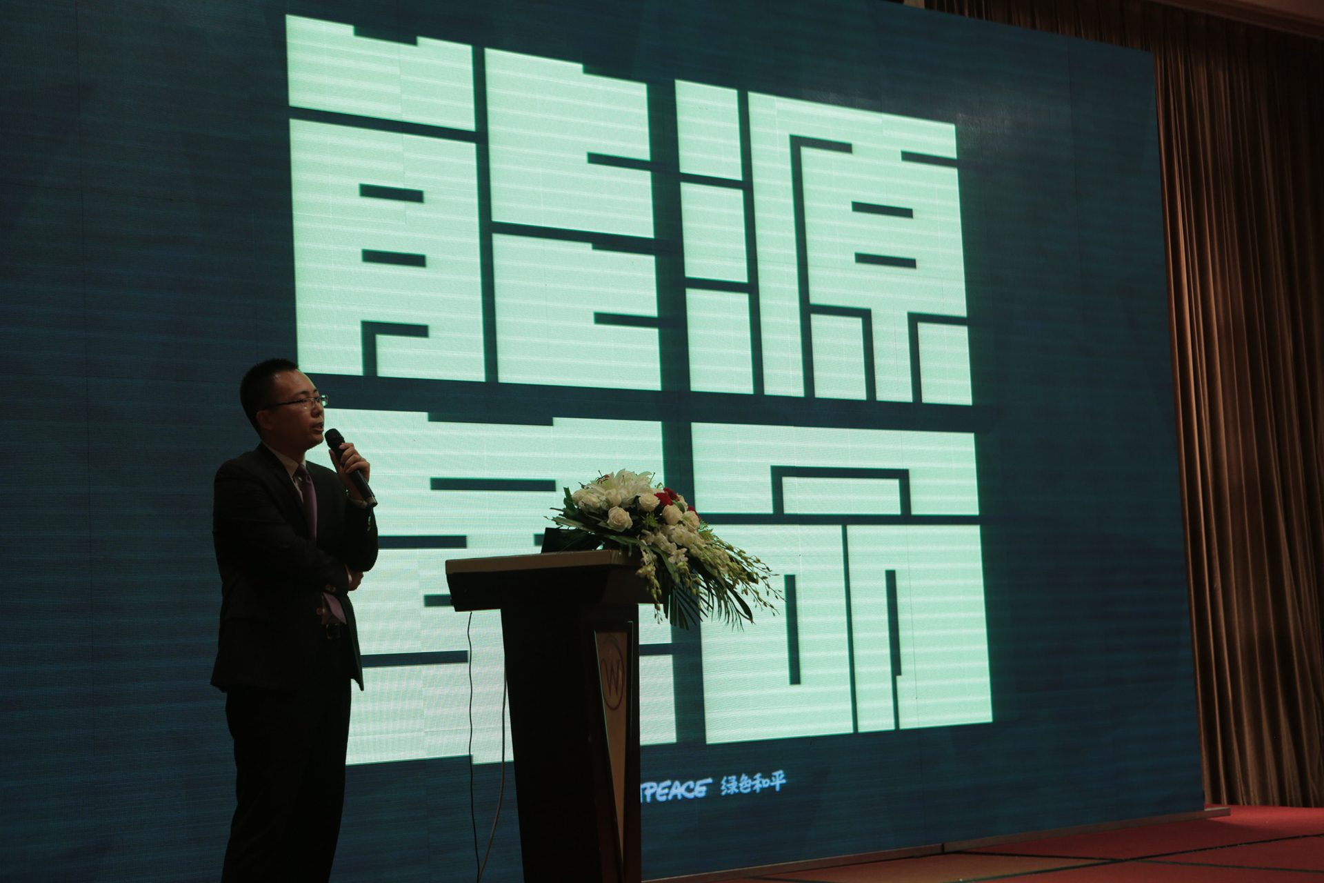
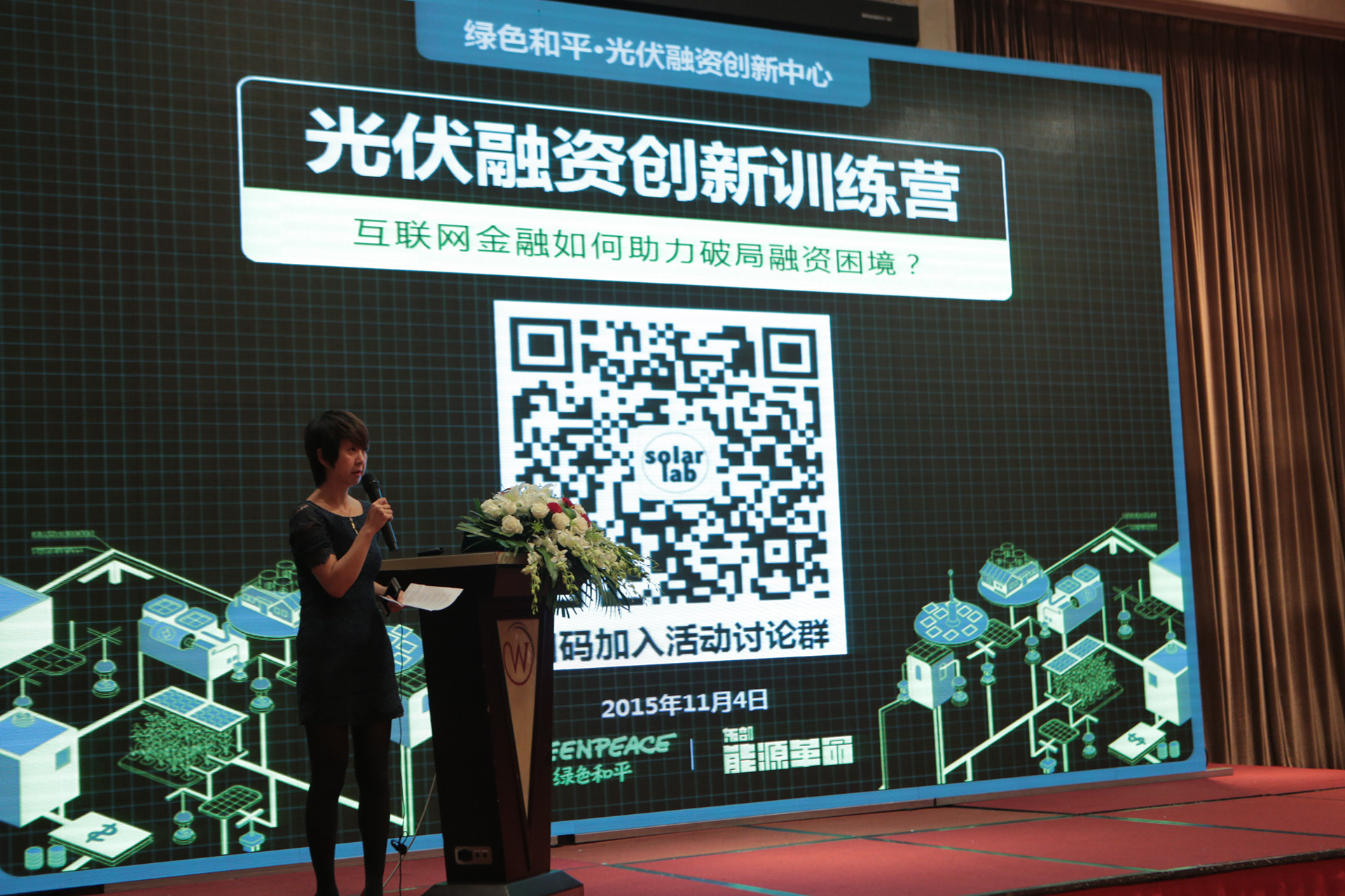
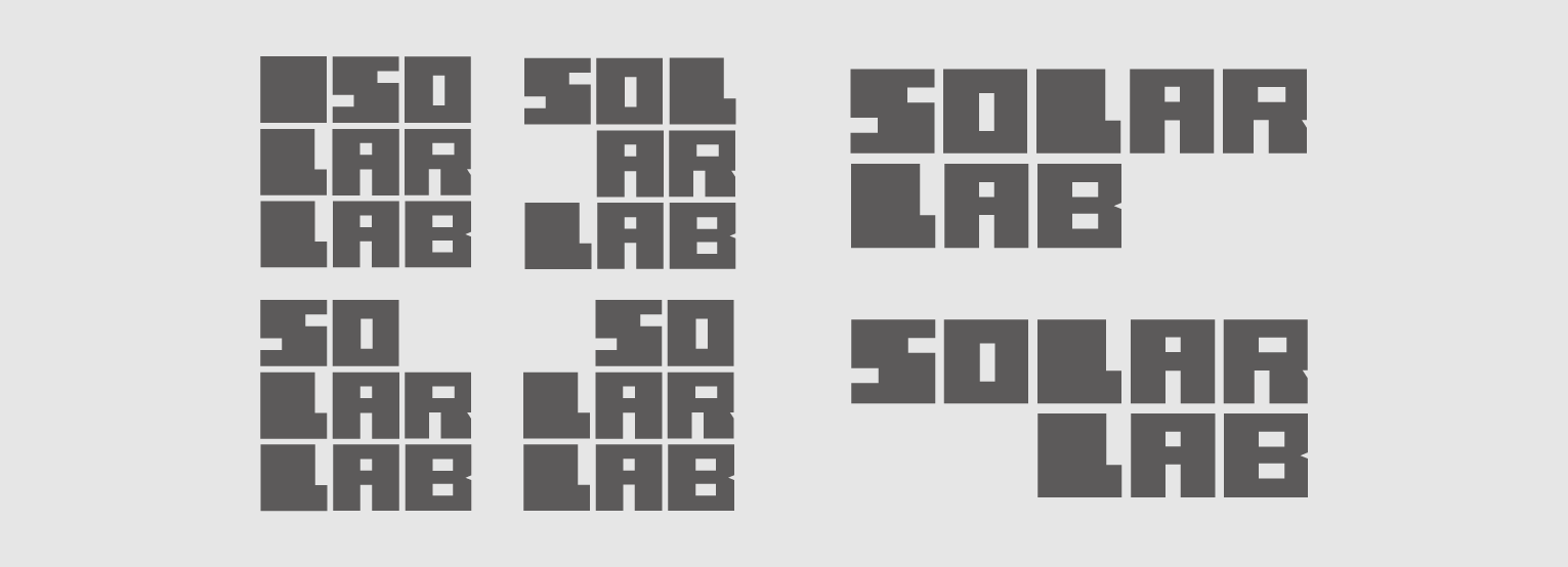
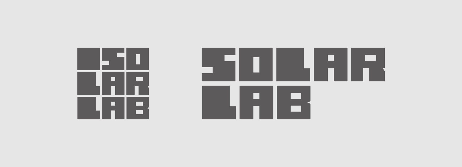
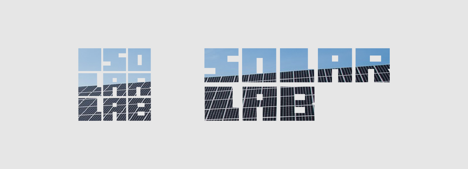
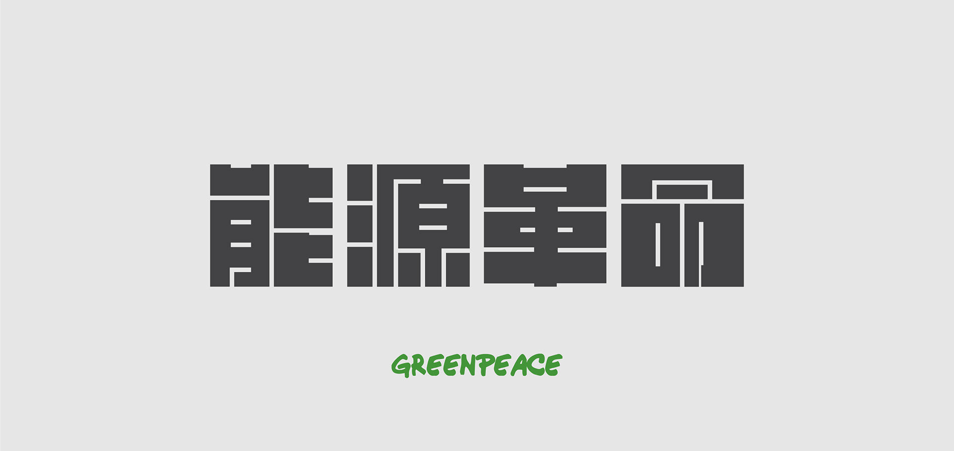
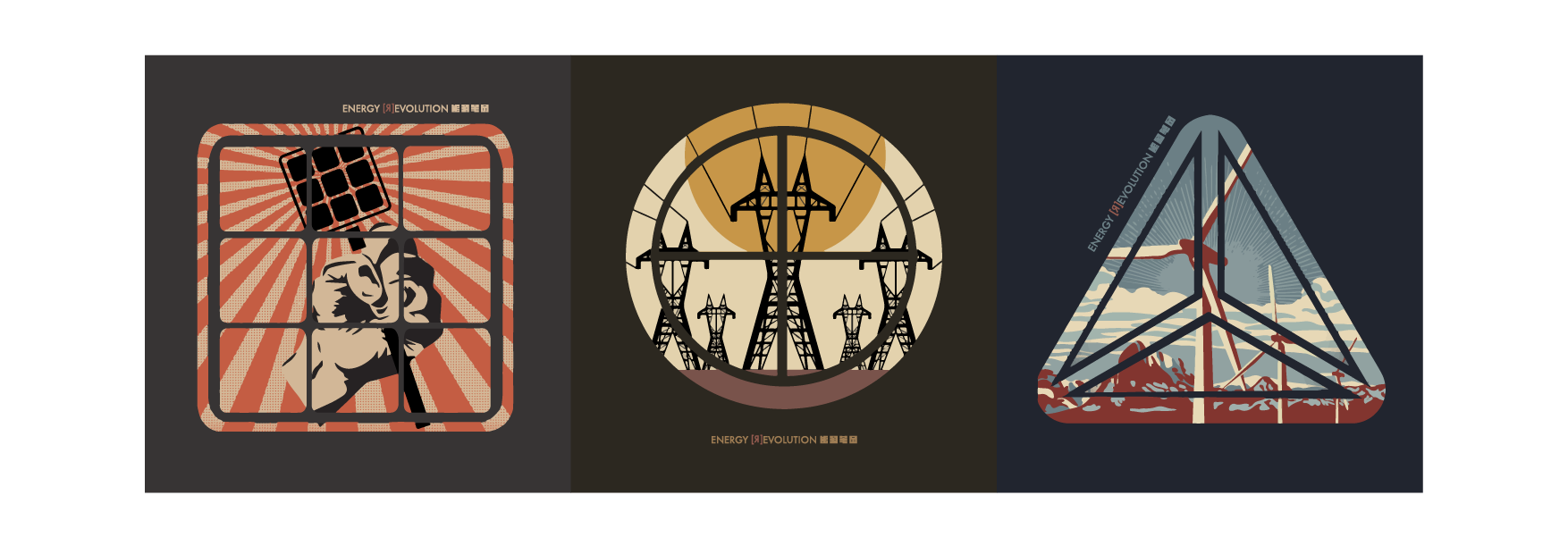
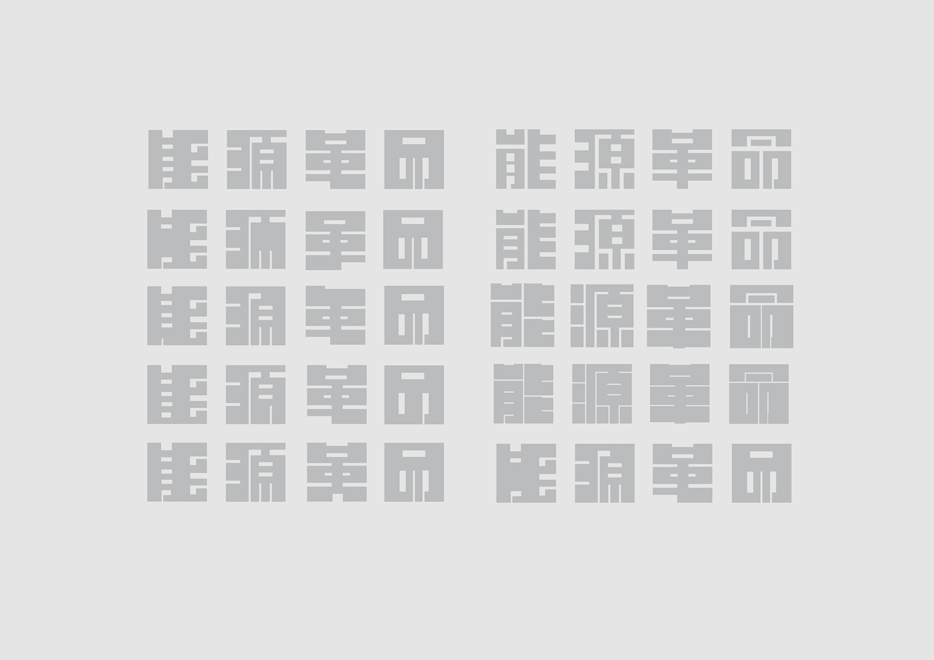
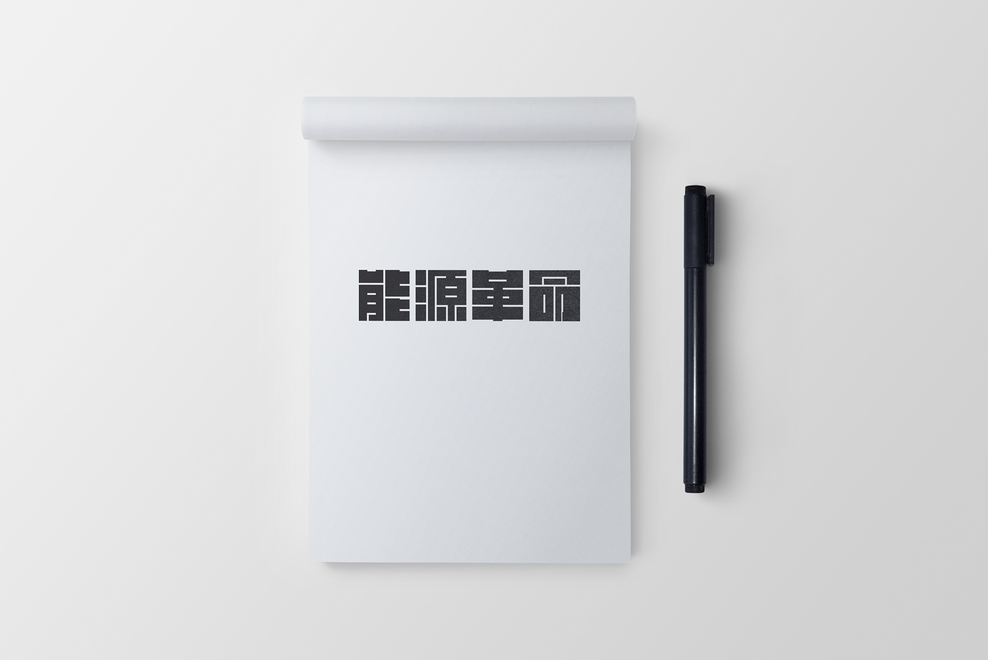
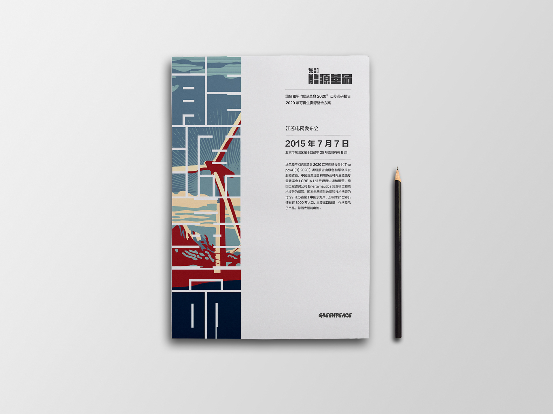
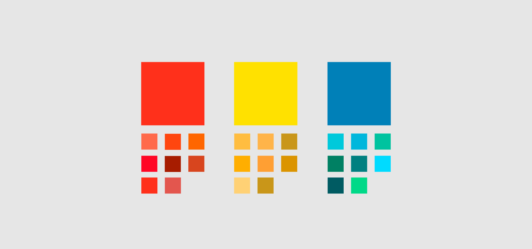
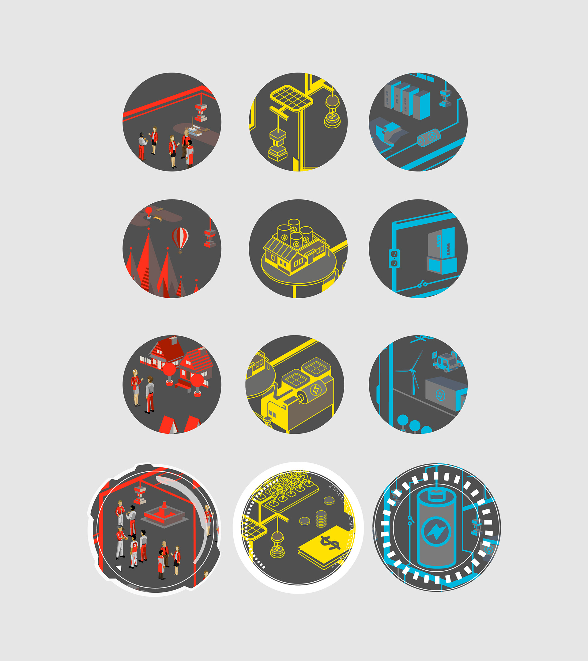
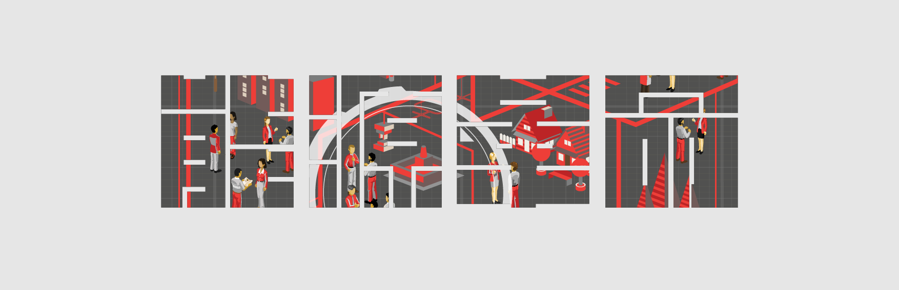
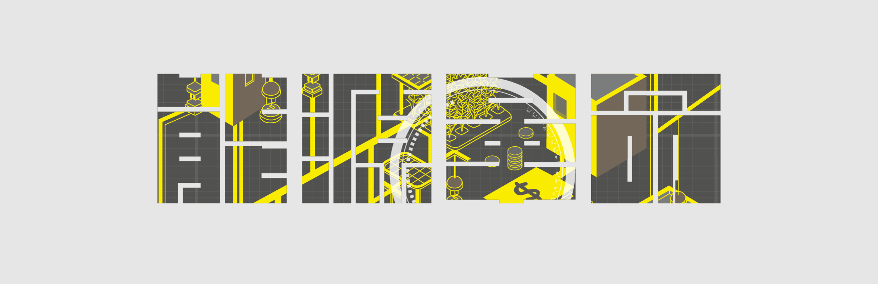
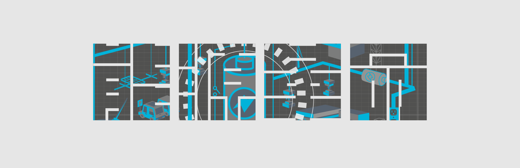
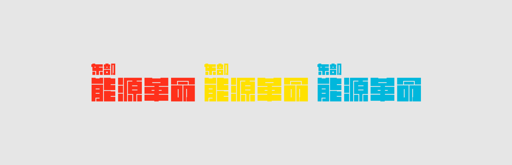
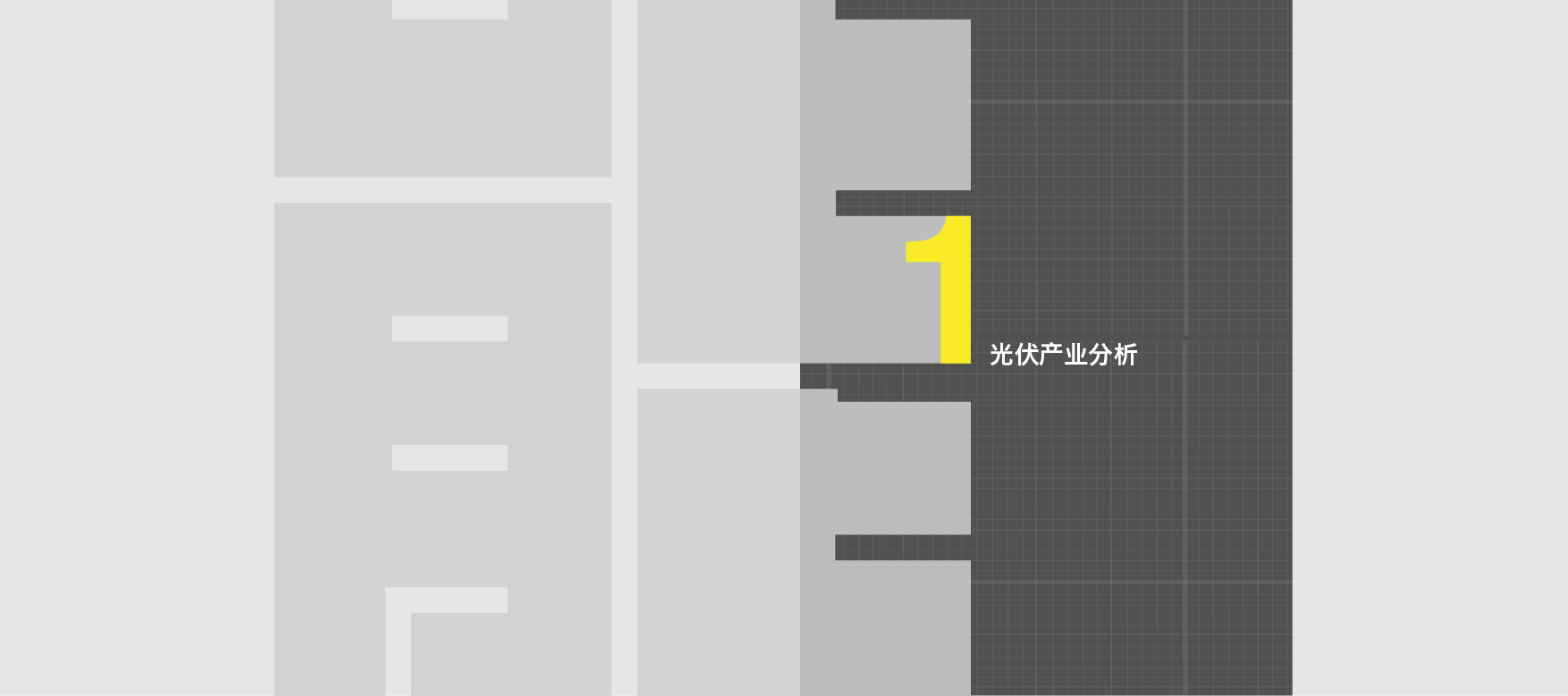
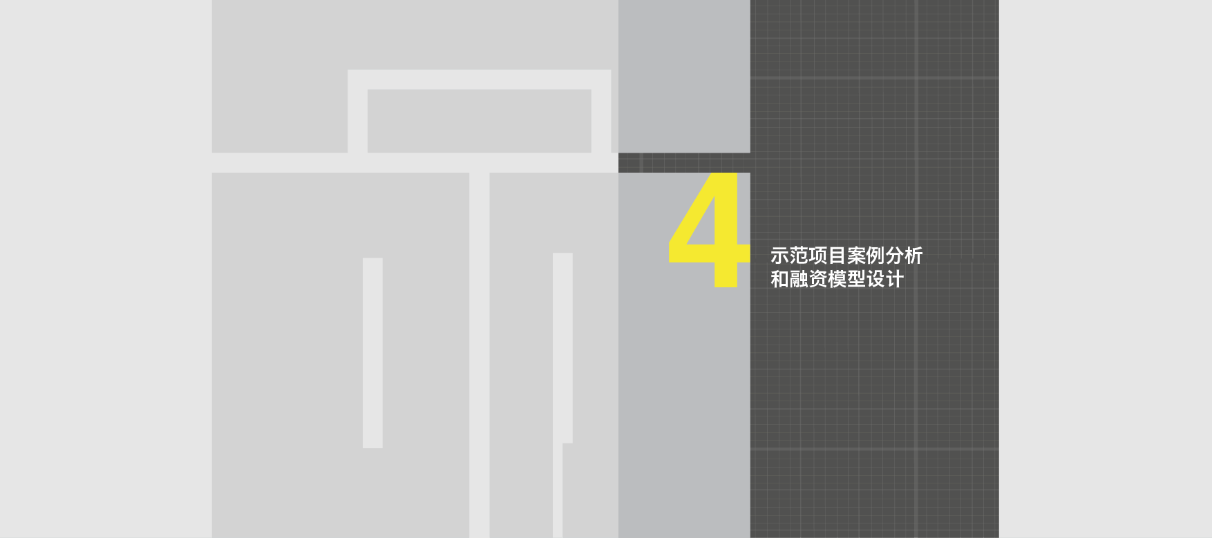
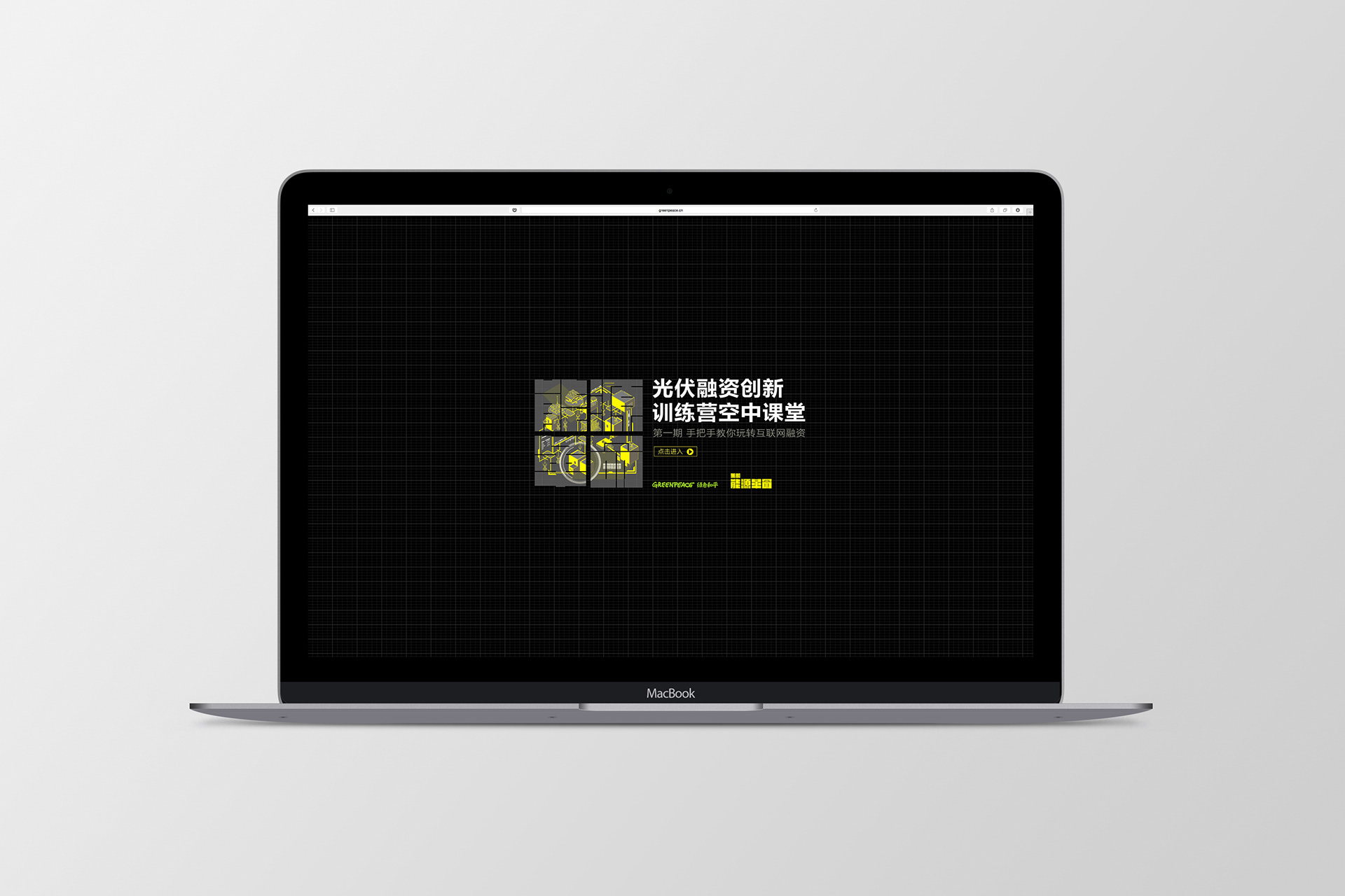
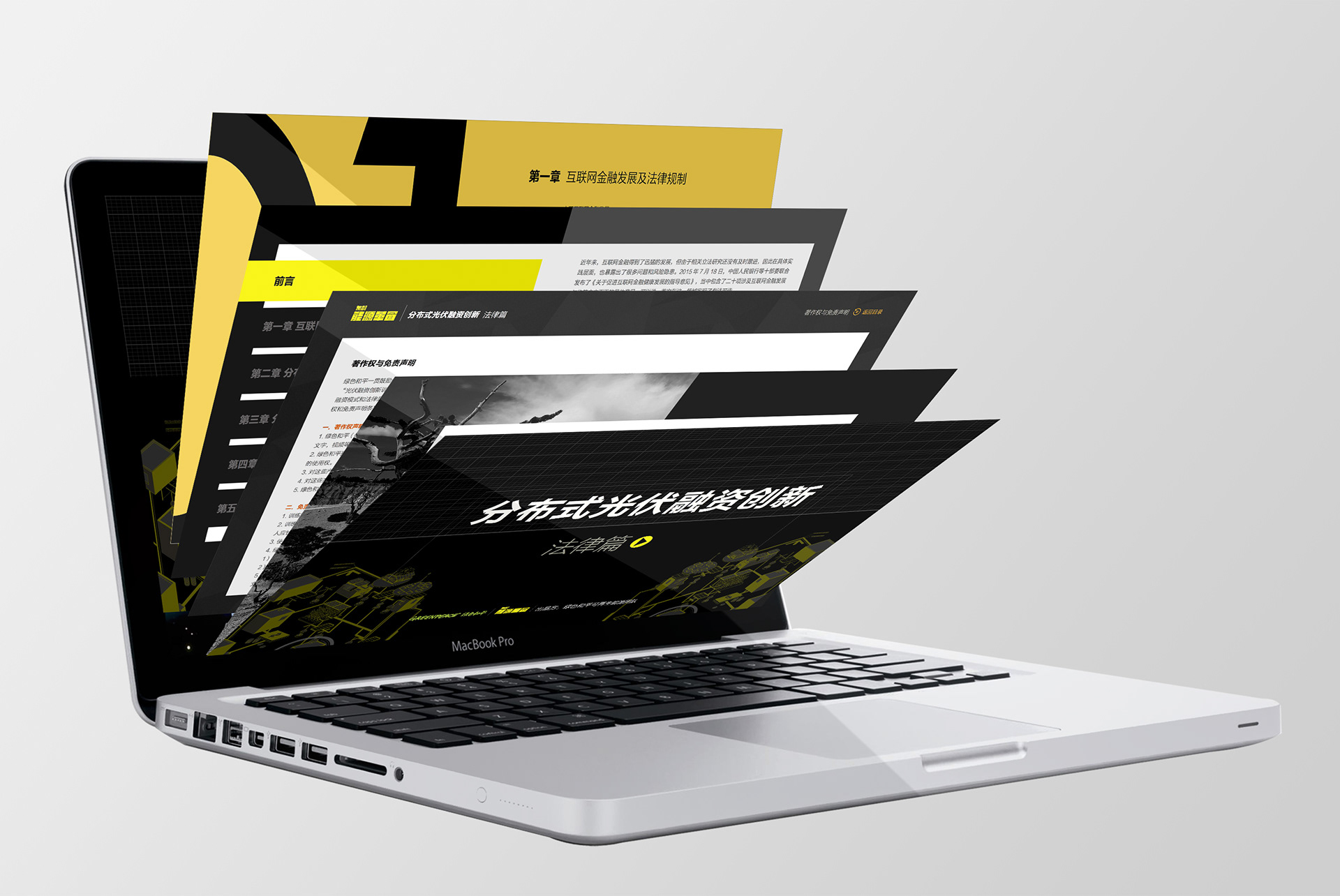
首先我们和客户一起把不同的沟通需求分化了。我们发现可以按照受众群体分类,分成三组:1)政府和行业领袖,2)投资方,3)普通大众。除了给每个类别一个主要色系,我们也设计了三组主题画面,针对于主要沟通的内容,用扁平化视觉处理交代主题,变成了可马上用的品牌资产,后续也可替换更新。能源革命的 logo 放大了也用来作为一个把画面裁切置入的 Key Visual 组成元素。后续能源革命加了东部的前缀,呼应当下信息传播上的需求。
我们创造了一套品牌识别系统,不仅视觉冲击力强,更难得的是他能按照不同用途调整基调和内容,考虑到了后续的更提性和可持续性。
Greenpeace does a lot of good work in China. Championing many causes in line with government reforms, in environmental protection, promotion of sustainable energy, anti-pollution measures in particular.
For this project we worked with the Climate and Energy division. The issue was that there wasn't an overarching visual identity, and as each design partner has free rein to explore the needs of the particular project, when viewed as a whole, their visual communications lack consistency and clarity. But their needs are as complex as the issues are, with interweaving messaging and audiences. The greatest challenge is thus the need for a strong identity on the macro level, yet flexibility to adapt to different tone & manner and messaging on the micro level, that is the only sustainable solution from a brand communications point of view.
First of all we worked with them to organize their communication needs. We found that this can be broken up into 3 categories, according to their target audiences, namely 1) government & industry experts, 2) investors, and 3) the general public. Besides assigning a key color palette for each, we also designed a Key Visual (flat graphic style) that referenced the key issues addressed to each audience. A primary logo (能源革命 meaning Engergy Revolution) is designed that is also used as a cutout to embed different brand assets. Later on 东部 (referencing the Eastern parts of China) is added as a prefix to lend credence and alignment to messaging needs.
We created a branding system that is clearly differentiated as a whole, with reusable brand assets that can be utilised in subsequent activational programs, and easily updated and replaced if need be. A system that is strong visually yet flexible and adpatable to future needs.


concept design: (Anfia Lin) United Design Practice


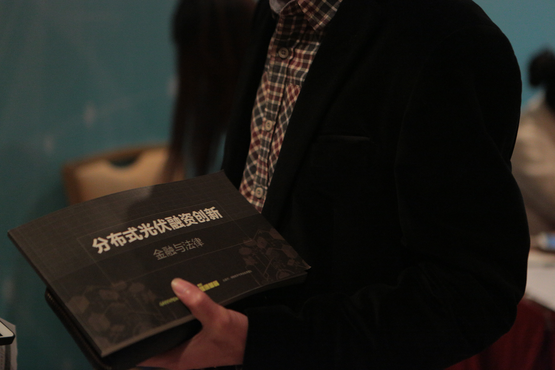
Below photographs courtesy of Greenpeace China