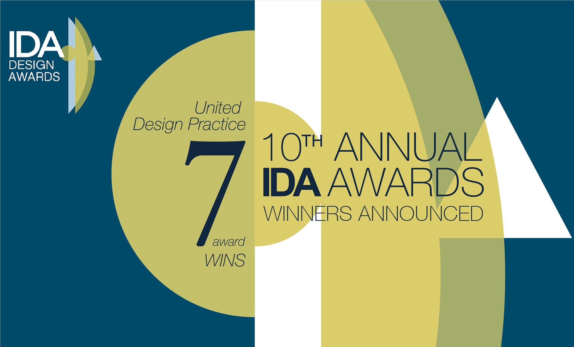
We are very honoured to be presented with 7 awards at the 10th International Design Awards (IDA).
As a multi-disciplinary design studio, we were especially proud that Yizheng rebranding project, consisting of a Brand Experience Center, and a Brand Video, were awarded with 5 awards, 3 awards for the former and 2 for the latter.
Even as we won 7 awards for the previous year at IDA too, this year, we won a Gold for Yizheng Brand Video, the only Gold in the Multimedia - Animation category
我司很荣幸在美国洛杉矶举办的第十届国际设计大奖里得到7个奖项。
一正项目作为跨界项目,得到很大认可,其中:视频类奖项 2个,空间类奖项 3个。
一正品牌视频 获得本届设计奖多媒体-动画组别的唯一金奖。
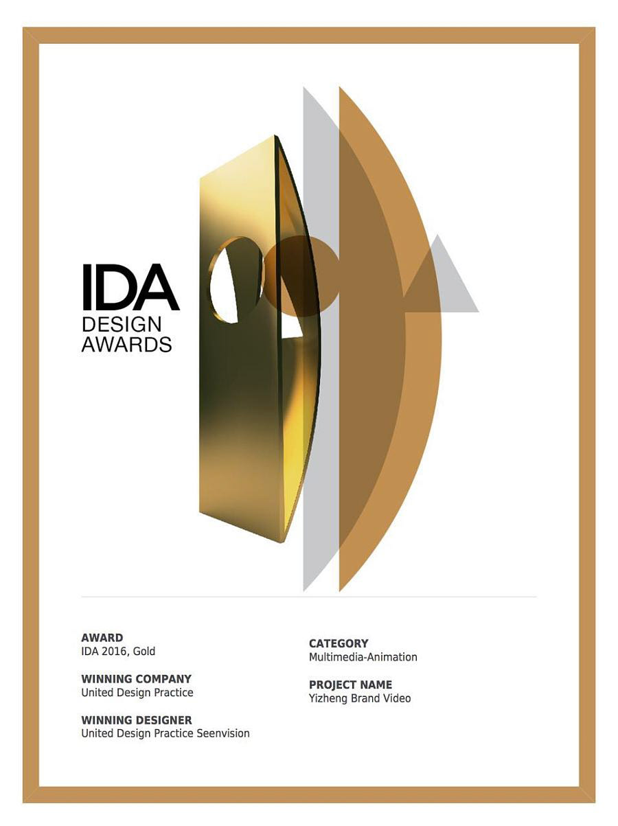
Yizheng Brand Video
一正品牌视频
by United Design Practice X Seenvision
Mutimedia - Animation 多媒体 - 动画 : Gold
Other Graphic Design 其他平面类 : Honorable Mention
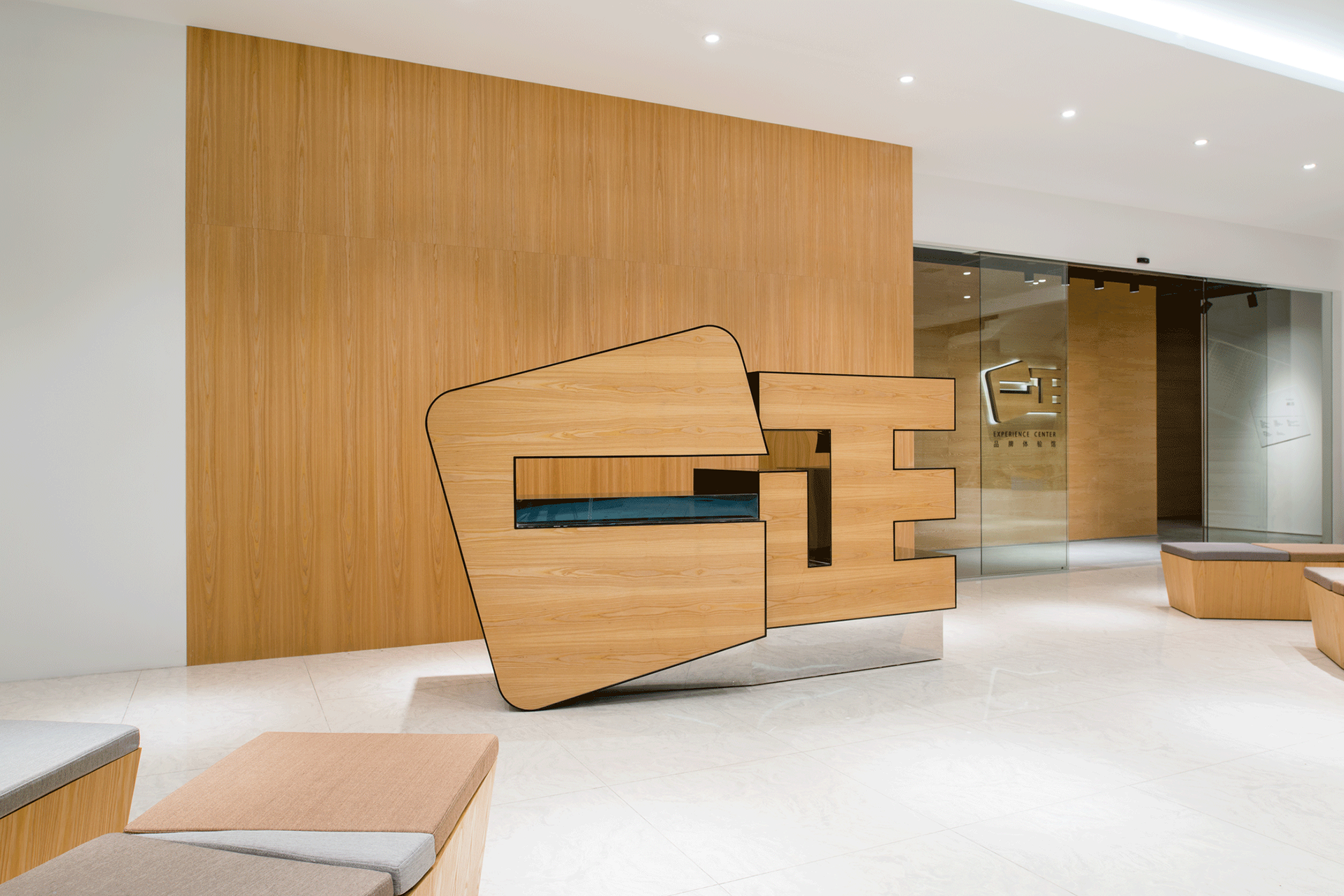
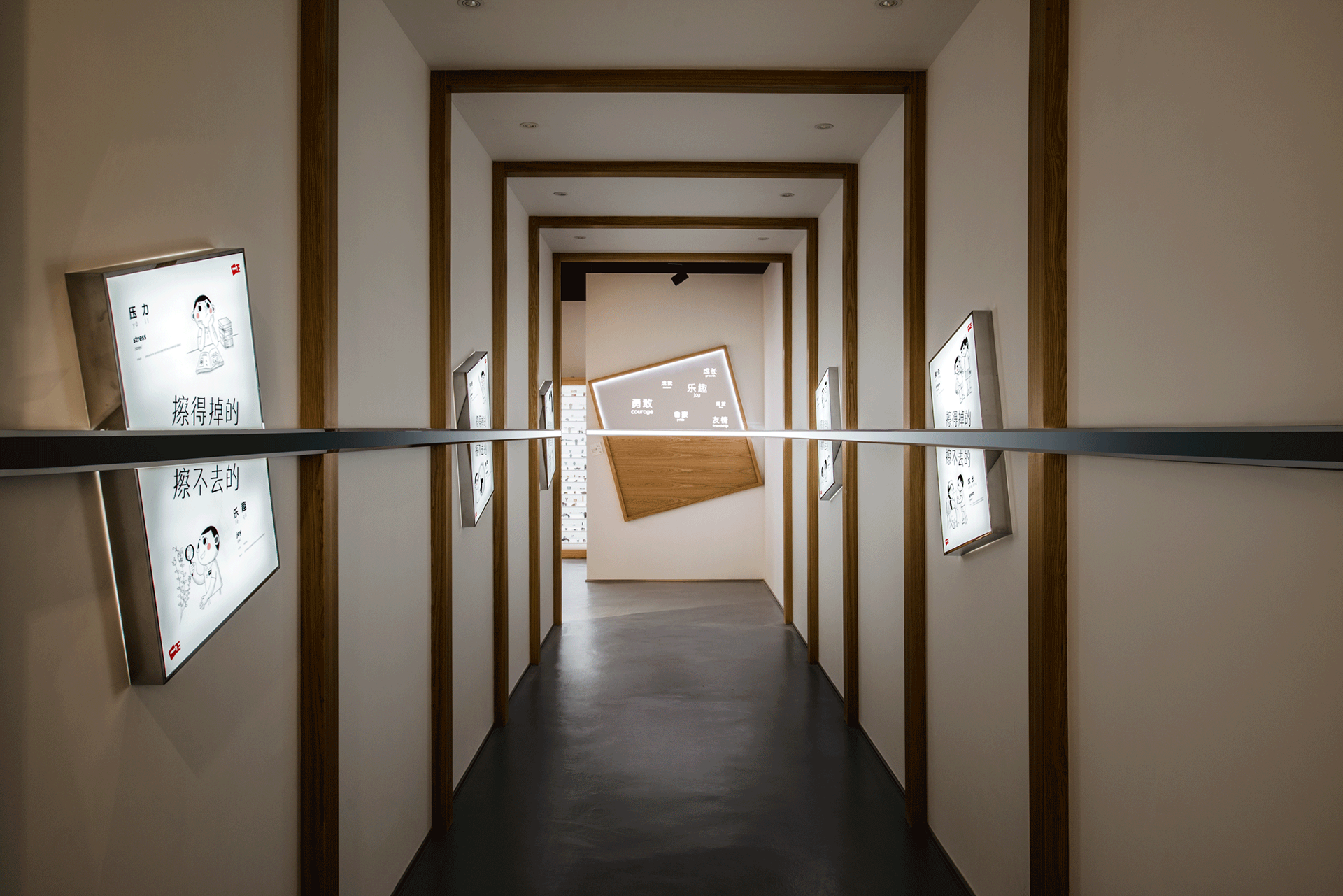
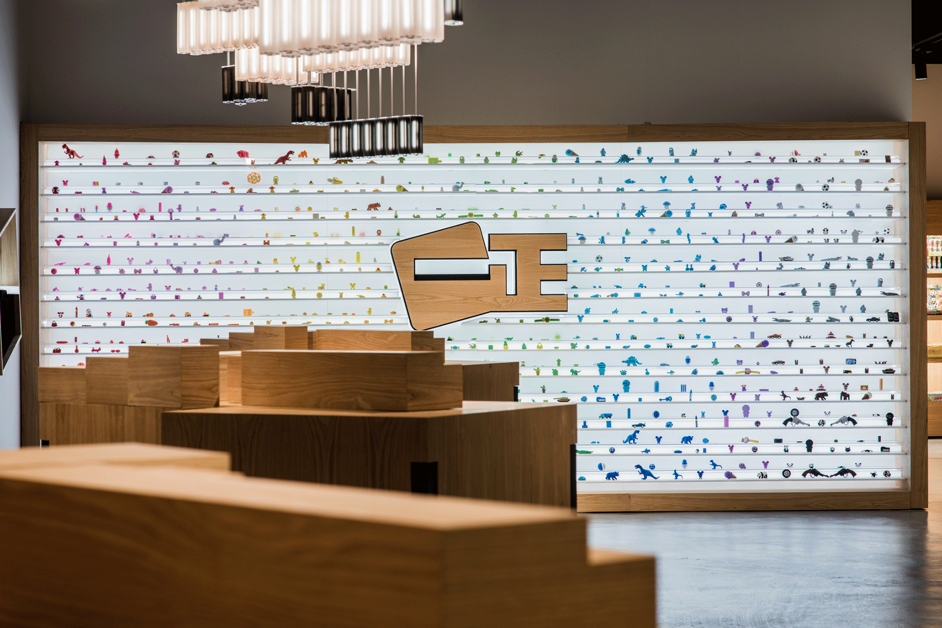
Yizheng Brand Experience Center
一正品牌体验馆
by United Design Practice X Light Collab X NFH
Interior Design - Commercial 室内设计 - 商业 : Bronze
Interior Design - Interior Lighting 室内设计 - 灯光 : Bronze
Conceptual 概念 : Honorable Mention
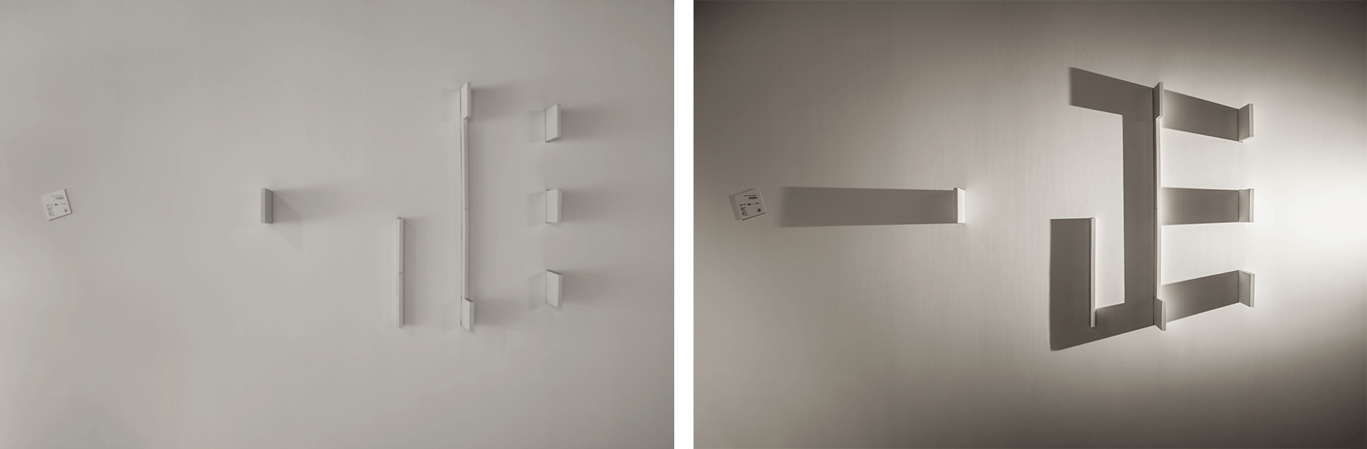
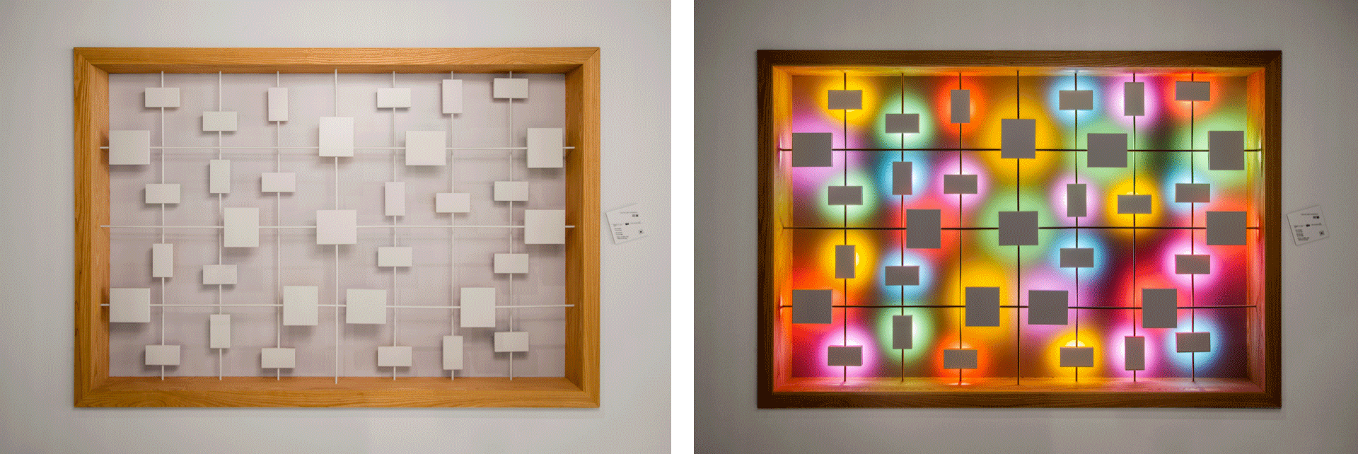
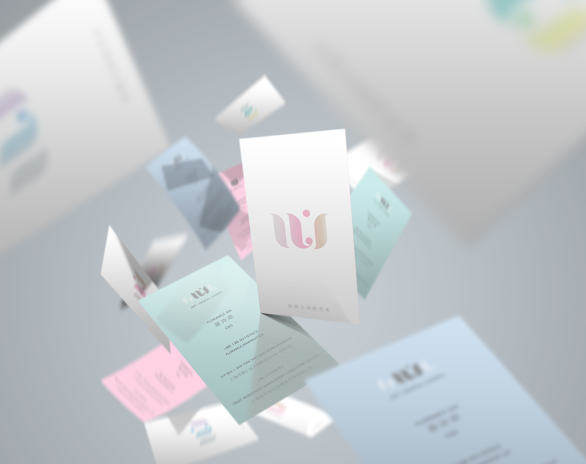
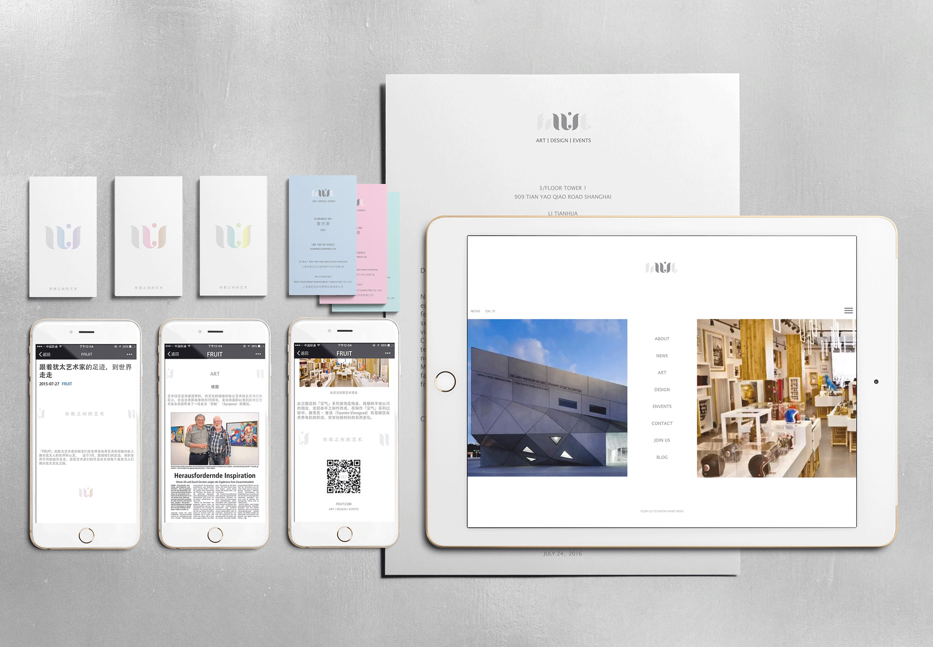
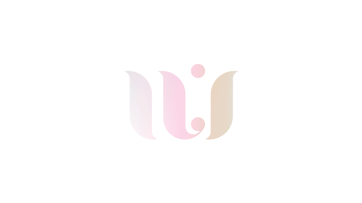
UI Art Branding
UI 艺术品牌设计
Corporate Identity 企业形象 : Honorable Mention
Neo Cycling Club Branding
Neo 自行车俱乐部品牌设计
Corporate Identity 企业形象 : Honorable Mention
Yizheng Brand Video
一正品牌视频
by United Design Practice X Seenvision
Mutimedia - Animation
多媒体 - 动画
Other Graphic Design
其他平面类


Our Concept / 我们的概念
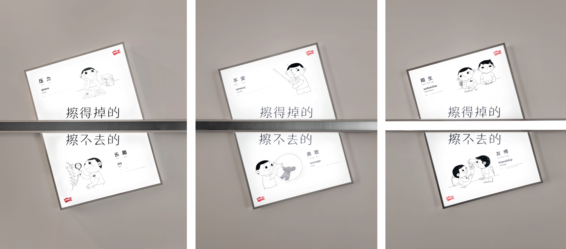
From our childhood, we all have good and bad memories. But as we grow older, the bad ones tend to fade, leaving the good ones. This is the empowering message that we wish to leave with parents. Everything has two sides to it. If we manage to overcome the short term difficulty, the reward is often life long. Once we overcome the unfamilarity of making friends, the friendship could last a lifetime. From this concept, we developed five posters, one of which this video is an elaboration of.
每个人儿时记忆的里,都些有好的和不好的回忆。但很奇妙,我们都会慢慢把不好的擦掉,留下美好的回忆。我们希望父母能将这些正面的经历告诉孩子,让孩子们可以不用担心,勇敢的面对。事情都有两面,克服了眼前的困难,往往获得都是一辈子的。克服了陌生,才可能获得陪伴自己后半生的友情。所以就有了 “擦得掉/擦不去” 这个概念。就好像一正的橡皮擦,它已不只是一种功能的满足,更多是一种情感的共鸣。我们为此创造了不同的 “擦不掉/擦得去” 的海报,视频也围绕这个主题进行展开。
Yizheng Brand Experience Center
一正品牌体验馆
by United Design Practice X Light Collab X NFH
Interior Design - Commercial
室内设计 - 商业
Interior Design - Interior Lighting
室内设计 - 灯光
Conceptual
概念
Our Concept / 我们的概念
In terms of brand communications, we ground the overall concept on the user level. In this age category, even if the child is the end user, the parent is the gatekeeper. The former typically only cares about whether how attractive the product is, the latter however, are the ones we are targeting in terms of messaging.
We all have good and bad memories from our childhood. But as we grow older, the bad ones tend to fade, leaving the good ones. This is the empowering message that we wish to convey to the parents and for them to tell their children. Everything has two sides to it. If we manage to overcome the short term difficulty, the reward is often life long. Once we overcome the unfamilarity of making friends, the resulting friendship could last a lifetime. From this concept, we developed five posters.
在品牌沟通层面,我们还是把重心放在最后受众和用户那里。亲子品类,虽然用户是孩子,沟通对象却是父母。因为前者只在乎东西好看,可爱,后者会在意更多,也有能力解析品牌层面的各种属性。这也为了后续市场端 2C 层面的沟通开个头,垫个基石。
每个人在儿时记忆里都有好的和不好的回忆。但很奇妙,我们都会慢慢把不好的擦掉,留下好的。我们希望父母能把这种正面激励的信息告诉孩子。事情都有两面,克服了眼前的困难,往往获得都是一辈子的。克服了陌生,就可能获得陪伴自己后半生的友情。所以就有了 “擦得掉/擦不去” 这个概念。因为一正橡皮擦已经不只是一种功能的满足,更多是一种情感的共鸣。我们为此创造了不同的 “擦不掉/擦得去” 的海报,视频是基于这一主题的展开版。
UI Art Branding
UI 艺术品牌设计
Corporate Identity
企业形象

Our Concept / 我们的概念
The Art of U & I.
Visually, we want to express the relationship, this literal space, between you and I. Setting the brand element apart we place content in the middle. This treatment made multiple posters into a series, and brochures into contiguous pages. And this can be done ad infinitum.
Tone and manner wise, we took special care to balance the relationship between colour and white space. We meant to present a quiet confidence.
你我之间的艺术。
这是最核心的理念。在视觉呈现上,这个“之间”是最关键的,所以我们把内容放在logo品牌符号中间。这个运用有个意外的惊喜:它能够无限延伸,让海报有了系列感,折页有了贯穿。
在调性上,我们小心平衡了色彩和空白的关系。采用的渐变色是淡雅的,表现一种内敛的自信。

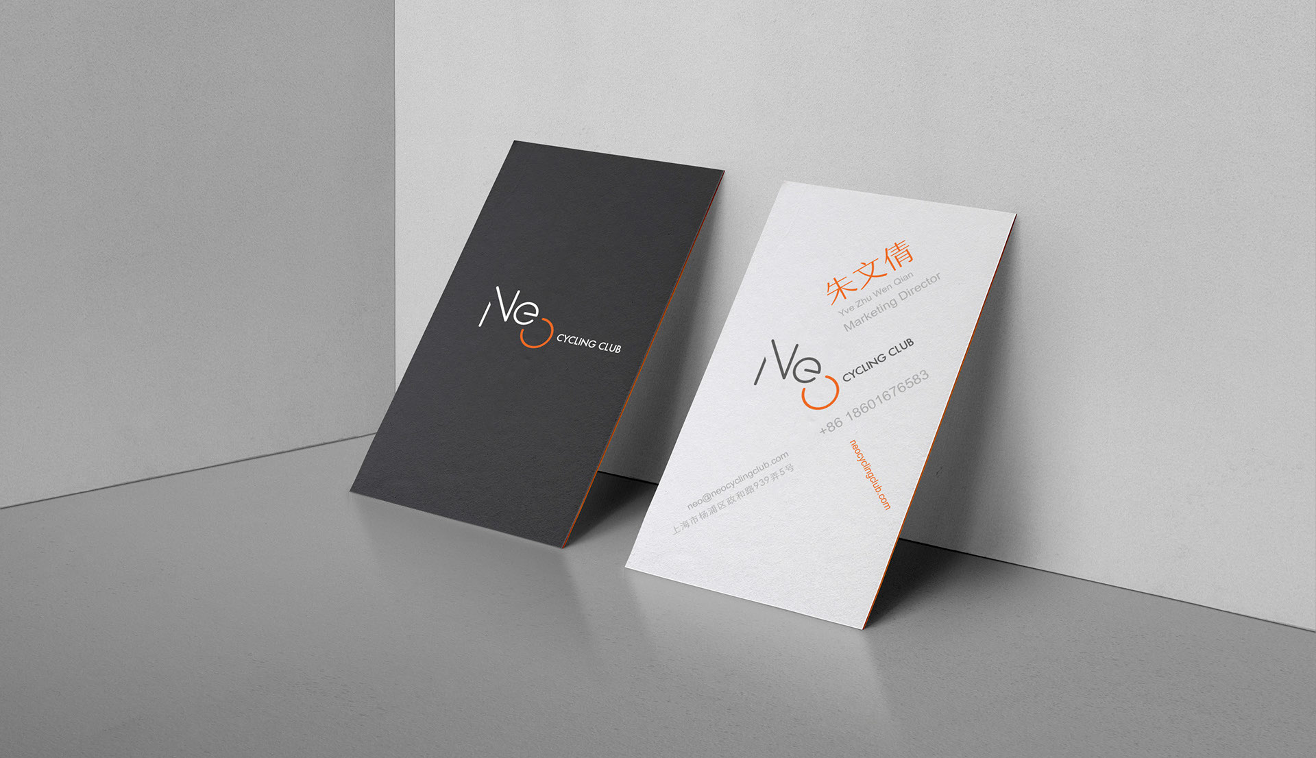
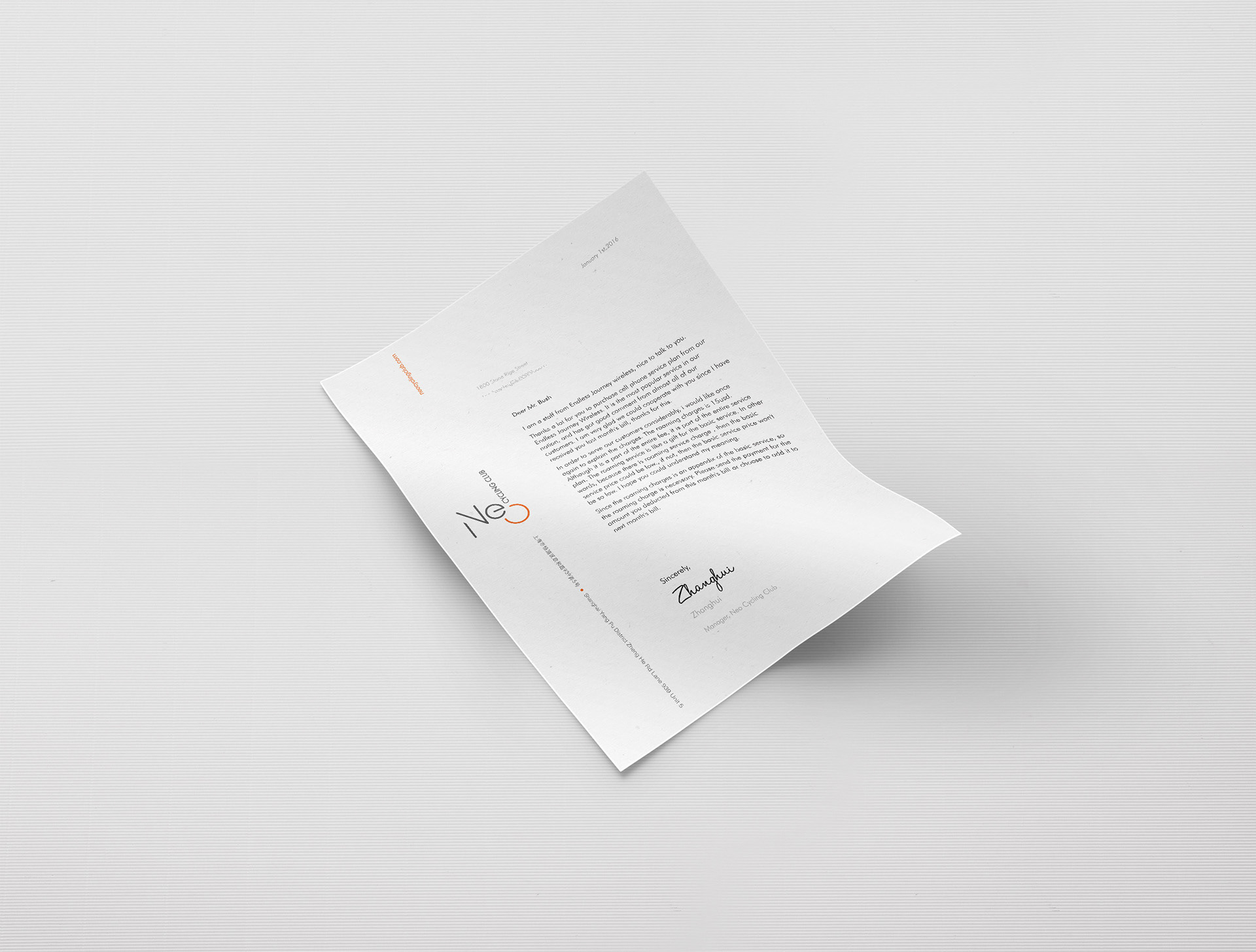
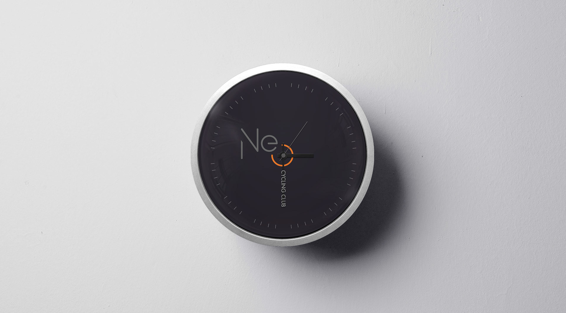
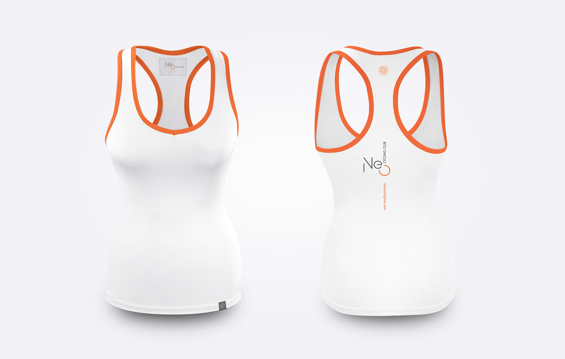
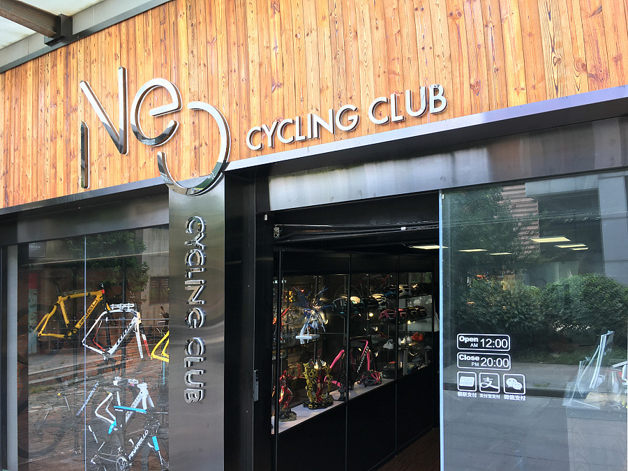
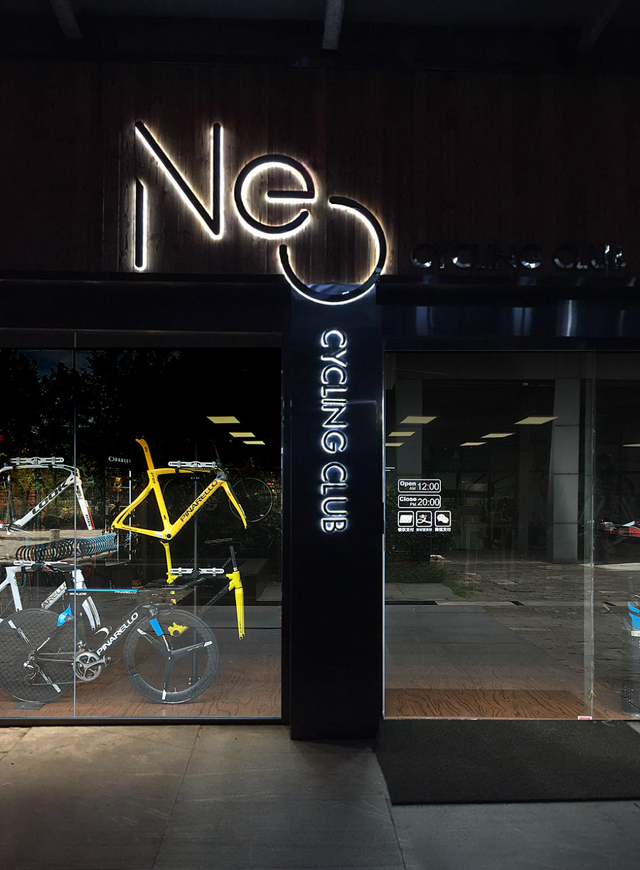
Neo Cycling Club Branding
Neo 自行车俱乐部品牌设计
Corporate Identity
企业形象
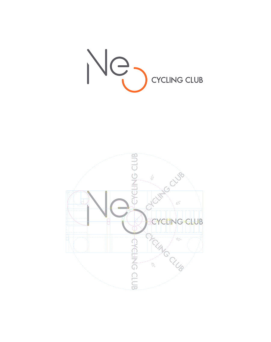
Our Concept / 我们的概念
We used this unique opportunity to play with a logo that spins, much like a wheel. Typically logo are locked into a fixed orientation. We made the O in Neo into a hub, from which 'cycling club' spins into different 45 degree incremental postions. The difficulty with such a design is two-fold. 1) As a whole the logo is asymetrical, we had to balance it visually with line-weights, and spacing. 2) To bring this idea to life we had to make the different orientations work across different extensions, this took quite a bit of skill and effort!
The end result is a logo that looked classy at first glance, but playful, dynamic, and suitably sporty across the entire consumer journey.
通常 logo 都只有一种锁定关系,我们利用了这次千载难逢的机会,来玩一个不只有一个锁定关系的 logo. 把 Neo 里面的 O 做成轴心,cycling club 做成轮辐,让后者有不同45度的出现方式。这个 logo 难点有两处。1) 因为字数关系,这 logo 是不对称的。得在视觉上把它平衡起来,通过间距,字体粗细大小写。2) 要让这种不寻常的做法成立——让他出现在各个不同的品牌延展,又显合理合适好看。这里真下了不小功夫!
Logo 第一眼是凸显专业性,格调。展开的延展体现品牌属性里的动感,活力,运动气息。