Yizheng Stationery as a company grew substantially since the first project we embarked with them years ago, the Yizheng Brand Experience Center. Back then our advice to them was: Let’s not change the logo as yet, but let’s give the brand an emotional narrative that speaks of who you are and what you can be.
Since then, we helped the enterprise to navigate the difficult journey from OEM, ODM to being brand owners and proud export champions. The range of projects we worked with them on included sharpening sub brands, creating new products, developing entirely new export driven brand and products, incubating IP content to combat piracy, conducting market research, navigate a buy over of a foreign brand, helping them design a new factory, and this project too, a rebrand of the parent brand.
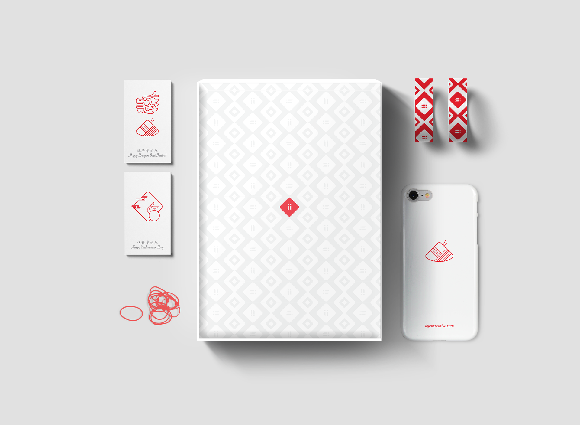
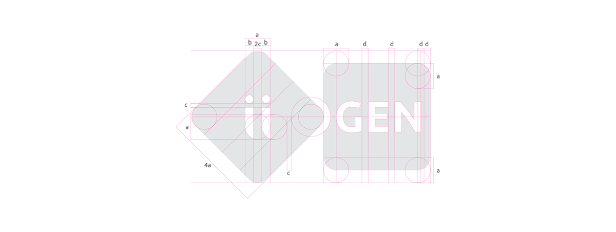
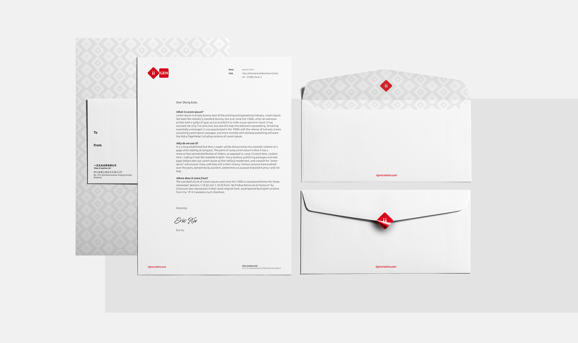
The original logo is in Chinese. This created problems in legibility especially for an international market. We needed a new brand in English, as they grow from a domestically driven brand to having an international presence.

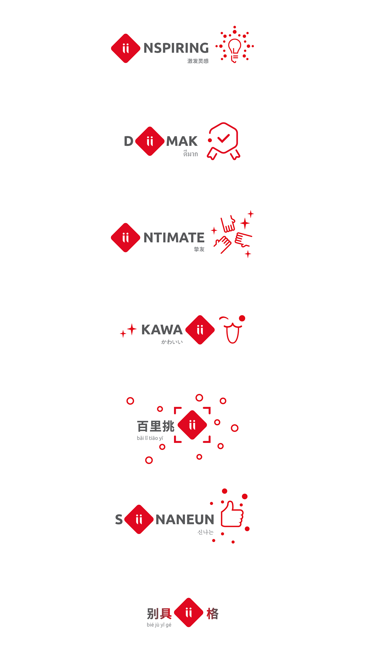
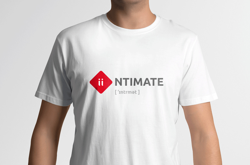
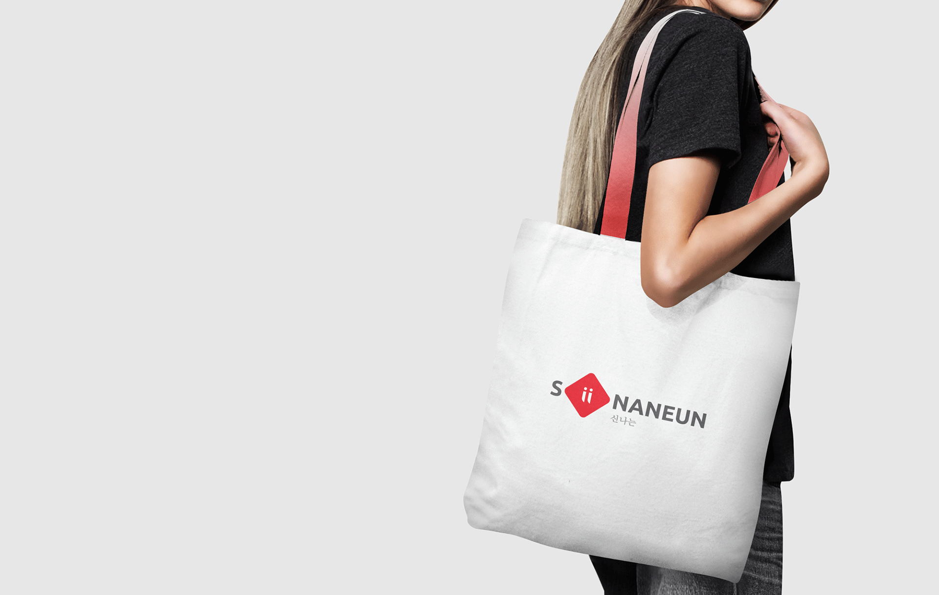
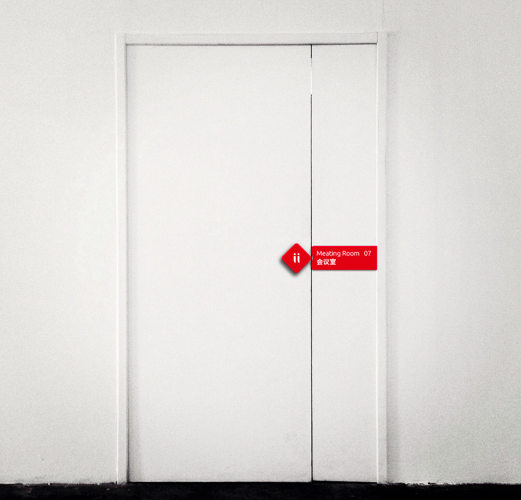
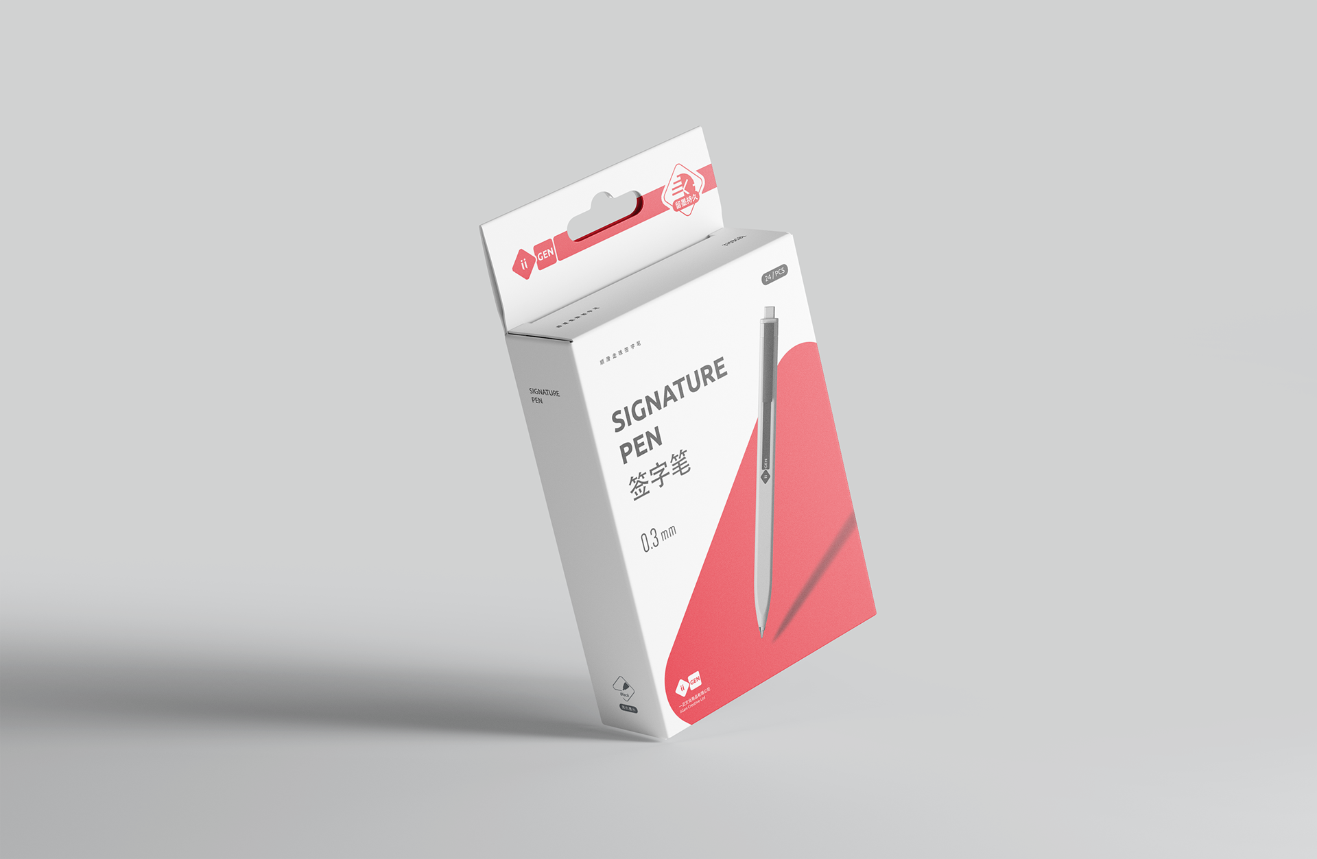
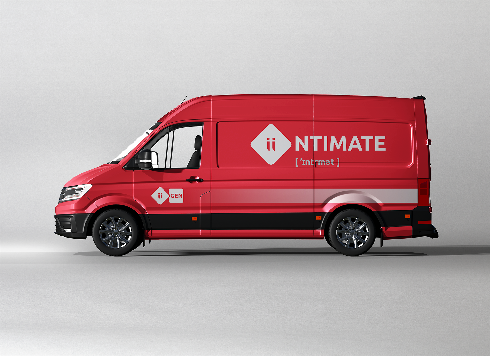
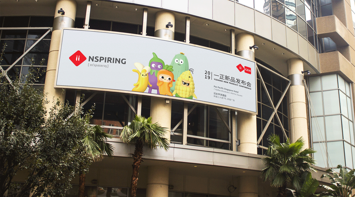
We retained recognizable elements from the old logo, like the color and the geometry of two squares. Now, the challenge is how to rename Yi Zheng into one befitting of its future international growth and vision. We chose ii GEN, with phonetically adjacent to Yi Zheng when spoken. With ‘GEN’ representing a new GENeration, ‘ii’ representing a new age with the people in it. i to we to ii. This new iiGEN stands for a brand that is entering a new era, selling products for a new, connected, and global generation.
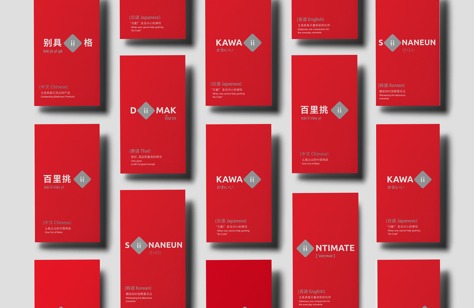
Hence the wordplay we created using ii as both symbol and alphabet in different languages, expressing different brand qualities in different languages. A brand with true global aspirations, demonstrating the will and sincerity to connect with diverse multi-national and multi-cultural markets.