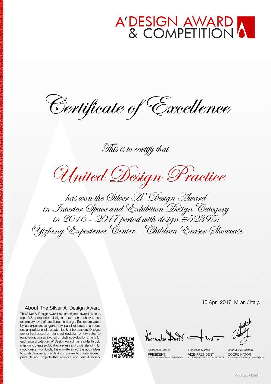
United Design Practice ( UPD ) 获得 A'Design Awads 室内空间-展览设计和灯光设计奖项。
A’ Design Awards 2017 Winners Announced
International A’ Design Award & Competition announces the best designs of 2016 - 2017 in all design disciplines.
International A’ Design Award & Competition announces the best designs of 2016 - 2017 in all design disciplines.
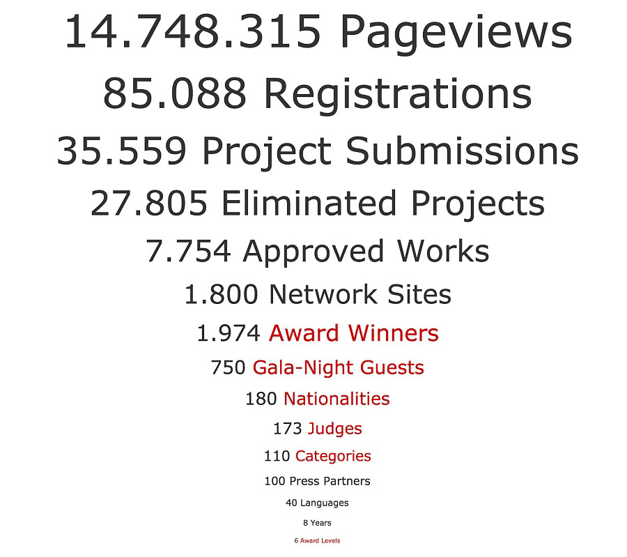
A’ Design Award & Competition (designaward.com), the World’s largest and most diffused international design awards announced results of the 2016 - 2017 design competition: 1958 Winners from 98 countries in 97 different design disciplines. Entries were carefully evaluated by an internationally influential jury panel composed of established scholars, prominent press members, creative design professionals and experienced entrepreneurs who devoted great care and attention to details while voting each entry.
A’设计大奖2017年度获奖名单公布
国际A’设计大奖赛现已公布2016-2017年所有设计领域的最优秀设计。
A’设计大奖赛(designaward.com), 全球最大并且涉及国家和地区最多的设计大奖赛现已正式公布2016-2017年设计大赛的结果:来自于98个国家和地区,97个不同的设计领域,共1959位设计获奖得主。参赛作品全部都由极具国际影响力的知名学者、著名媒体成员、创意设计专业人士和有经验的企业家组成的评审团进行公平仔细的审察,评审团都倾注了极大的精力和关心,谨慎仔细地对每件参赛作品进行评估。
DESIGN NAME:
Yizheng Experience Center
项目名称:
Yizheng Experience Center
项目名称:
一正品牌体验馆
PRIMARY FUNCTION:
Children Eraser Showcase
Children Eraser Showcase
主要功能:
儿童橡皮展示
INSPIRATION:
Children erasers are more than functional products, children collect them, the erasers bear witness to their childhood. We have good and bad memories from our childhood, as time passes, we erase the bad keeping the good. Hence our key concept. Erasing x with y. For eg. erasing discomfort with courage, erasing stress with joy. This is expressed in a brand video shown in the center, also in the concept tunnel before they view the exhibits. A line in the tunnel express this erasing.
Children erasers are more than functional products, children collect them, the erasers bear witness to their childhood. We have good and bad memories from our childhood, as time passes, we erase the bad keeping the good. Hence our key concept. Erasing x with y. For eg. erasing discomfort with courage, erasing stress with joy. This is expressed in a brand video shown in the center, also in the concept tunnel before they view the exhibits. A line in the tunnel express this erasing.
释义:
儿童橡皮擦不仅仅是功能性的产品,孩子们也是收藏它们的,橡皮擦会让这些人看到他们的童年。随着时间的推移,我们从童年开始,我们消除了不良情绪以保留美好的回忆。所以我们的关键概念:用y擦除x。例如 勇气消除胆怯,快乐消除压力。这是在体验馆的品牌视频和观看展览之前的概念隧道中表达的,隧道中的一条线表示这个“擦除”。
UNIQUE PROPERTIES / PROJECT DESCRIPTION:
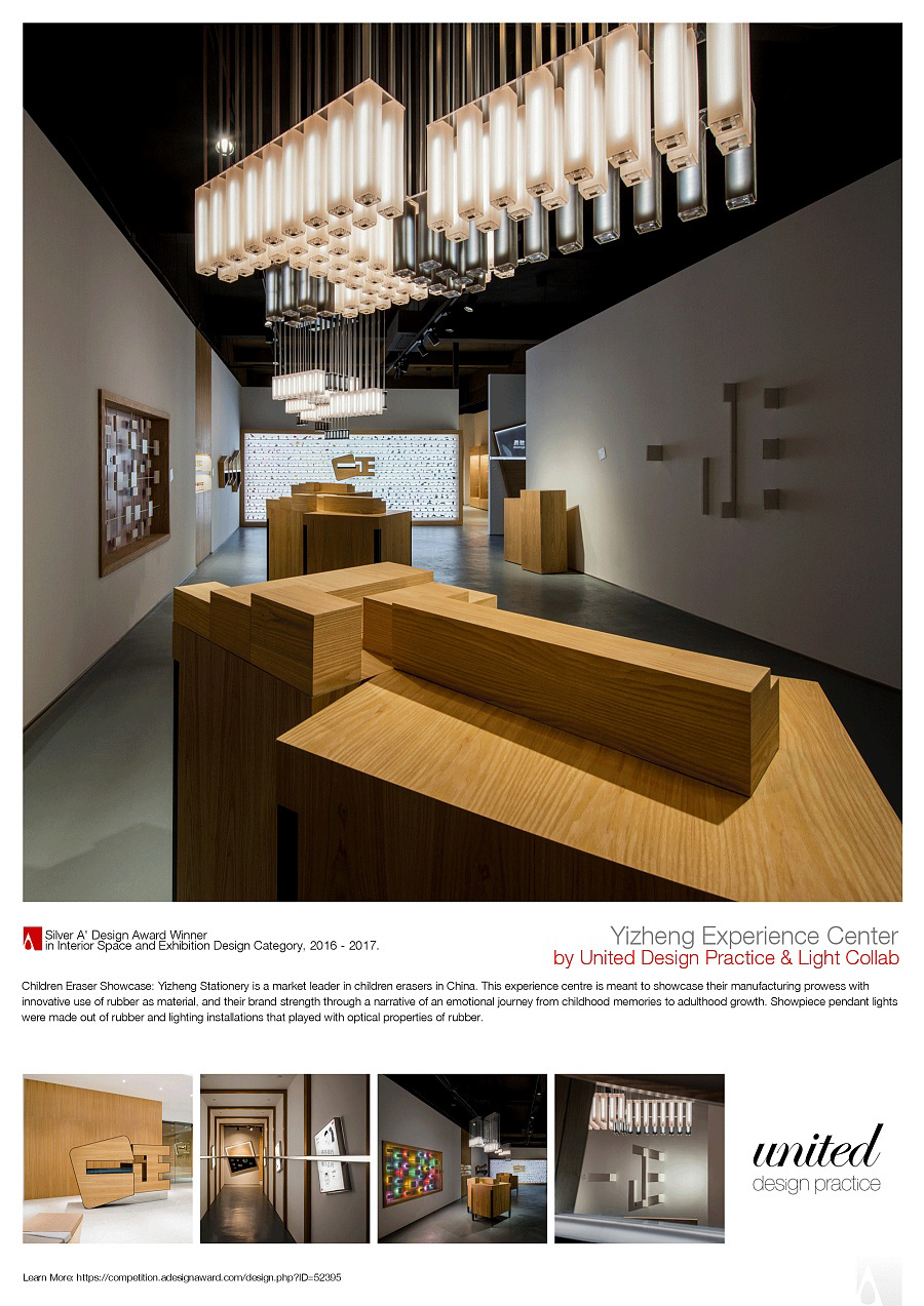
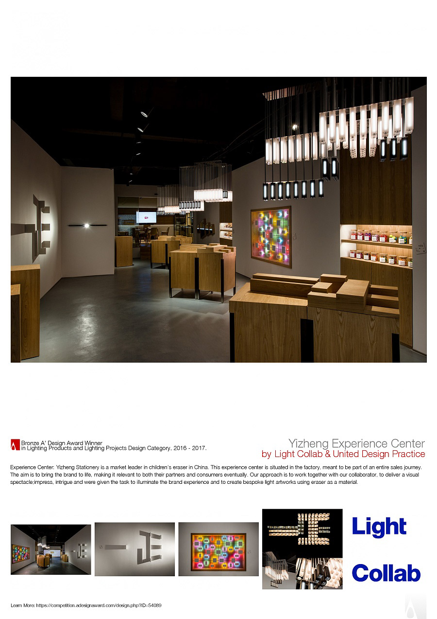
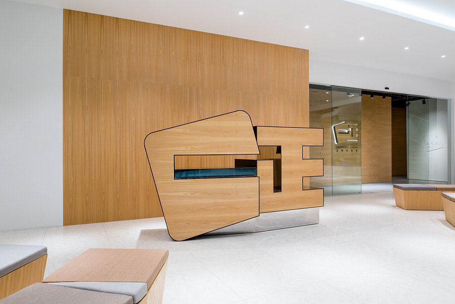
Yizheng Stationery is a market leader in children erasers in China. This experience centre, though grounded in this category, does not target children directly. This space is situated in their factory, to enhance the sales journey for their visiting distributors and foreign buyers. Other spaces like this in China focus on production and manufacturing prowess. Here we decided to focus instead on establishing emotional connections and making intriguing exhibits with rubber as material.
项目背景:
一正文具是中国儿童橡皮擦市场的领导者。这个体验中心,虽然基于这一类,但不直接针对孩子。这个空间位于他们的工厂,以完善他们的访问经销商和外国买家的销售旅程。中国其他这样的空间,专注于阐述生产和制造能力。在这里,我们决定重点关注建立情感联系,并以橡胶作为材料制作有吸引力的展品。
OPERATION / FLOW / INTERACTION:
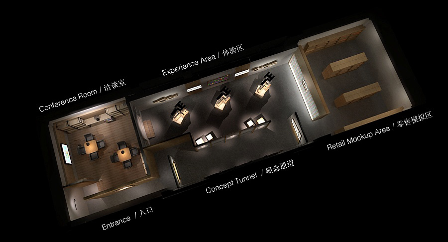
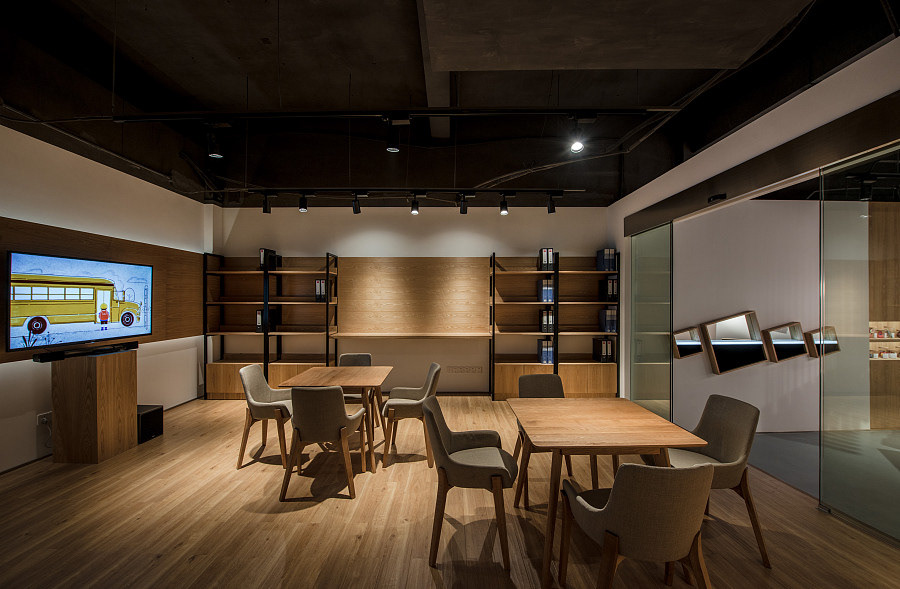
As this experience centre is situated in the factory, it is meant to be part of an entire sales journey. As such, the spatial layout and circulation is meant to enhance this experiential journey. Upon arrival, they past through the lobby, enter the experience centre and turn left into conference area. Here they rest, freshen up take a drink, and watch the brand video. Thereafter, they leave to visit the factory, to see for themselves the level of automation and production sophistication. Re-entering the space, they turn right, passing into the concept tunnel, and into the retail mockup area. It is important for business partners to understand the diversity of their product range. The journey continues into the experience zone and back to the conference room where the client will address further questions and conclude the business discussion.
As this experience centre is situated in the factory, it is meant to be part of an entire sales journey. As such, the spatial layout and circulation is meant to enhance this experiential journey. Upon arrival, they past through the lobby, enter the experience centre and turn left into conference area. Here they rest, freshen up take a drink, and watch the brand video. Thereafter, they leave to visit the factory, to see for themselves the level of automation and production sophistication. Re-entering the space, they turn right, passing into the concept tunnel, and into the retail mockup area. It is important for business partners to understand the diversity of their product range. The journey continues into the experience zone and back to the conference room where the client will address further questions and conclude the business discussion.
互动流程:
由于这个体验中心位于工厂,所以它是整个销售过程的一部分。因此,空间布局和流通意味着增强这一体验之旅。抵达后,他们经过大厅,进入体验中心左转进入会议区。在这里休息一下,观看品牌视频。此后,他们参观工厂, 了解制造水平和生产的复杂程度。再重新进入空间,他们右转,进入概念隧道、零售模型区。商业伙伴必须了解其产品范围的多样性。旅程将继续进入体验区,并返回到会议室,客户将进一步沟通并结束业务讨论。
PRODUCTION / REALIZATION TECHNOLOGY:
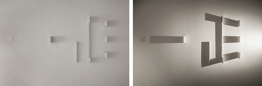
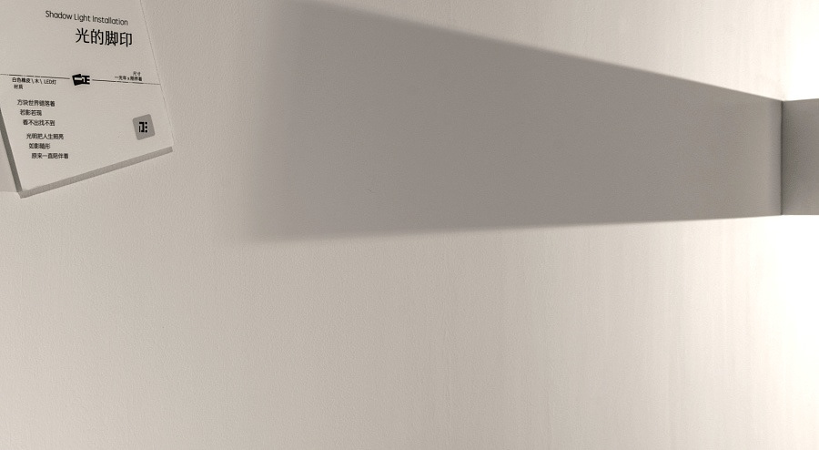
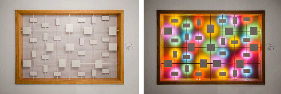
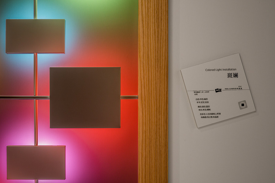
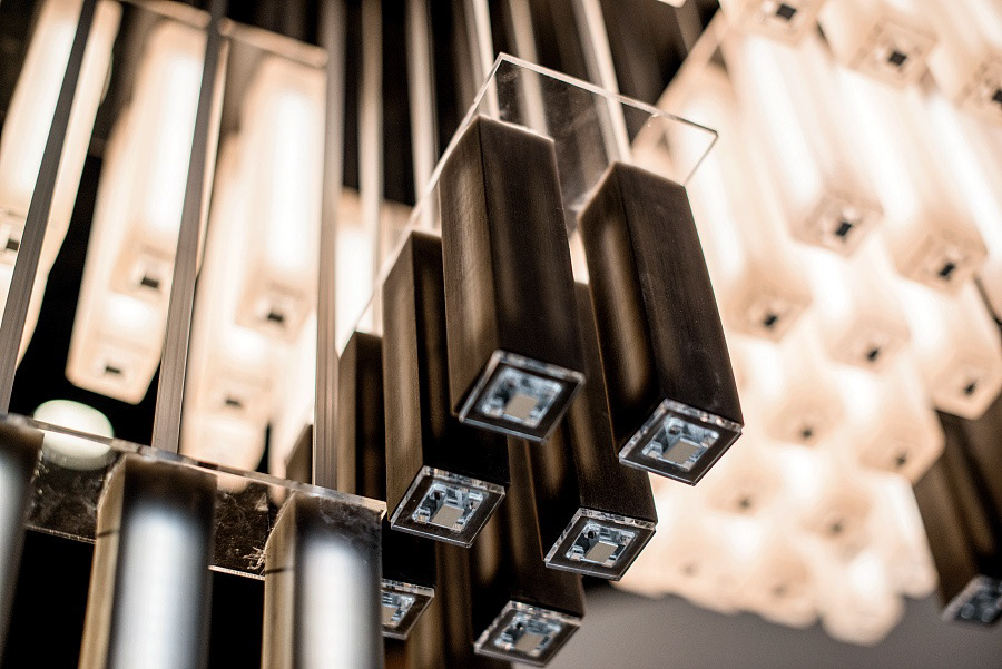
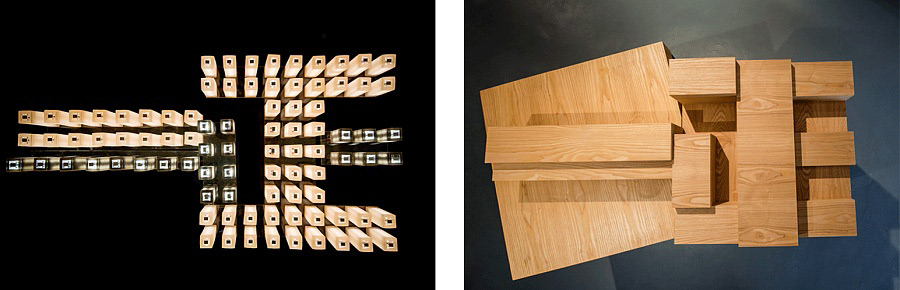
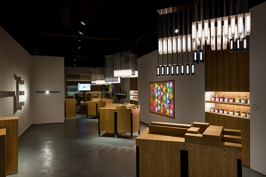
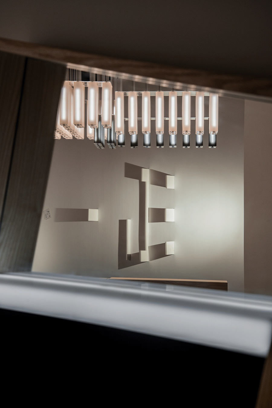
We installed two rubber light installations. One is a play on shadow, another on colour. White rubber blocks protrude from the wall in seemingly random fashion, only when the light is turned on do the Yizheng chinese characters come into being. In the second we used light reflected off coloured rubber blocks to compose a painting with light. Both are dramatized by the before after effect in the storytelling with light. Besides the light play, we wanted to make something surprising for which rubber is suited for yet seldom considered. We experimented with making rubber light fixtures, and after numerous prototyping rounds, they turned out amazingly well. It took a while to get the right mix of both rigidity and translucency in the white and black rubber tubes. We made 3 sets of these rubber chandeliers, and they are configured differently elevation wise. But from a bottom looking up, it spells the chinese characters of Yizheng, being a mirror image of the wooden blocks on the podium below.
We installed two rubber light installations. One is a play on shadow, another on colour. White rubber blocks protrude from the wall in seemingly random fashion, only when the light is turned on do the Yizheng chinese characters come into being. In the second we used light reflected off coloured rubber blocks to compose a painting with light. Both are dramatized by the before after effect in the storytelling with light. Besides the light play, we wanted to make something surprising for which rubber is suited for yet seldom considered. We experimented with making rubber light fixtures, and after numerous prototyping rounds, they turned out amazingly well. It took a while to get the right mix of both rigidity and translucency in the white and black rubber tubes. We made 3 sets of these rubber chandeliers, and they are configured differently elevation wise. But from a bottom looking up, it spells the chinese characters of Yizheng, being a mirror image of the wooden blocks on the podium below.
执行技术:
我们安装了两个橡胶灯装置。一个是光影的演绎,另一个是彩色的。白色橡胶块似乎以随意的方式从墙壁突出,只有当灯光开启时,一正的汉字才能形成。在彩色部分,我们用光线反射出来的光组成一幅画。两者都是在用光的能量进行故事叙述。除了光线之外,我们也想让一些不寻常的材料——橡皮 得以应用。我们尝试制作橡胶灯具,在白色和黑色橡胶管中,经过无数次的原型设计,才获得刚性和透明度的正确配比。我们制作了3套这种橡皮吊灯,它们的高低不同,但从底部看,都描绘了一正的汉字,作为下面讲台上木块的镜像。
SPECIFICATIONS / DIMENSION / PACKAGE / TECHNICAL PROPERTIES:
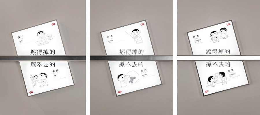
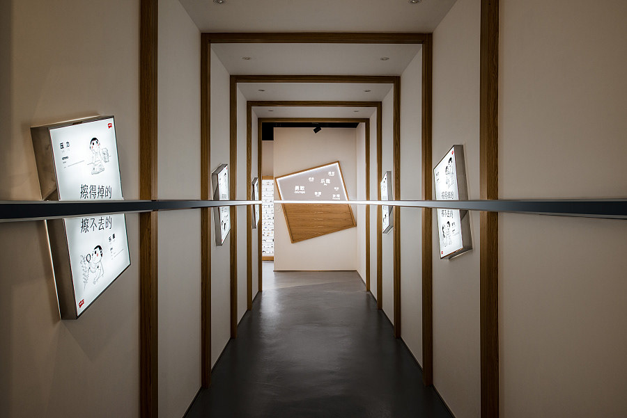
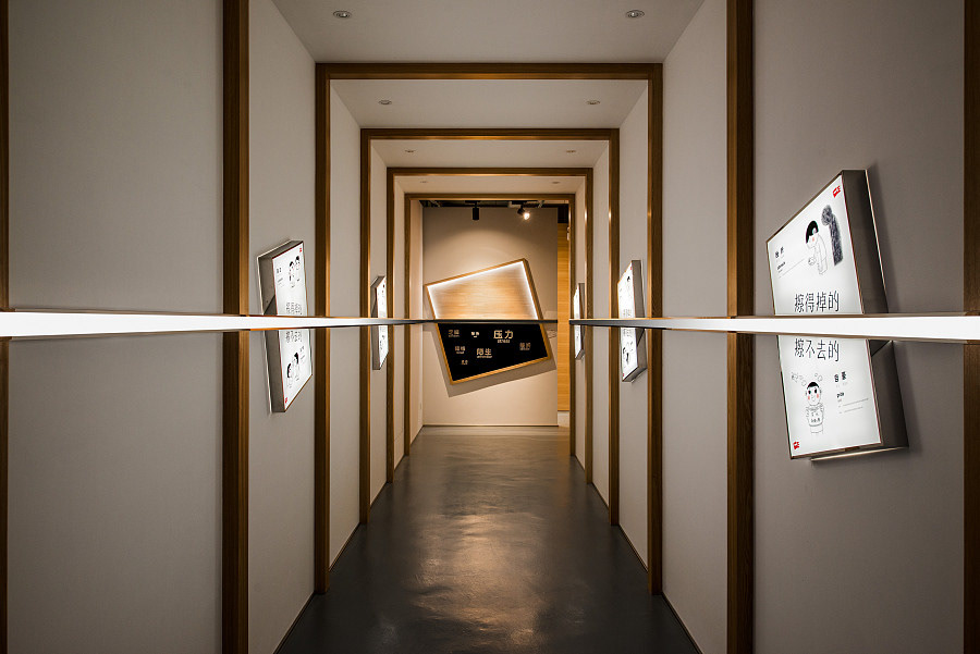
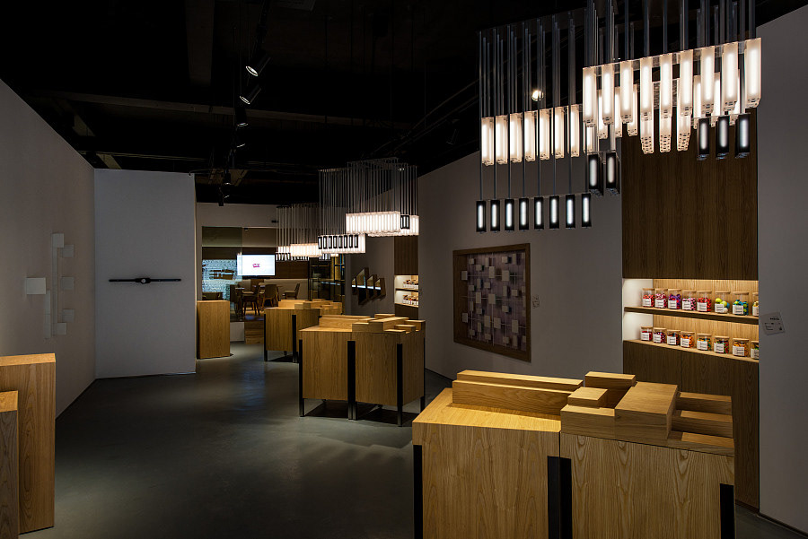
The entire space is about 200 sqm in total, in three areas, a conference area, a retail mockup area, and an experience area. A concept tunnel lead in to the experience area. Spatially, the Concept Tunnel is not only a transitional space. The 5 key posters are placed along the tunnel walls at a 15 degree angle (consistent with the incline in the logo). A line that shifts from black to shining white cuts the posters in half, emphasizing the two sides of the same story. This line is the spatial embodiment of the idea of what is erased away and what is not. Turning the corner the line ends at opposite sides of the tunnel, cutting across a black painting and a white painting. Looking forward and backward in the tunnel is like looking into the future and back at the past. With the right encouragement, we walk towards the white painting, and see the growth we have attained, only to turn back to realise we have overcome these obstacles that are on the black painting. Many manufacturers likes to talk about how great they are. This is not only unconvincing, it is a sign of low self-esteem and lack of confidence, much like a person you meet who likes to brag. In initial discussions with the client, we reached the alignment that we will not talk, but actually demonstrate with real actions. The retail mockup area shows impressive product range. The acrylic wall displays an overwhelming numbers of erasers of all shapes and colours. How then do we demonstrate brand innovation, creativity, and constant pursuit of excellence? This is where we came up with delightful solutions.
The entire space is about 200 sqm in total, in three areas, a conference area, a retail mockup area, and an experience area. A concept tunnel lead in to the experience area. Spatially, the Concept Tunnel is not only a transitional space. The 5 key posters are placed along the tunnel walls at a 15 degree angle (consistent with the incline in the logo). A line that shifts from black to shining white cuts the posters in half, emphasizing the two sides of the same story. This line is the spatial embodiment of the idea of what is erased away and what is not. Turning the corner the line ends at opposite sides of the tunnel, cutting across a black painting and a white painting. Looking forward and backward in the tunnel is like looking into the future and back at the past. With the right encouragement, we walk towards the white painting, and see the growth we have attained, only to turn back to realise we have overcome these obstacles that are on the black painting. Many manufacturers likes to talk about how great they are. This is not only unconvincing, it is a sign of low self-esteem and lack of confidence, much like a person you meet who likes to brag. In initial discussions with the client, we reached the alignment that we will not talk, but actually demonstrate with real actions. The retail mockup area shows impressive product range. The acrylic wall displays an overwhelming numbers of erasers of all shapes and colours. How then do we demonstrate brand innovation, creativity, and constant pursuit of excellence? This is where we came up with delightful solutions.
规格:
整个空间总共约200平方米,分会议区,零售模拟区和体验区三个区域。从一个概念隧道进入体验空间。空间上,概念隧道不仅是一个过渡空间,5个关键海报沿着隧道呈15度角(与标志中的倾斜度一致)放置,一条从黑色变成闪亮的白色的线条将海报分割两半,这条线强调了两面在同一个故事中,什么被抹去,什么留下。转弯的角线在隧道的两边结束,穿过一幅黑色的画和一幅白色的画。隧道中向前看,在正确的鼓励下,我们走向白色的画面,看到我们所取得的成就,只有回头才能意识到我们克服了黑色画面上的这些障碍。许多制造商喜欢谈论他们有多好,这不仅不能令人信服,而且表现为自尊心低,缺乏信心,就像一个你遇到喜欢吹牛的人一样。在与客户的初步讨论中,我们达成了一致,我们不会高谈阔论,而是用真实的行动来展示。零售模拟区展示令人印象深刻的产品系列,亚克力墙壁显示出所有形状和颜色的压倒性数量的橡皮产品。那么我们如何展示品牌创新,创造力和不断追求卓越?这就是我们想出的令人愉快的解决方案。
RESEARCH ABSTRACT:
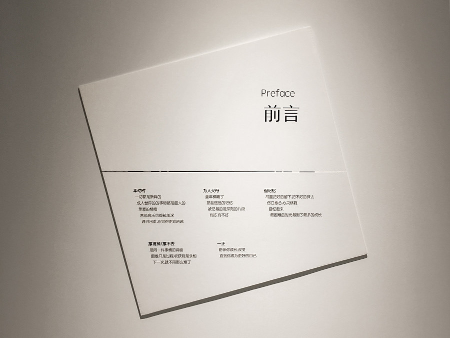
As manufacturers in China transit from OEM, ODM to being brand owners, the founders need to embark on the often unfamiliar process of brand building. This process of building their brands from scratch is an onerous task, and with so much to do, knowing where to start, and subsequent project phasing is key. Here we decided to embark on B2B communications first, before tackling B2C touchpoints. It is more direct, and cost effective, without taking too much time tackling market segmentation and product line architecture issues. Especially important for small medium enterprises (SMEs), is for the brand consultants to deliver in as quick a time frame as possible a solid response and ROI for the inception phase. Only then will the SME be confident enough to embark on the next phase in the long process of brand building. In this phase, we left the logo largely untouched. Our aim is to bring the brand to life, making it relevant to both their partners and consumers eventually. Corporate brand experience centres targeted at business partners traditionally has many exhibition boards with lengthy paragraphs just talking about their manufacturing prowess and production capabilities. Truthfully, this type of execution puts people to sleep, and what it does is deliver messaging on a very crude level. Our approach therefore is to deliver a visual spectacle; impress, intrigue and they will want to know more.
研究摘要:
如今中国的制造业都在转型中,从代工、代设计、到经营自己的品牌。创始人到了这个阶段,知道这是唯一能够提高附加值的办法,但往往是茫然的。从零开始打造一个品牌,不只是做什么的问题,精力和经费都是有限的,先做什么是更重要的问题。在个项目我们从 B2B 的品牌沟通做起。它更直接,并且具有成本效益,而不需要太多时间来处理市场细分和产品线架构问题。相对于B2C, 这是简单的,关于要传达的信息,选择的沟通媒介,需要的推广费用。更重要的是,针对于民营企业,品牌策划方需要最快的速度让甲方看到成效,才能更有信心得在漫长的品牌建立的旅程上,信心满满得再跨出一步。在这个阶段,我们的标志大部分都没有改变。我们的目标是将品牌带入生活,最终使其与合作伙伴和消费者相关。针对商业伙伴的企业品牌体验中心传统上有许多展板,其中冗长的段落只谈其制造实力和生产能力。真的,这种执行方式让人们厌倦,它所做的是在非常粗糙的层面上传递信息。因此,我们的方法是提供视觉景观; 印象深刻,他们会想记住更多。
CHALLENGE:
Making rubber light pendants and installations took many rounds of prototyping and testing, to find the right properties of rigidity, translucency, reflectivity and colour. The pendants in particular need to factor in light and heat emission, the engineering aspects took much work. Also the relative light levels in the experience area in particular needed to be precisely controlled, like an orchestra of lights.
Making rubber light pendants and installations took many rounds of prototyping and testing, to find the right properties of rigidity, translucency, reflectivity and colour. The pendants in particular need to factor in light and heat emission, the engineering aspects took much work. Also the relative light levels in the experience area in particular needed to be precisely controlled, like an orchestra of lights.
挑战:
制作橡胶灯吊坠和装置进行多轮原型和测试,找到刚性、透明度、反射率和颜色的正确属性。吊坠特别需要考虑光和热的排放,工程方面需要大量工作。此外,体验区域的相对光线特别需要精确控制,如灯光管组合装置。
TEAM MEMBERS :
Creative Lead: Lin Wei,
Lighting Designer: Toh Yahli,
Graphic Designer: Zhu Yu,
Spatial Designer: Wang Ruimin,
Construction: NFH
Illustration: Seenvision
团队成员 :
创意决策:Lin Wei,
灯光设计:Toh Yahli,
平面设计:Zhu Yu,
空间设计:Wang Ruimin,
执行:NFH,
动画/插画:Seenvision
IMAGE CREDITS:
Photographed by Shawn Koh (Feng Studios)
影像拍摄:
Shawn Koh (Feng Studios)